

Logos used on products/packaging:
Edited by Keanu Riives, 17 February 2013 - 10:42 PM.

Bullet Bill
Posted 17 February 2013 - 10:39 PM

POPULAR
Edited by Keanu Riives, 17 February 2013 - 10:42 PM.
Add Mii on miiverse:
thewiiuguy
^ dayum what a creative name
Tenzō of the Wood Release
Posted 17 February 2013 - 10:46 PM


Pokey
Posted 17 February 2013 - 10:53 PM
Edited by Lupaie, 17 February 2013 - 10:54 PM.
What the world needs is more geniuses with humility, there are so few of us left
Chain Chomp

Posted 17 February 2013 - 11:03 PM
Bullet Bill
Posted 17 February 2013 - 11:07 PM
Good initiative but the oldr logo is much better. Your capital N doesn't fit the rest of the letters. The rest of the font is not too consistent, reminds me a bit like a medium ITC-Avantgarde. Font is also used for the new Rare logo.
Add Mii on miiverse:
thewiiuguy
^ dayum what a creative name
Chain Chomp
Posted 17 February 2013 - 11:09 PM
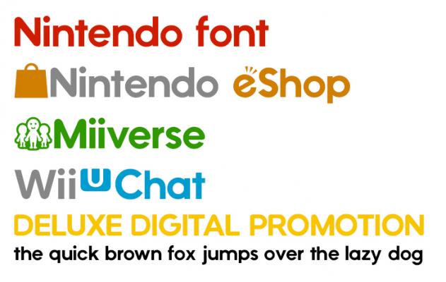
The font is actually made by me (I'm a noob at it). You're right, still has a lot of room improvement (like you stated the consistency isn't great). What i did was, I started off with Chalet NewYork as a base font and took letters from the Wii U/Miiverse/eShop/Wii U Chat/TVii/Internet Browser logos and glued them all together. I even included special characters like the Miiverse icon and the "U" icon.
Sample:
This is quite an achievement for me as I am 15 and still learning graphic design and typography but eventually i'll be great at it!
The Dovahkiin
Posted 17 February 2013 - 11:11 PM

Signature by Cerberuz
Bullet Bill
Posted 17 February 2013 - 11:11 PM
i dont really like the font. i cant place my thumb on the exact reason but i dont. makes it feel like its more of a toy. ill go with that. try comic sans. i heard that its a really great font to use
Add Mii on miiverse:
thewiiuguy
^ dayum what a creative name
Pokey
Posted 17 February 2013 - 11:12 PM
The font is actually made by me (I'm a noob at it). You're right, still has a lot of room improvement (like you stated the consistency isn't great). What i did was, I started off with Chalet NewYork as a base font and took letters from the Wii U/Miiverse/eShop/Wii U Chat/TVii/Internet Browser logos and glued them all together. I even included special characters like the Miiverse icon and the "U" icon.
Sample:
This is quite an achievement for me as I am 15 and still learning graphic design and typography but eventually i'll be great at it!
What the world needs is more geniuses with humility, there are so few of us left
Bullet Bill
Posted 17 February 2013 - 11:15 PM
Good practise! Do you use Illustrator? You can easily adjust excisting fonts with that one. Try downloading ITC Avantgarde Heavy and Bold/medium. And then adjust that one. You'll see that it will have a same look but a bit more consistent. True, your newer logo is looking a bit more modern but it has less character. Try to keep that in mind.
Add Mii on miiverse:
thewiiuguy
^ dayum what a creative name
Chain Chomp
Posted 17 February 2013 - 11:18 PM
I kinda see what you mean. It's probably because the old logo's font was more serious-looking (blocky, geometric), and the new font is more rounded.
Yes, Comic sans is amazing. I use it all the time, especially on really important design projects! Don't forget rainbow gradients and drop shadows! /s

Pokey
Posted 17 February 2013 - 11:27 PM
I use a program called FontCreator. I have Illustrator, so I might try that out. Define "character"?
What the world needs is more geniuses with humility, there are so few of us left
Bullet Bill
Posted 17 February 2013 - 11:29 PM
Character: uniqueness, an own identity. Just copy only a few characters from thevoriginal and show it to someone, chances are that they will still identify it as the Nintendo logo even if you mis the N+NDO. Same cannot be said for your logo.
Add Mii on miiverse:
thewiiuguy
^ dayum what a creative name
Chain Chomp

Posted 17 February 2013 - 11:52 PM


Red Koopa Troopa

Posted 18 February 2013 - 12:20 AM
Boo

Posted 18 February 2013 - 12:33 AM
Pokémon Trainer

Posted 18 February 2013 - 12:46 AM
Lakitu
Posted 18 February 2013 - 03:22 AM
Super Saiyan Dingus
Posted 18 February 2013 - 04:43 AM
This statement is false. The previous statement is true.
RIP in peace Nintendo.

Action Puzzle gamer ftw

Posted 18 February 2013 - 06:02 AM
If you're too lazy to click on my profile, I am Pikmin Pie/Typical.


Gaming →
Introduction Central →
Just got my first Wii UStarted by sen2008, 17 Jun 2015 |
|
|
||
Gaming →
E3 2015 →
E3 Best (and worst) moments so far.Started by BanjoKazooie, 16 Jun 2015 |
|

|
||
Gaming →
Introduction Central →
I'm new and need friends!Started by Dark7aura, 15 May 2015 |
|
|
||
WII U
Gaming →
Wii U Games and Software →
Wii U Game Reviews →
WII U first thoughtsStarted by KDoom11, 19 Mar 2015 |
|

|
||
Non-Gaming →
The Café →
Club Nintendo Game Code not SentStarted by bomber43, 11 Feb 2015 |
|
|
0 members, 2 guests, 0 anonymous users

