

Holy crap! That's awesome!Arkhandar, I hope you don't mind me borrowing your idea for tabs at the bottom - brilliant idea by the way.
These are what I've been working on and spending most of my brain power on these past few days and it's still not complete as you can tell.
Suggestions are welcome and needed.
(Everything's done from scratch)
WiiUOShome.png

Wii U OS Redesign Concept
Started by Abcdude, Sep 29 2013 11:20 PM
73 replies to this topic
#61

Portal
-

- Members
-

- 1,075 posts
Pokey
- NNID:AwewomeMii
-
- Fandom:
- StarWars and Korra
Posted 30 October 2013 - 04:49 AM
 )
)- Kiki Neko-Chan likes this
Some people always have a cellphone on them. I'm so awesome I always have a 3DS.
Check out my blog! Portal's Portal
#62
KeptMyWiiUAndLeftTheForums
-

- Members
-

- 2,337 posts
Lakitu

- NNID:xWydrAx
-
- Fandom:
- Smash Bros all day.
Posted 30 October 2013 - 09:25 AM
Thanks for your opinion! I went for something Nintendo-like, if you know what I mean - something similar to but a flatter version of the current Wii U interface. I'll take your suggestions and use them to improve it!
Add some white! Nintendo loves their white and grays.
- Kiki Neko-Chan and MatrixChicken like this
WAR IS PEACE
FREEDOM IS SLAVERY
IGNORANCE IS STRENGTH
LISTEN AND BELIEVE
#63
Robotic Sunshine Commander
-
- Members
-
- 1,350 posts
Pokey
Posted 30 October 2013 - 10:02 AM
That kind of thinking is what stopped the Gamecube from being taken seriously, despite its killer hardware at the time.
It was perceived as "kiddie," "lunch box for elementary school," etc.
Nowadays, not only the hardware design, bu the sofware UI lead perception as well.
Wii U UI looks (and SOUNDS) very childish.
Sure, you don't want to alienate kids. therefore, it wouldn't be wise to go the route of Metro UI for example.
But you also want to present everything in the best light possible for modern crossover appeal.
If this was 2006 even, the UI would be considered modern.
But now, it looks ancient.
The layout is not bad, though eShop and the Wii U Menu could do well with a modified, updated sidebar.
And all the random shapes are more than annoying, breaking visual continuity, like there aren't part of any theme at all, just a random thought.
It seems that the graphic design/UI/UX team is either resistant to or incapable of change in terms of keeping up with the times.
At some point, I imagine the UI will be updated. But it won't be until the OS itself gets the bloat down quite a bit more.
If this UI were on any other console, it would be ridiculed heavily.
The fact that it is deemed "somewhat normal" or "the Nintendo way" on a Nintendo console only means that people expect less from Nintendo (in terms of UI/UX, not games). that should not be the case.
So the Wii U UI looks childish? pfff.
I'm pretty sure a bunch of jumbled random a** boxes is a little more "kiddie" as you would call it.....
Oh, and atleast the avatars can actually be used in action. UNLIKE EVERY OTHER PLATFORM.
hey maybe it's just me....oh wait....it isn't lol.
As you see here, all of your friends and randoms appear to greet you with insight to other games and inform you on their activity...Seems like a flawless and very social design to me.
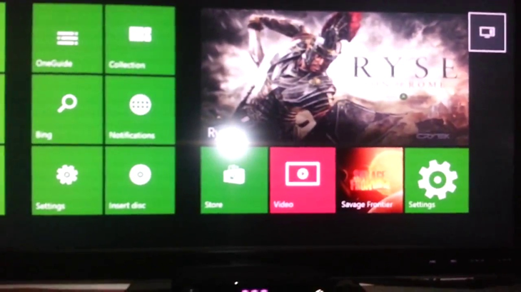
The Xbox One dashboard is full of ads and animation themed icons/ boxes. Bland background, sloppy layout of settings and other apps . it just doesn't compare.
What about the ps4's interface? It seems as if everything is layed out quite alright, but again there are limited options here. With the string layout it seems awkward to access apps unlike with the second screen gamepad on Wii u that can be used toward improving the experience with everyone you love to play games with. The Wii U's UI was rough at first, but now that everything is somewhat laid out in front of you from the get-go i would have to say it is the cleanest OS we have seen for next gen platforms..


 S
S
Edited by Robotic Sunshine Commander, 30 October 2013 - 10:10 AM.
- KeptMyWiiUAndLeftTheForums likes this

#64
NintendoReport
-

- Moderators
-

- 5,907 posts
NintendoChitChat
- NNID:eddyray
-
- Fandom:
- Nintendo Directs and Video Presentations
Posted 30 October 2013 - 10:09 AM
So the Wii U UI looks childish? pfff.
I'm pretty sure a bunch of jumbled random a** boxes is a little more "kiddie" as you would call it.....
Oh, and atleast the avatars can actually be used in action. UNLIKE EVERY OTHER PLATFORM.
hey maybe it's just me....oh wait....it isn't lol.
As you see here, all of your friends and randoms appear to greet you with insight to other games and inform you on their activity...Seems like a flawless and very social design to me.
Don't take my word for it but I believe he was referring to the iphone like row of icons on the main menu and not the wara wara plaza.
Edited by Sorceror12, 30 October 2013 - 10:10 AM.
Keep Smiling, It Makes People Wonder What You Are Up To!
PA Magician | Busiest PA Magician | Magician Reviewed | Certified Magic Professionals
 --
--  --
-- 
PA Magician | Busiest PA Magician | Magician Reviewed | Certified Magic Professionals
-- --
#65
Arkhandar
-
- Members
-

- 479 posts
Dry Bones
-
- Fandom:
- Zelda, Metroid, Mario, Kirby, DK
Posted 30 October 2013 - 10:28 AM
So the Wii U UI looks childish? pfff.
I'm pretty sure a bunch of jumbled random a** boxes is a little more "kiddie" as you would call it.....
Oh, and atleast the avatars can actually be used in action. UNLIKE EVERY OTHER PLATFORM.
hey maybe it's just me....oh wait....it isn't lol.
As you see here, all of your friends and randoms appear to greet you with insight to other games and inform you on their activity...Seems like a flawless and very social design to me.
The Xbox One dashboard is full of ads and animation themed icons/ boxes. Bland background, sloppy layout of settings and other apps . it just doesn't compare.
What about the ps4's interface? It seems as if everything is layed out quite alright, but again there are limited options here. With the string layout it seems awkward to access apps unlike with the second screen gamepad on Wii u that can be used toward improving the experience with everyone you love to play games with. The Wii U's UI was rough at first, but now that everything is somewhat laid out in front of you from the get-go i would have to say it is the cleanest OS we have seen for next gen platforms..
I agree with you. The Xbox One dashboard is a complete mess (although it has some interesting ideas on ad placement and media selection), and the PS4 just seems to be a huge frankenstein between the XrossMediaBar, Windows 8 and tablet UI where you can't find anything anywhere. Because of this, I also believe that the Wii U UI is the cleanest of the 3.
However, it's far from perfect. It still has a lot of rough edges, there doesn't seem to be any kind of style (and art) direction at all (kinda reminds me of a huge pile of random thoughts), it looks childish, outdated and slow as frick. Furthermore, I still see the WaraWara Plaza (in it's current state) to be one of those ideas that seem good on paper, but fail horribly on practice. I don't know, it just seems so.. out of place and just as you said.. random. The only thing that I've found it useful so far was to just stare at it due to the lack of games the Wii U had in the first 8 months of the year.
At least the Wii was unique by having it's own style (that spread across everything from UI to ads) and looked nice and updated for a couple of years.
Edited by Arkhandar, 30 October 2013 - 10:29 AM.
If you try to fail and succeed, which have you done?

#66
NintendoReport
-
- Moderators
-
- 5,907 posts
NintendoChitChat
- NNID:eddyray
-
- Fandom:
- Nintendo Directs and Video Presentations
Posted 30 October 2013 - 10:35 AM
I agree with you. The Xbox One dashboard is a complete mess (although it has some interesting ideas on ad placement and media selection), and the PS4 just seems to be a huge frankenstein between the XrossMediaBar, Windows 8 and tablet UI where you can't find anything anywhere. Because of this, I also believe that the Wii U UI is the cleanest of the 3.
However, it's far from perfect. It still has a lot of rough edges, there doesn't seem to be any kind of style (and art) direction at all (kinda reminds me of a huge pile of random thoughts), it looks childish, outdated and slow as frick. Furthermore, I still see the WaraWara Plaza (in it's current state) to be one of those ideas that seem good on paper, but fail horribly on practice. I don't know, it just seems so.. out of place and just as you said.. random. The only thing that I've found it useful so far was to just stare at it due to the lack of games the Wii U had in the first 8 months of the year.
At least the Wii was unique by having it's own style (that spread across everything from UI to ads) and looked nice and updated for a couple of years.
You make a good point about the Nintendo Wii U , UI being clean but lacking art style and direction. Sounds odd for a company that is known for delivering great art style and polish in their software.
Keep Smiling, It Makes People Wonder What You Are Up To!
PA Magician | Busiest PA Magician | Magician Reviewed | Certified Magic Professionals
-- --
PA Magician | Busiest PA Magician | Magician Reviewed | Certified Magic Professionals
-- --
#67
Arkhandar
-
- Members
-
- 479 posts
Dry Bones
-
- Fandom:
- Zelda, Metroid, Mario, Kirby, DK
Posted 30 October 2013 - 10:38 AM
Arkhandar, I hope you don't mind me borrowing your idea for tabs at the bottom - brilliant idea by the way.
No problem. I'm glad you guys like the tabs idea. 
And thanks for showing your own mockups. You usually do some great stuff in photoshop so I was really curious myself to see what did you have next. I have to say, I'm not disappointed. xD
I was planning on stop making more mockups for now since there wasn't much interest in the community, but now that you've also contributed I'm pumped up again.
- Kiki Neko-Chan likes this
If you try to fail and succeed, which have you done?
#68
Kiki Neko-Chan
-

- Members
-

- 399 posts
Bullet Bill
-
- Fandom:
- Wii/U, The Sims
Posted 02 November 2013 - 06:48 PM

POPULAR
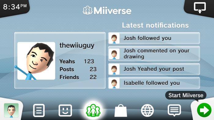
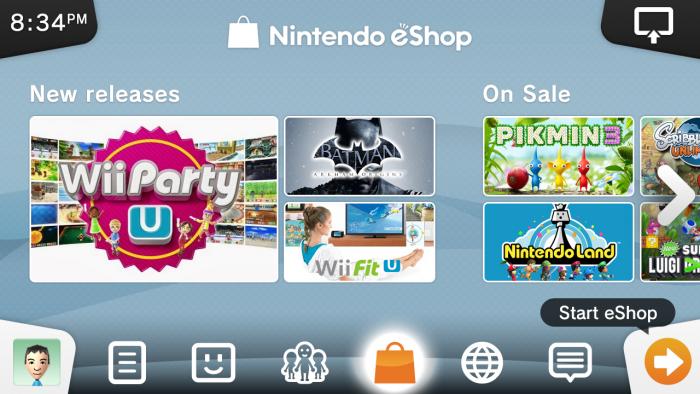
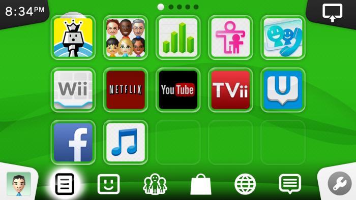
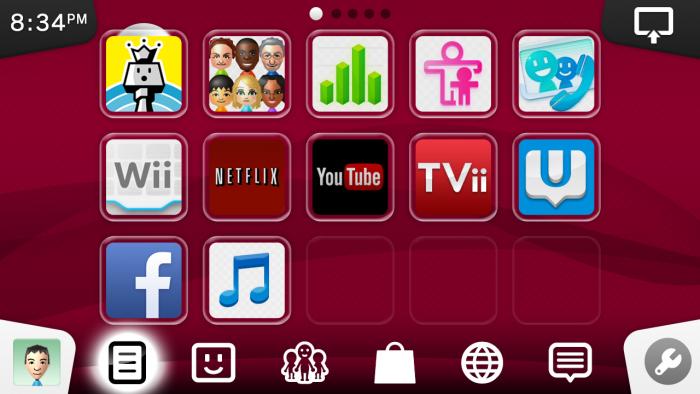
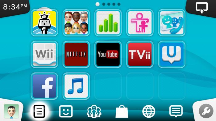
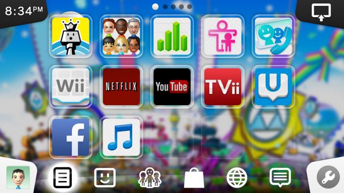
Here's version 2 of my previous concept!
I toned down the colours and redid the entire layout.
There isn't a definite art style on my concept.. It uses a combination of the glass style from the Wii U OS and flat design.
The background is inspired by the floating waves background in Mii Maker which is animated as well.
Soo.. yeah.
Update: One more thing.. It looks absolutely beautiful on the GamePad! Check it out for yourself!
Attached Thumbnails
Edited by Kiki Neko-Chan, 02 November 2013 - 06:49 PM.
- Abcdude, Arkhandar, Robotic Sunshine Commander and 4 others like this
Add Mii on miiverse:
thewiiuguy
^ dayum what a creative name
#69
grahamf
-

- Members
-

- 2,532 posts
The Happiness Fairy
Posted 02 November 2013 - 07:42 PM
I love that style and would be happy to have that on my Wii U. But the colors are pretty toned down, which is fine but seems to remind me of the PS3? But at this point it's just me nitpicking. I haven't been contributing at all though.
Edited by grahamf, 02 November 2013 - 07:44 PM.
$̵̵͙͎̹̝̙̼̻̱͖̲̖̜̩̫̩̼̥͓̳̒̀ͨ̌̅ͮ̇̓ͮ̈͌̓̔̐͆ͩ̋͆ͣ́&̾̋͗̏̌̓̍ͥ̉ͧͣͪ̃̓̇̑҉͎̬͞^̸̠̬̙̹̰̬̗̲͈͈̼̯̞̻͎ͭ̐ͦ̋́̆̔̏̽͢$̻̜͕̜̠͔̮͐ͬ̍ͨͩͤͫ͐ͧ̔̆͘͝͞^̄̋̄͗̐ͯͮͨͣ͐͂͑̽ͩ͒̈̚͏̷͏̗͈̣̪͙̳̰͉͉̯̲̘̮̣̘͟ͅ&̐ͪͬ̑̂̀̓͛̈́͌҉҉̶̕͝*̗̩͚͍͇͔̻̬̼̖͖͈͍̝̻̪͙̳̯̌̅̆̌ͥ̊͗͆́̍ͨ̎̊̌͟͡$̶̛̛̙̝̥̳̥̣̥̞̝̱̺͍̭̹̞͔̠̰͇ͪ͋͛̍̊̋͒̓̿ͩͪ̓̓͘^̈ͥͩͭ͆͌ͣ̀̿͌ͫ̈́̍ͨ̇̾̚͏̢̗̼̻̲̱͇͙̝͉͝ͅ$̢̨̪̝̗̰͖̠̜̳̭̀ͥͭͨ̋ͪ̍̈ͮͣ̌^ͦ̏ͬ̋͑̿́ͮ̿ͨ̋̌ͪ̓̋̇͆͟҉̗͍$̛̪̞̤͉̬͙̦̋ͣͬ̒͗̀̍͗̾̽̓̉͌̔͂̇͒̚̕͜^̧͎̖̟̮͚̞̜̮̘͕̹͚̏ͩ͐ͯ͑̍̍̀͒͘*̿ͨ̽̈́͐ͭ̌̈͋̚͟͝҉͕̙*̨̢̭̭̤̺̦̩̫̲͇͕̼̝̯̇ͨ͗̓̃͂ͩ͆͂̅̀̀́̚̚͟%̨͚̙̮̣̭͖͕͙ͣ̽ͮͤ́ͫ̊̊̐̄̌ͣ͌̉̔͊̽̾ͨ^̢̹̭͍̬̖͇̝̝̬̱͈͔̹͉̫̿͛̄̿͊͆ͦ̃ͮͩ͌ͭ̔ͫ̆͞ͅͅ%̵̼̖̻̘ͪͤ̈̃̓̐̑ͩͭ̄̑͊ͫ̆̌̄͡*̴̮̪͕̗̩͇͇ͪ̑̊̈́́̀͞^̼̝̥̦͇̺̘̤̦͕̦̞͑̑ͯ̂ͯ̕͞%ͮͫ̿ͫ̊̈̔̍҉҉̴̸̡*̛̭̖͇͚̝̤̬̰̅̎ͥͯ̓͑̾ͬͨͮ́̕͝^̧̽͋̈ͤͮ̈́́̍ͧ̊҉͇̙̣̯̀́%̴̡̛̘͚͈̗̖̮̫̏̆ͦ̽̔̈̽͒͛̈
#70
Kiki Neko-Chan
-
- Members
-
- 399 posts
Bullet Bill
-
- Fandom:
- Wii/U, The Sims
Posted 02 November 2013 - 08:14 PM
I love that style and would be happy to have that on my Wii U. But the colors are pretty toned down, which is fine but seems to remind me of the PS3? But at this point it's just me nitpicking. I haven't been contributing at all though.
The background colour is fully customizable and can even be have an image of the game that is inserted in the console. But yeah, i see how it's looking like XMB... is that good or bad?
- Abcdude, KeptMyWiiUAndLeftTheForums and Nintyfan like this
Add Mii on miiverse:
thewiiuguy
^ dayum what a creative name
#71
grahamf
-
- Members
-
- 2,532 posts
The Happiness Fairy
Posted 02 November 2013 - 10:15 PM
I wouldn't say that the resemblance is bad... XMB is pretty nice. The GameCube and Wii had a bit more subdued theme also.
$̵̵͙͎̹̝̙̼̻̱͖̲̖̜̩̫̩̼̥͓̳̒̀ͨ̌̅ͮ̇̓ͮ̈͌̓̔̐͆ͩ̋͆ͣ́&̾̋͗̏̌̓̍ͥ̉ͧͣͪ̃̓̇̑҉͎̬͞^̸̠̬̙̹̰̬̗̲͈͈̼̯̞̻͎ͭ̐ͦ̋́̆̔̏̽͢$̻̜͕̜̠͔̮͐ͬ̍ͨͩͤͫ͐ͧ̔̆͘͝͞^̄̋̄͗̐ͯͮͨͣ͐͂͑̽ͩ͒̈̚͏̷͏̗͈̣̪͙̳̰͉͉̯̲̘̮̣̘͟ͅ&̐ͪͬ̑̂̀̓͛̈́͌҉҉̶̕͝*̗̩͚͍͇͔̻̬̼̖͖͈͍̝̻̪͙̳̯̌̅̆̌ͥ̊͗͆́̍ͨ̎̊̌͟͡$̶̛̛̙̝̥̳̥̣̥̞̝̱̺͍̭̹̞͔̠̰͇ͪ͋͛̍̊̋͒̓̿ͩͪ̓̓͘^̈ͥͩͭ͆͌ͣ̀̿͌ͫ̈́̍ͨ̇̾̚͏̢̗̼̻̲̱͇͙̝͉͝ͅ$̢̨̪̝̗̰͖̠̜̳̭̀ͥͭͨ̋ͪ̍̈ͮͣ̌^ͦ̏ͬ̋͑̿́ͮ̿ͨ̋̌ͪ̓̋̇͆͟҉̗͍$̛̪̞̤͉̬͙̦̋ͣͬ̒͗̀̍͗̾̽̓̉͌̔͂̇͒̚̕͜^̧͎̖̟̮͚̞̜̮̘͕̹͚̏ͩ͐ͯ͑̍̍̀͒͘*̿ͨ̽̈́͐ͭ̌̈͋̚͟͝҉͕̙*̨̢̭̭̤̺̦̩̫̲͇͕̼̝̯̇ͨ͗̓̃͂ͩ͆͂̅̀̀́̚̚͟%̨͚̙̮̣̭͖͕͙ͣ̽ͮͤ́ͫ̊̊̐̄̌ͣ͌̉̔͊̽̾ͨ^̢̹̭͍̬̖͇̝̝̬̱͈͔̹͉̫̿͛̄̿͊͆ͦ̃ͮͩ͌ͭ̔ͫ̆͞ͅͅ%̵̼̖̻̘ͪͤ̈̃̓̐̑ͩͭ̄̑͊ͫ̆̌̄͡*̴̮̪͕̗̩͇͇ͪ̑̊̈́́̀͞^̼̝̥̦͇̺̘̤̦͕̦̞͑̑ͯ̂ͯ̕͞%ͮͫ̿ͫ̊̈̔̍҉҉̴̸̡*̛̭̖͇͚̝̤̬̰̅̎ͥͯ̓͑̾ͬͨͮ́̕͝^̧̽͋̈ͤͮ̈́́̍ͧ̊҉͇̙̣̯̀́%̴̡̛̘͚͈̗̖̮̫̏̆ͦ̽̔̈̽͒͛̈
#72
MatrixChicken
-
- Members
-

- 869 posts
Knock knock, Scootaloo...
- NNID:MatrixChicken
-
- Fandom:
- MLP:FiM, Mario, Star Wars... And more...
Posted 02 November 2013 - 11:01 PM
Mmmmmm, lovely. You've done it once again, Keanu. Also, is that "U" icon a web shortcut for this site? Those would be nice.
- Kiki Neko-Chan likes this
Deviantart: MatrixChicken | Youtube: ThunderFilmStudios | Twitter: @JohnAlBerge
Twitch.tv: ThunderFilms | Soundcloud: ScootriX
#73
Kiki Neko-Chan
-
- Members
-
- 399 posts
Bullet Bill
-
- Fandom:
- Wii/U, The Sims
Posted 03 November 2013 - 06:12 AM
Mmmmmm, lovely. You've done it once again, Keanu. Also, is that "U" icon a web shortcut for this site? Those would be nice.
Haha, it could be.
It's just a fake filler app that I added in to make the screen look more populated.
Add Mii on miiverse:
thewiiuguy
^ dayum what a creative name
#74
KeptMyWiiUAndLeftTheForums
-
- Members
-
- 2,337 posts
Lakitu
- NNID:xWydrAx
-
- Fandom:
- Smash Bros all day.
Posted 03 November 2013 - 01:44 PM
Here's version 2 of my previous concept!
I toned down the colours and redid the entire layout.
There isn't a definite art style on my concept.. It uses a combination of the glass style from the Wii U OS and flat design.
The background is inspired by the floating waves background in Mii Maker which is animated as well.
Soo.. yeah.
Update: One more thing.. It looks absolutely beautiful on the GamePad! Check it out for yourself!
It's... it's beautiful :')
Definitely my favouite design so far. I would be delighted if this was the official OS. I could only give one (very) minor complaint, which is that the tabs in the top corners and the selected bottom tabs are black, which just feels to PS3 to me (Maybe 60 - 70% gray would be better?). But yeah, like I said, that would be my only complaint
Edited by xWydrAx, 03 November 2013 - 01:46 PM.
WAR IS PEACE
FREEDOM IS SLAVERY
IGNORANCE IS STRENGTH
LISTEN AND BELIEVE


0 user(s) are reading this topic
0 members, 0 guests, 0 anonymous users

