


16 replies to this topic
#1

Foot
-
- Members
-

- 1,038 posts
The most badass sociopath to ever exist.
- NNID:DPapcinEVO
-
- Fandom:
- Sock Wars, Shoehorn Leghorn
Posted 15 August 2012 - 11:55 AM
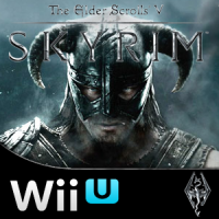
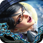
Not sure if its worthy of a topic, but it looks EXTREMELY cool to me
I am the foot. I do not like you. You smother me with socks and shoes, then step on me thousands of times a day.
We foot will rebel one day.
We foot will rebel one day.
#2
Colinx
-

- Members
-
- 1,301 posts
Pokey
-
- Fandom:
- Animal Crossing & SeaWorld
Posted 15 August 2012 - 11:55 AM
Looks cool! 

#3
Expansion Pak
-

- Members
-

- 821 posts
Enlightened Fanboy
- NNID:Koopamann14
-
- Fandom:
- Pokemon the Series: XY and PS4
Posted 15 August 2012 - 11:56 AM
Looks good.
I shower you with coconut cream pies.

#5
jono
-
- Members
-

- 552 posts
Boo
Posted 15 August 2012 - 12:25 PM
Awesome boxart! Here's the Gamescom trailer for those who missed it:
#7
KgGamesXL
-
- Members
-

- 107 posts
Cheep-Cheep
Posted 15 August 2012 - 12:33 PM
Hmm looks nicer than i thought it would.
#8
Soul
-

- Members
-

- 3,660 posts
TYBG
-
- Fandom:
- I ENJOY HIP HOP BEATS
Posted 15 August 2012 - 12:34 PM
I like this shade of blue better than the last one.
#9
Mignaga
-

- Members
-

- 1,504 posts
JOO TAKE MAH EMMERROWDS?!
-
- Fandom:
- Zero Escape Metroid Madoka
Posted 15 August 2012 - 12:59 PM
Awesome! Looks like it will be cool to have up on my shelf.

Be wary, the suck is coming.
#10
Socalmuscle
-

- Members
-
- 1,677 posts
Hammer Bro.
Posted 15 August 2012 - 01:29 PM
It is, as they say,
"teh swoopy"
"teh swoopy"


#12
Fully87
-
- Members
-

- 41 posts
Green Koopa Troopa
-
- Fandom:
- Dark Souls, Deus Ex, Half-Life
Posted 16 August 2012 - 07:34 AM
The Nintendo Network sign is missing which is a big dissapointment, This would be a day 1 purchase if it has online.

#14
uPadWatcher2
-
- Members
-

- 457 posts
Dry Bones
-
- Fandom:
- Mario, StarFox, Kid Icarus, SSB
Posted 16 August 2012 - 10:59 AM
Looks good! But the Yellow could have been silver instead. Yellow was an ugly choice by Nintendo.
Don't say that! You're gonna upset non-specific action figure!!!!

"Let's dance, boys!"
- Bayonetta
#15
CUD
-

- Members
-
- 1,337 posts
Super Saiyan Dingus
- NNID:CUDesu
-
- Fandom:
- Gaben
Posted 18 August 2012 - 12:04 AM
Agreed to the max. The yellow looks horrible.Looks good! But the Yellow could have been silver instead. Yellow was an ugly choice by Nintendo.
- Dragon likes this
This statement is false. The previous statement is true.
RIP in peace Nintendo.

#16
dkrumble725
-
- Members
-

- 83 posts
Spear Guy
-
- Fandom:
- Chrono Trigger, SMT, DKC, and alot more.
Posted 18 August 2012 - 10:45 AM
In this case, the yellow looks OK to me, because there is yellow in the artwork. Whenever there is a game without yellow in it's artwork, it will look ugly as hell.
I SHALL PASS WITH RAMBI
#17
WisdomPowerCourage
-

- Members
-

- 615 posts
ZEWOP BOOPITY BOP!
-
- Fandom:
- Cats Pajamas.
Posted 18 August 2012 - 11:14 AM
Looks good! But the Yellow could have been silver instead. Yellow was an ugly choice by Nintendo.
Agreed to the max. The yellow looks horrible.
Actually when you look at the yellow next to one that has a white stripe or a black one, the yellow to me looked way better.


Also tagged with one or more of these keywords: Wii U Games, Box Art
Gaming →
Wii U Games and Software →
Donkey Kong Country: Tropical Freeze box art revealed!Started by Hunter, 28 Aug 2013 |
|

|
||
 |
Gaming →
Introduction Central →
Assassin's Creed 3Started by Smertrius , 02 Mar 2013 |
|

|
|
Gaming →
Wii U Games and Software →
What GCN games should be remastered next?Started by BlueBlur, 28 Jan 2013 |
|
|
||
Gaming →
Wii U Games and Software →
Universal Network ID on Nintendo DevicesStarted by currysonic, 13 Jan 2013 |
|

|
||
Gaming →
Wii U Games and Software →
Wii U Demos: UpdatedStarted by smbeats, 10 Jan 2013 |
|

|
0 user(s) are reading this topic
0 members, 0 guests, 0 anonymous users

