

It actually goes really well with their new Windows 8 interface design.I personally don't think it matches the products that they are trying to sell. It would be like Nintendo changing their logo to a naked woman with a snake crawling across her. Well maybe not that extreme but you get the point. It is too boring, and doesn't jump out at you.

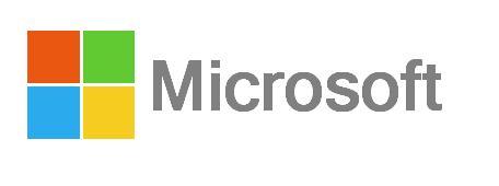
Microsoft changes their logo after 25 years
Started by Kiki Neko-Chan, Aug 23 2012 06:43 AM
Microsoft Windows Xbox Bing Office New logo count goopz a lot
58 replies to this topic
#41

CUD
-

- Members
-

- 1,337 posts
Super Saiyan Dingus
- NNID:CUDesu
-
- Fandom:
- Gaben
Posted 26 August 2012 - 06:44 AM
- Kiki Neko-Chan likes this
This statement is false. The previous statement is true.
RIP in peace Nintendo.

#42
Mignaga
-

- Members
-

- 1,504 posts
JOO TAKE MAH EMMERROWDS?!
-
- Fandom:
- Zero Escape Metroid Madoka
Posted 26 August 2012 - 09:56 AM
Microsoft products should be exciting. This logo is not.It actually goes really well with their new Windows 8 interface design.

Be wary, the suck is coming.
#43
CUD
-
- Members
-
- 1,337 posts
Super Saiyan Dingus
- NNID:CUDesu
-
- Fandom:
- Gaben
Posted 26 August 2012 - 03:09 PM
They should be exciting? What are you talking about? The Nintendo logo isn't anything special.Microsoft products should be exciting. This logo is not.
This statement is false. The previous statement is true.
RIP in peace Nintendo.
#44
Mignaga
-
- Members
-
- 1,504 posts
JOO TAKE MAH EMMERROWDS?!
-
- Fandom:
- Zero Escape Metroid Madoka
Posted 26 August 2012 - 03:38 PM
With stuff like the Xbox they want to portray that their piece of equipment is more exciting than their competitions. This logo does not indicate this what so ever. As for Nintendo's logo, I have never said it is good, and never will. It is dull, and isn't memorable at all.They should be exciting? What are you talking about? The Nintendo logo isn't anything special.
Be wary, the suck is coming.
#45
CUD
-
- Members
-
- 1,337 posts
Super Saiyan Dingus
- NNID:CUDesu
-
- Fandom:
- Gaben
Posted 26 August 2012 - 03:57 PM
Excitement isn't something that they're going for with their logo, this isn't just a logo for a games company but a company that covers a lot more. They chose something that is simple, matches the style of their Windows 8 UI and represents what their company offers; it is overall a well designed logo.With stuff like the Xbox they want to portray that their piece of equipment is more exciting than their competitions. This logo does not indicate this what so ever. As for Nintendo's logo, I have never said it is good, and never will. It is dull, and isn't memorable at all.
- Kiki Neko-Chan likes this
This statement is false. The previous statement is true.
RIP in peace Nintendo.
#46
Mignaga
-
- Members
-
- 1,504 posts
JOO TAKE MAH EMMERROWDS?!
-
- Fandom:
- Zero Escape Metroid Madoka
Posted 26 August 2012 - 04:09 PM
Ok. Whatever. It is a personal preference kind of thing. You like it because it matches their (what looks to be) train wreck of a new OS, and I feel that it is wrong for them.Excitement isn't something that they're going for with their logo, this isn't just a logo for a games company but a company that covers a lot more. They chose something that is simple, matches the style of their Windows 8 UI and represents what their company offers; it is overall a well designed logo.
Be wary, the suck is coming.
#47
CUD
-
- Members
-
- 1,337 posts
Super Saiyan Dingus
- NNID:CUDesu
-
- Fandom:
- Gaben
Posted 26 August 2012 - 04:18 PM
I don't see it as about preference really, you feel it is wrong for them because it isn't exciting when that's not something it should be. I don't like the look of what they're doing with Windows 8 either but that doesn't change the fact that this logo suits its design.Ok. Whatever. It is a personal preference kind of thing. You like it because it matches their (what looks to be) train wreck of a new OS, and I feel that it is wrong for them.
This statement is false. The previous statement is true.
RIP in peace Nintendo.
#48
Auzzie Wingman
-

- Members
-

- 4,346 posts
Mournblade
- NNID:AuzzieWingman
-
- Fandom:
- Not enough space here
Posted 26 August 2012 - 05:00 PM
Logos are creative, identifiable labels for things. They can be made exciting, but that is not their main purpose. It's there to show who owns what.
Basically, logos aren't made for selling.
Basically, logos aren't made for selling.
Trophy Cards are classy too! LOLZIGZAGOON

#49
Hamez
-

- Members
-

- 187 posts
Blooper
- NNID:PrinceLuna
-
- Fandom:
- 007, Team Fortress 2, Zelda, Ponies
Posted 26 August 2012 - 06:01 PM
I disagree. Logos can sometimes be the first thing people see in a company. For a company that may not be as widely known as Microsoft, a logo could be very important as it gives people a first impression on the company, maybe even determining whether or not someone buys from it. Microsoft could get away with it, because almost everyone already knows what Microsoft is and what they sell, but in general logos are important.
- Kiki Neko-Chan likes this

#50
Auzzie Wingman
-
- Members
-
- 4,346 posts
Mournblade
- NNID:AuzzieWingman
-
- Fandom:
- Not enough space here
Posted 26 August 2012 - 10:35 PM
No, I'm saying logos aren't made for the purpose of appeal. They are labels designed to represent that this company and/or product is different from all the rest. In other words, a unique identifier.
When have you ever seen a logo that screams "I must buy all their products". Sure, I might love all the games Level-5 makes, but in no way does the design of their logo help me make that choice. Their logo could be in Times New Roman Size 12 for all I care, I'd still buy it.
Of course, if everyone was to have Times New Roman Size 12, then you might as well say it's all owned by the one, rather boring company. This is why logos are made to be colourful and whatnot. It's not to attract customers; it's to split them from the competition.
- CUD likes this
Trophy Cards are classy too! LOLZIGZAGOON
#51
Noonabites
-

- Members
-

- 813 posts
Piranha Plant
Posted 04 September 2012 - 10:59 PM
I'm such a fan of simplistic logos.. and though I do prefer this over their older logo, I can't help but feel as if this looks like something made in Microsoft Office D:
- Kiki Neko-Chan likes this
#52
Hamez
-
- Members
-
- 187 posts
Blooper
- NNID:PrinceLuna
-
- Fandom:
- 007, Team Fortress 2, Zelda, Ponies
Posted 05 September 2012 - 02:51 PM
Here's a replication I made in Paint from scratch. It took about 7 minutes.
I could use Publisher or Word and I could have made it more accurate with the character spacing and soft edges on the squares, but close enough.
I could use Publisher or Word and I could have made it more accurate with the character spacing and soft edges on the squares, but close enough.
Edited by Hamez, 06 September 2012 - 07:21 PM.
- Noonabites likes this
#53
Noonabites
-
- Members
-
- 813 posts
Piranha Plant
Posted 06 September 2012 - 01:04 AM
Here's a replication I made in Paint from scratch. It took about 7 minutes.
Oh you. Though this does prove my point of it looking like it was made on a Microsoft home software..
#54
Kiki Neko-Chan
-
- Members
-

- 399 posts
Bullet Bill
-
- Fandom:
- Wii/U, The Sims
Posted 06 September 2012 - 03:37 PM
Here's a replication I made in Paint from scratch. It took about 7 minutes.
Although I'm not on the "I hate the new logo" bandwagon, I admit I recreated the logo in 1 and a half minutes.
Add Mii on miiverse:
thewiiuguy
^ dayum what a creative name
#55
Nintendustin
-

- Members
-

- 483 posts
Dry Bones
-
- Fandom:
- Nintendo
#56
Noonabites
-
- Members
-
- 813 posts
Piranha Plant
Posted 10 September 2012 - 11:11 PM
I really like it. Simple is better.
At least I'm not the only one who thinks this way about their new logo.
#57
Usman Mohammad
-

- Members
-
- 350 posts
Bullet Bill
Posted 12 September 2012 - 01:27 AM
People who hate the new logo find it ugly, will seriously not like the Metro typography and Metro UI in Windows 8
- Noonabites likes this
#58
Noonabites
-
- Members
-
- 813 posts
Piranha Plant
Posted 12 September 2012 - 11:13 PM
People who hate the new logo find it ugly, will seriously not like the Metro typography and Metro UI in Windows 8
I was thinking this. The logo is a great representation of the presentation of the next Windows to launch... I hate to see what's said about that.
#59
Hamez
-
- Members
-
- 187 posts
Blooper
- NNID:PrinceLuna
-
- Fandom:
- 007, Team Fortress 2, Zelda, Ponies
Posted 13 September 2012 - 08:17 PM
This logo is actually more complex than what it was before.I really like it. Simple is better.

It would look really ugly when stamping it on hardware products, such as this mouse and keyboard that I'm using. It's not as sleek as the old one, and sleek is what most technology products are looking like now.

Edited by Hamez, 13 September 2012 - 08:18 PM.


Also tagged with one or more of these keywords: Microsoft, Windows, Xbox, Bing, Office, New logo, count goopz a lot
Gaming →
E3 2015 →
E3 Best (and worst) moments so far.Started by BanjoKazooie, 16 Jun 2015 |
|

|
||
Non-Gaming →
Roleplay and Forum Games →
What a Xbox Portable Would Look Like.Started by Gruff, 16 Jul 2014 |
|
|
||
Gaming →
General Gaming →
Bravely Default Dev. NexGen Tech DemoStarted by LinkKennedy, 08 Apr 2014 |
|

|
||
Gaming →
General Gaming →
Official Gaming Deals ThreadStarted by Hank Hill, 20 Mar 2014 |
|

|
||
Gaming →
General Gaming →
IGN dislikes Nintendo?Started by twohits, 18 Mar 2014 |
|

|
0 user(s) are reading this topic
0 members, 0 guests, 0 anonymous users

