Posted 25 March 2013 - 02:13 PM
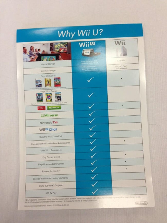
That features comparison chart is a prime example of what is wrong with Nintendos treatment of the Wii U.
They've done so many things right with this console:
1) they built a next gen-worthy piece of hardware designed to thrill.
2) they've innovated yet again with the gamepad.
3) they've built truly amazing software services into the system.
4) theyve sold at a loss to guarantee value.
Basically, the Wii U is Nintendo breaking out of their comfort zone and going after the console king prize once again.
THEN...
They pull this crap.
They spend all this money into making the wii u into a very capable machine that is very clearly the start of the next generation. Then they even make it look cool. The gamepad itself is actually a nice centerpiece for any room there is a tv.
But LOOK at that chart.
Does it scream "you MUST have the Wii U!?"
No. It looks like a list of chores handed out to residents of an insane asylum.
Or a list of shift changes at your local drab police station.
I don't know who is doing nintendos wii u marketing now, but they need to move on to a different firm, pronto.
The few commercials that have been out... Suck.
The ad style for wii u in print and on the web... Sucks.
If ever there was a system screaming out how awesome it is, only to have its proclamations drowned out by the droning buzz of corporate over thinking, it's the Wii U.
This is the system Nintendo fans have been waiting for.
And it gets... The asylum visiting hours treatment...
Not only that, but Nintendo comparing wii u to the wii not only INTRODUCES confusion (it doesn't clear it up. It creates it) between the wii u and the wii, but it shows nintendos ineptitude in revealing how easily the wii u blows away the only two other consoles that are competing right now.
Even the wii u box graphics. Suckage.
The angle of the wii u picture and slight reflection are great. But the rest of the theme. Looks like police pants.
With the wii, Nintendo nailed the marketing, the box graphics, everything for its time.
That helped sell it as much as anything.
For the wii u... They are actually hurting the system with this crappy marketing.
Hopefully they change the whole deal after e3.
Oh. And don't even get me started on the crappy Nintendo direct logo that looks like a 10 year old did it in Mario Paint on the SNES.
Ok. Rant over.
Just continue to be shocked at seeing such a winner of a console married to the worst marketing scheme in recent memory.
