

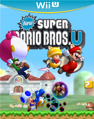
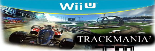
I NEED CONSTRUCTIVE CRITISISM

My First Custom Box Art c:
Started by
unleashedknight
, Aug 30 2012 06:45 AM
4 replies to this topic
#1

unleashedknight
-

- Banned
-

- 273 posts
Bob-omb
Posted 30 August 2012 - 06:45 AM
Tell me if its bad
I NEED CONSTRUCTIVE CRITISISM
I NEED CONSTRUCTIVE CRITISISM
#2
BanjoKazooie
-
- Members
-

- 1,258 posts
Witch Slayer
-
- Fandom:
- LOZ, Mario, Elder Scrolls
Posted 30 August 2012 - 06:56 AM
You need to add tilt then make a side to make it more 3 demensional. But the cover art looks nice, it just looks like a poster not a box.
I was once known here as KillerMario, but since I really like Banjo-Kazooie, I changed my display name to show them my respect 
#3
Stephen
-
- Members
-
- 290 posts
Bob-omb
-
- Fandom:
- mario, mariokart, minecraft
Posted 30 August 2012 - 07:03 AM
I like the design allot, it shows you the new features of the game which is good, and it isn't too crowded. Also the colour scheme is good too.
The one thing I will say is that the New super Mario U logo needs to be in front of the baby Yoshi, so that you can see all the writing.
Also if you want to create the whole box I found a good template to use
http://th02.devianta...ard-d5a8bcj.png
The one thing I will say is that the New super Mario U logo needs to be in front of the baby Yoshi, so that you can see all the writing.
Also if you want to create the whole box I found a good template to use
http://th02.devianta...ard-d5a8bcj.png
Edited by stephen, 30 August 2012 - 07:04 AM.
PM me if you want to add me on 3ds
#4
Alph
-
- Members
-
- 1,246 posts
Koppai's Best
Posted 30 August 2012 - 07:14 AM
I like it, try to put Luigi and the Pink Yoshi a bit lower down because you can't see a bit of the writing and make the insides of the bubbles (the black bit) transparent. Other than that it's really good!
Hi, my name is Alph. I live on a planet named Koppai. I am famous for saving my planet from starvation. My best friends are Brittany and Captain Olimar, NOT Captain Charlie. I like surfing the KopNet and playing Kopetball.
#5
Mignaga
-

- Members
-

- 1,504 posts
JOO TAKE MAH EMMERROWDS?!
-
- Fandom:
- Zero Escape Metroid Madoka
Posted 30 August 2012 - 11:58 AM
Place the images on the cover in better places. It looks like you just kinda threw them on there. Aside from that it looks good.

Be wary, the suck is coming.


1 user(s) are reading this topic
0 members, 1 guests, 0 anonymous users

