My Wii U Menu Concept
#1
Posted 09 July 2011 - 11:18 AM
I'm new to this forum so for my first post I decided to create a menu concept for the Wii U.
The style of the menu is similar to the Wii one, but has many differences in colour and organization.
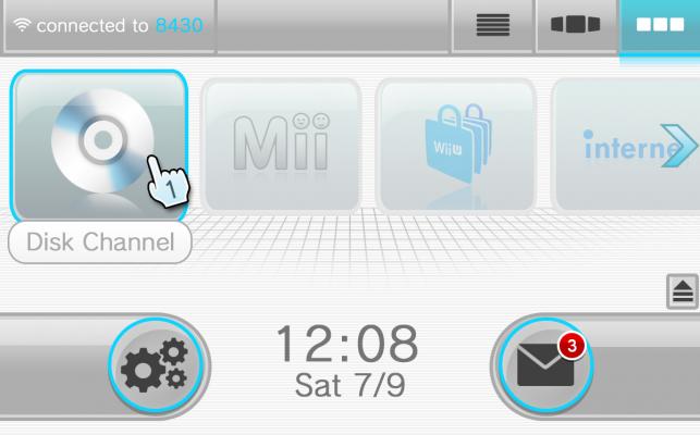
The icons on the top of the menu allow the user to view the list of channels in different ways.
The message icon with the red notification count shows the user all of the notifications like Friend requests, messages and more.
The gears icon is the settings menu which allows the user to personalize as well as change specific settings.
The "connected to _____" button shows the user what connection (wi-fi) the system is connected to and shows other connections.
I would appreciate it if you could make some suggestions and comments on this
Thank you!!!
- Feld0 likes this
Add Mii on miiverse:
thewiiuguy
^ dayum what a creative name
#2
Posted 09 July 2011 - 11:35 AM
- Kiki Neko-Chan likes this
#3
Posted 09 July 2011 - 11:55 AM
Add Mii on miiverse:
thewiiuguy
^ dayum what a creative name
#4
Posted 12 July 2011 - 05:34 AM
- Kiki Neko-Chan likes this
#5
Posted 12 July 2011 - 06:07 AM
-
Edited by BassDropper, 05 September 2013 - 01:33 AM.
- Kiki Neko-Chan likes this
#6
Posted 12 July 2011 - 06:49 PM
Add Mii on miiverse:
thewiiuguy
^ dayum what a creative name
#7
Posted 12 July 2011 - 08:19 PM
#8
Posted 16 July 2011 - 02:15 AM
#10
Posted 21 July 2011 - 04:27 PM
#11
Posted 21 July 2011 - 05:41 PM
Oh yeah I remember that vid xDHey, speaking of which, did anyone watch this a while back.
It was awesome, I hope Nintendo does something similar to that.
#12
Posted 19 April 2012 - 02:34 AM
#13
Posted 24 April 2012 - 01:20 PM
1 user(s) are reading this topic
0 members, 1 guests, 0 anonymous users