Jump to content


Photo

Wii U menu

u menu wii

  • Please log in to reply
111 replies to this topic

#101 uPadWatcher2

uPadWatcher2

    Dry Bones

  • Members
  • 457 posts
  • Fandom:
    Mario, StarFox, Kid Icarus, SSB

Posted 29 May 2012 - 09:49 AM

Right now I'm working on an amazing new Wii U OS mockup. I'll post it when it's done (:


Look forward to your concept.

Edited by uPadWatcher2, 29 May 2012 - 02:31 PM.

Bayonetta2banner102414.png


"Let's dance, boys!"

- Bayonetta


#102 Nintendaniel

Nintendaniel

    Goomba

  • Members
  • 5 posts

Posted 29 May 2012 - 11:14 AM

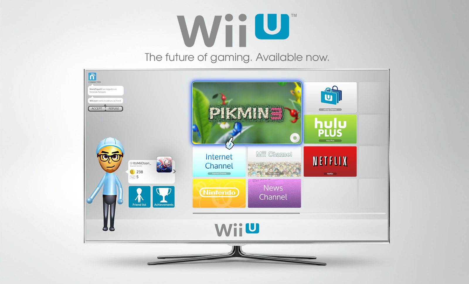
Here it is:

Posted Image

Features:

- Nintendo Network Sidebar - you see whether you are connected to NN, your notifications pop out, you see your digital 'gamer card'/stats, and your Mii will make cool movements: for example when you get break a record it'll happily jump in the air.
- You have your big game artwork as main 'channel'. Around this game/disk-channel you have your other channels. They scroll to the right when your Wii pointer touches the border of the screen, so you do not have to bush buttons to scroll.

Btw, this mockup wasn't yet fully ready, I kind of rushed it :$
When I have time I will do finishing touch.

Hope you like the mockup ;)

#103 neverwinteru

neverwinteru

    Pokey

  • Members
  • 1,159 posts

Posted 29 May 2012 - 11:40 AM

Here it is:

Posted Image

Features:

- Nintendo Network Sidebar - you see whether you are connected to NN, your notifications pop out, you see your digital 'gamer card'/stats, and your Mii will make cool movements: for example when you get break a record it'll happily jump in the air.
- You have your big game artwork as main 'channel'. Around this game/disk-channel you have your other channels. They scroll to the right when your Wii pointer touches the border of the screen, so you do not have to bush buttons to scroll.

Btw, this mockup wasn't yet fully ready, I kind of rushed it :$
When I have time I will do finishing touch.

Hope you like the mockup ;)


very clean and slick i like it

#104 uPadWatcher2

uPadWatcher2

    Dry Bones

  • Members
  • 457 posts
  • Fandom:
    Mario, StarFox, Kid Icarus, SSB

Posted 29 May 2012 - 02:32 PM

Here it is:

Posted Image

Features:

- Nintendo Network Sidebar - you see whether you are connected to NN, your notifications pop out, you see your digital 'gamer card'/stats, and your Mii will make cool movements: for example when you get break a record it'll happily jump in the air.
- You have your big game artwork as main 'channel'. Around this game/disk-channel you have your other channels. They scroll to the right when your Wii pointer touches the border of the screen, so you do not have to bush buttons to scroll.

Btw, this mockup wasn't yet fully ready, I kind of rushed it :$
When I have time I will do finishing touch.

Hope you like the mockup ;)


Nice job on the mock up. Looks to me more like a promo. In other words-- WIN!!!!!!!!

Bayonetta2banner102414.png


"Let's dance, boys!"

- Bayonetta


#105 uh20

uh20

    Thwomp

  • Members
  • 340 posts
  • Fandom:
    i HATE m$windows

Posted 29 May 2012 - 09:00 PM

the gamer-tag thing looks like microsofts version of club nintendo
:laugh:

#106 tangweihua

tangweihua

    Spiked Goomba

  • Members
  • 14 posts

Posted 31 May 2012 - 11:25 PM

a bit like Ihone4S

#107 Keviin

Keviin

    Lakitu

  • Members
  • 2,270 posts
  • Fandom:
    Zelda, Mario, Metroid, Resident Evil

Posted 31 May 2012 - 11:43 PM

Here it is:

Posted Image

Features:

- Nintendo Network Sidebar - you see whether you are connected to NN, your notifications pop out, you see your digital 'gamer card'/stats, and your Mii will make cool movements: for example when you get break a record it'll happily jump in the air.
- You have your big game artwork as main 'channel'. Around this game/disk-channel you have your other channels. They scroll to the right when your Wii pointer touches the border of the screen, so you do not have to bush buttons to scroll.

Btw, this mockup wasn't yet fully ready, I kind of rushed it :$
When I have time I will do finishing touch.

Hope you like the mockup ;)


Good but a bit empty on the left..
No sig.

#108 neverwinteru

neverwinteru

    Pokey

  • Members
  • 1,159 posts

Posted 31 May 2012 - 11:46 PM

Good but a bit empty on the left..


Yea now that im looking at it i notice it too, it would be awesome if there was like a mini friend activity feed so you could see what's happening with everybody.

Edited by Misterrrrrr ECHO3!, 31 May 2012 - 11:47 PM.


#109 Socalmuscle

Socalmuscle

    Hammer Bro.

  • Members
  • 1,677 posts

Posted 01 June 2012 - 12:56 AM

Great mockup.
You obviously have an eye for design and the skills to put it together.
I'd like to make two suggestions to your design approach overrall.
1) take some time and look into "weighting" of elements on a canvas, page, screen, etc.
It's one of the things you don't necessarily see, but It seperate the very talented hobbyist from the true professional. People don't notice Tess kinds of things right away, but subconsciously, they know when things are just right.
2) use the "rule of thirds" in your designs from here on out. It's used in photography, graphic design, cinematography, etc. it will solve the few issues there are with your excellent concept work. That "empty space on the left" will never show itself again.
You can have a future with your design skills. Just look into these two areas to take it to the next level.
You seem to understand the need for negative space, or "white space" just use that in conjunction with the two practices outlined above. Very nice work.
I was shocked to see the quality of it. Good job! And thank you for sharing it.

#110 Keviin

Keviin

    Lakitu

  • Members
  • 2,270 posts
  • Fandom:
    Zelda, Mario, Metroid, Resident Evil

Posted 01 June 2012 - 04:57 AM

Yea now that im looking at it i notice it too, it would be awesome if there was like a mini friend activity feed so you could see what's happening with everybody.

Yup, something like that. It's a nice extra, and everything is better than an empty spot.
No sig.

#111 Nintendaniel

Nintendaniel

    Goomba

  • Members
  • 5 posts

Posted 02 June 2012 - 02:54 AM

Thanks for the feedback, everybody! Today I'll try to update the mockup a bit. Stay tuned!

#112 neverwinteru

neverwinteru

    Pokey

  • Members
  • 1,159 posts

Posted 02 June 2012 - 01:09 PM

*sits down*

And now we eagerly wait his revision...........Loading..............Loading.......


1 user(s) are reading this topic

0 members, 1 guests, 0 anonymous users

Anti-Spam Bots!