Jump to content


Photo

Should Nintendo Go Back To Red Logo Branding?


  • Please log in to reply
10 replies to this topic

Poll: Should Nintendo Go Back To Red Logo Branding? (25 member(s) have cast votes)

What Should Nintendo Do?

  1. Go with Red Branding (9 votes [36.00%])

    Percentage of vote: 36.00%

  2. Stick with Current Branding (Blue and White) (8 votes [32.00%])

    Percentage of vote: 32.00%

  3. Use a Whole Different Color Scheme (8 votes [32.00%])

    Percentage of vote: 32.00%

Vote Guests cannot vote

#1 10k

10k

    Bullet Bill

  • Members
  • 392 posts
  • Fandom:
    Zelda, Metroid, Mass Effect, Mario

Posted 28 May 2012 - 03:46 AM

Sony is blue now. Microsoft was always green. Nintendo was red for most generations except for the Wii and midway through the GameCube.

To me, going red is a combination of nostalgia of the old days (bringing back some gamers who ditched Nintendo for the PS1 or Xbox) and also looking more hardcore and intense instead of white game cases (PS3 being clear cases with black and Xbox being green looks much better than the generic white cases of the Wii)

So, should Nintendo start branding their stuff Red or stick with the blue and white?
Posted Image
Posted Image
Posted Image

Red 3DS cases in Japan:Posted Image

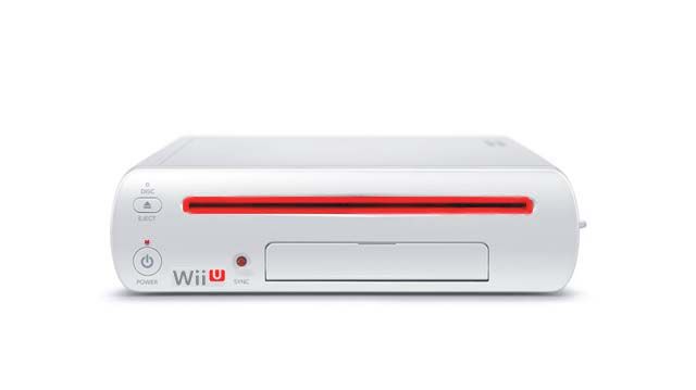
Mock Wii U case with Red theme: Posted Image

Edited by 10k, 28 May 2012 - 03:52 AM.

Posted Image
Never argue with an idiot, they drag you down to their level and then beat you with experience.

#2 Keviin

Keviin

    Lakitu

  • Members
  • 2,270 posts
  • Fandom:
    Zelda, Mario, Metroid, Resident Evil

Posted 28 May 2012 - 03:50 AM

Red is my absolute favorite color, but the red Wii U logo just doesn't feel right... Also the red LED and boxart... Nah.
No sig.

#3 Deadly Virus

Deadly Virus

    Boo

  • Members
  • 598 posts
  • Fandom:
    3D Mario, Metroid, F-Zero, Pokémon, SSB

Posted 28 May 2012 - 03:57 AM

Eh, could be cool. I'd rather they went black/blue though. Like back in the days of the Revolution. ^_^

Posted Image

Posted Image


#4 Joshua

Joshua

    The Dovahkiin

  • Members
  • 2,334 posts
  • NNID:JoshuaCM
  • Fandom:
    Anything Nintendo, Skyrim and more!

Posted 28 May 2012 - 04:16 AM

I wish it to be red again. From what I see, the standard Nintendo logo is a dull grey. :(

Posted Image

Signature by Cerberuz


#5 PipoPito

PipoPito

    Dry Bones

  • Members
  • 459 posts
  • Fandom:
    Sonic, Metroid, Pokemon, Ape Escape

Posted 28 May 2012 - 05:30 AM

Black / Blue is awesome. White is boring. Red is good, but too.... .... .... ... idk...
Old Usernames: Pipopito, Great Mighty Poo , Pit.

#6 10k

10k

    Bullet Bill

  • Members
  • 392 posts
  • Fandom:
    Zelda, Metroid, Mass Effect, Mario

Posted 28 May 2012 - 05:52 AM

I'd be good with black and blue. Just not white or grey. So damn dull and boring.
Posted Image
Never argue with an idiot, they drag you down to their level and then beat you with experience.

#7 Hank Hill

Hank Hill

    Propaniac

  • Moderators
  • 2,203 posts
  • NNID:GameCollector
  • Fandom:
    Professor Layton, inFAMOUS

Posted 28 May 2012 - 06:33 AM

For their logo, I don't mind the red. For everything else...it rather looks odd. Especially for the Metroid case. o>O

GameZombie44.png


The post above was certified to be simply smashing by the Wii U Forum Staff.


http://www.ebay.com/...mecollector1982


#8 Blake

Blake

    Lakitu

  • Banned
  • 2,197 posts

Posted 28 May 2012 - 07:28 AM

I would kill for Nintendo to go back to their red logo.

But I am not sure if I like the idea on having red game cases.

#9 Chinomanila

Chinomanila

    Bullet Bill

  • Members
  • 390 posts
  • Fandom:
    Legend of Zelda,Bioshock,Pikmin

Posted 28 May 2012 - 08:19 AM

I like black and blue.
Posted Image

#10 jono

jono

    Boo

  • Members
  • 552 posts

Posted 28 May 2012 - 09:12 AM

How about barf green?

#11 SilverArrow

SilverArrow

    Paragoomba

  • Members
  • 27 posts
  • Fandom:
    PONIES

Posted 28 May 2012 - 09:14 AM

I have to agree. Red has always been Nintendo's signature colour for everything. I was a little disappointed when it became blue. Call me nostalgic, but I think for trademark and original purposes they should return to red. I rarely see that ever so classic Nintendo logo with the red elipse around it, and it would be very refreshing to see that logo return.

Still though, the Wii U logo in red doesn't quite look right. Also, the red on the Wii U looks a little too much like something that would remind XBOX players of that evil Red Ring Of Death. Not saying it IS that, but it just reminds me of it. A lot.
Posted Image


0 user(s) are reading this topic

0 members, 0 guests, 0 anonymous users

Anti-Spam Bots!