Jump to content


Photo

Wii U Box Case design revealed?


  • Please log in to reply
52 replies to this topic

#1 Meelow100

Meelow100

    Piranha Plant

  • Members
  • 855 posts

Posted 06 August 2012 - 08:18 PM

http://gonintendo.co...story&id=182746

http://www.target.co...U)&altindexid=1

These where posted on Amazon, Target, and GameStop, these look great! :).

Posted Image
Posted ImagePosted ImagePosted ImagePosted Image

Edited by Meelow100, 07 August 2012 - 10:19 AM.


#2 StarFoxWiiU1

StarFoxWiiU1

    Shy Guy

  • Members
  • 31 posts

Posted 06 August 2012 - 08:19 PM

Kinda look like the Gamecube's.

#3 Stephen99

Stephen99

    Goomba

  • Members
  • 2 posts

Posted 06 August 2012 - 08:21 PM

Could be? Reminds me of the Gamecube's. But it could change soon. I like it.

#4 Kardibask

Kardibask

    Ninj

  • Members
  • 314 posts
  • NNID:Kardibask
  • Fandom:
    Marvel, DC Comics

Posted 06 August 2012 - 08:25 PM

Nice. I like the yellow, but it seems a little odd at the same time. I hope we get official confirmation whether these are the real deal or not.

e674231265.jpg


#5 Hank Hill

Hank Hill

    Propaniac

  • Moderators
  • 2,203 posts
  • NNID:GameCollector
  • Fandom:
    Professor Layton, inFAMOUS

Posted 06 August 2012 - 08:29 PM

I...really like these. The yellow line is a nice touch.

GameZombie44.png


The post above was certified to be simply smashing by the Wii U Forum Staff.


http://www.ebay.com/...mecollector1982


#6 Andy

Andy

    The Ganon Slayer

  • Members
  • 1,352 posts
  • NNID:Andyjoe522
  • Fandom:
    The Legend of Zelda

Posted 06 August 2012 - 08:31 PM

*
POPULAR

I have to say; these are the most believable, and enjoyable designs I've seen so far. I really hope these turn out to be real.
Posted Image

#7 Tipzil

Tipzil

    Bob-omb

  • Members
  • 262 posts
  • Fandom:
    Link, Pokemon, Nintendo, Minecraft

Posted 06 August 2012 - 08:39 PM

I like it!
The avengers one looks awesome!!!
"I wombo, you wombo, he, she, me wombo, the study of womboligy, come on Spongebob, this is first grade!" ~ Patrick, Spongebob Squarepants

"Nah Nah Nah Man, you see, mah name is An'twan!" ~ Josh, Drake & Josh

#8 Expansion Pak

Expansion Pak

    Enlightened Fanboy

  • Members
  • 821 posts
  • NNID:Koopamann14
  • Fandom:
    Pokemon the Series: XY and PS4

Posted 06 August 2012 - 08:59 PM

I like 'em! Those might be the best looking covers I've seen.

Edited by Young Koopanort, 06 August 2012 - 09:02 PM.

I shower you with coconut cream pies.


#9 AMAC

AMAC

    Pegasus

  • Members
  • 1,055 posts
  • Fandom:
    Yoshi, Ponies, Mario, Professor Layton

Posted 06 August 2012 - 09:00 PM

Those look pretty nice to me. I'll be happy if these turn out to be the real box art designs.

#10 Blake

Blake

    Lakitu

  • Banned
  • 2,197 posts

Posted 06 August 2012 - 09:13 PM

I don't like them.

As mentioned before, they look like the GameCube boxes. And I think the light blue wouldn't look good with certain colors.
I also don't like where the "Nintendo Network" logo is. It would be cooler on the top left in the light blue tab.

LOL, also notice these are all Ubisoft games.

#11 Mignaga

Mignaga

    JOO TAKE MAH EMMERROWDS?!

  • Members
  • 1,504 posts
  • Fandom:
    Zero Escape Metroid Madoka

Posted 06 August 2012 - 10:30 PM

I don't like them.

As mentioned before, they look like the GameCube boxes. And I think the light blue wouldn't look good with certain colors.
I also don't like where the "Nintendo Network" logo is. It would be cooler on the top left in the light blue tab.

LOL, also notice these are all Ubisoft games.

PSH. You just wish you were cool enough to like these.
I really like these. I actually kinda hope that these are the actual designs.

Mig_Sig.png

Be wary, the suck is coming.


#12 Joshua

Joshua

    The Dovahkiin

  • Members
  • 2,334 posts
  • NNID:JoshuaCM
  • Fandom:
    Anything Nintendo, Skyrim and more!

Posted 06 August 2012 - 11:49 PM

Looks cool. I wonder if Nintendo is going for the traditional case size or a smaller variant like the PS3 cases?

Posted Image

Signature by Cerberuz


#13 Socalmuscle

Socalmuscle

    Hammer Bro.

  • Members
  • 1,677 posts

Posted 07 August 2012 - 12:04 AM

Those look nasty.

The art for the games looks great.

The Wii U differentiator graphics looks like super old photoshop designs from the 90's.

No thanks.

Get rid of the ugly yellow and whatever color underlines the yellow.

Even the "swoop" style is so overplayed.

Nintendo did themselves a favor at retail by making their box art consistent with their Wii console. the nice aesthetic of the logo, colors, etc. gives you a high view of the product just by looking at it.

Nintendo should go with a motif that matches their console and logo.

swoop style:

Posted Imagenon-swoop:

Posted ImageObviously rquick and rough work here, but if you can look for potential, the color usage lends itself to higher perceived quality than the "wal-mart special" look of the fisher price looking designs.

Edited by Socalmuscle, 07 August 2012 - 12:46 AM.


#14 Alph

Alph

    Koppai's Best

  • Members
  • 1,246 posts

Posted 07 August 2012 - 03:12 AM

I like them. I've noticed that they're all Ubisoft's game, too! :)

Hi, my name is Alph. I live on a planet named Koppai. I am famous for saving my planet from starvation. My best friends are Brittany and Captain Olimar, NOT Captain Charlie. I like surfing the KopNet and playing Kopetball.


#15 BanjoKazooie

BanjoKazooie

    Witch Slayer

  • Members
  • 1,258 posts
  • Fandom:
    LOZ, Mario, Elder Scrolls

Posted 07 August 2012 - 03:23 AM

Honestly, Idc Wat the box cover looks like, it's what's In the box that I
Care about

post-1466-0-36015200-1348103349.png

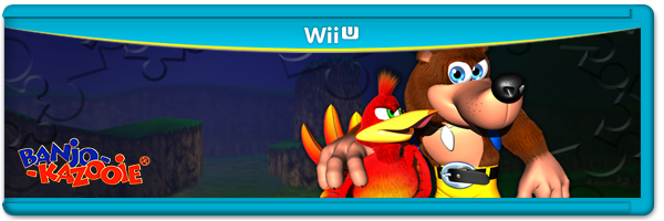
I was once known here as KillerMario, but since I really like Banjo-Kazooie, I changed my display name to show them my respect :)


#16 Auzzie Wingman

Auzzie Wingman

    Mournblade

  • Members
  • 4,346 posts
  • NNID:AuzzieWingman
  • Fandom:
    Not enough space here

Posted 07 August 2012 - 03:32 AM

Not really a fan for numerous reasons:
1. When it comes to display design, generally the colours you want to make the image stand out is blue or orange. If you have a look at movie posters and the like, it's most commonly one of the two. Don't know why, but these appeal the best. With the blue Wii U section at the top, and considering how full it is, you are making it far more important than the actual product image, and that's generally not the idea.

2. THAT YELLOW LINE! Grrr... makes me want to puke up a yellow-less rainbow. Whoever made that first one in Socalmuscle's post, I'd prefer that over whatever wherever is hosting the posting whatever.

3. I'm gonna be honest, I don't feel at all enticed to buy this type of box-art over what the competitors have. This includes the Wii as well. I'd rather buy the Wii template over this supposed Wii U template.

Trophy Cards are classy too! LOLZIGZAGOON


AuzzieWingman.png


#17 Deadly Virus

Deadly Virus

    Boo

  • Members
  • 598 posts
  • Fandom:
    3D Mario, Metroid, F-Zero, Pokémon, SSB

Posted 07 August 2012 - 04:14 AM

Looks alright, not sure if I like the yellow though. If this is official, I'm just waiting for the cries of "kiddie" and "fisher price" from the MS/Sony fanboys.. -_-

Posted Image


#18 Rockalot

Rockalot

    Blooper

  • Members
  • 158 posts
  • Fandom:
    Dragon Ball, Nintendo

Posted 07 August 2012 - 04:15 AM

I have to agree with Auzzie Wingman and the others, as a designer I think they're woeful. Could you get more kindergarten? Total waste of space as well. These aren't legit. I hope not anyway.

Posted Image


#19 Keviin

Keviin

    Lakitu

  • Members
  • 2,270 posts
  • Fandom:
    Zelda, Mario, Metroid, Resident Evil

Posted 07 August 2012 - 04:29 AM

The actual Wii U logo now is Grey + Blue, so I think they'll stick to that, and because of that, add a black or white 'background'. I like these, they look fresh, but I don't think they will fit with a lot of games boxarts.
No sig.

#20 esper

esper

    Red Koopa Troopa

  • Members
  • 72 posts
  • Fandom:
    Nintendo The Muppets Pokemon Yu-Gi-Oh

Posted 07 August 2012 - 05:20 AM

I like it, also there's a rumor that the yellow is supposed to be gold.


0 user(s) are reading this topic

0 members, 0 guests, 0 anonymous users

Anti-Spam Bots!