Jump to content


Photo

Zelda U graphics thoughts


  • Please log in to reply
134 replies to this topic

#121 NintendoReport

NintendoReport

    NintendoChitChat

  • Moderators
  • 5,907 posts
  • NNID:eddyray
  • Fandom:
    Nintendo Directs and Video Presentations

Posted 17 June 2014 - 12:20 PM

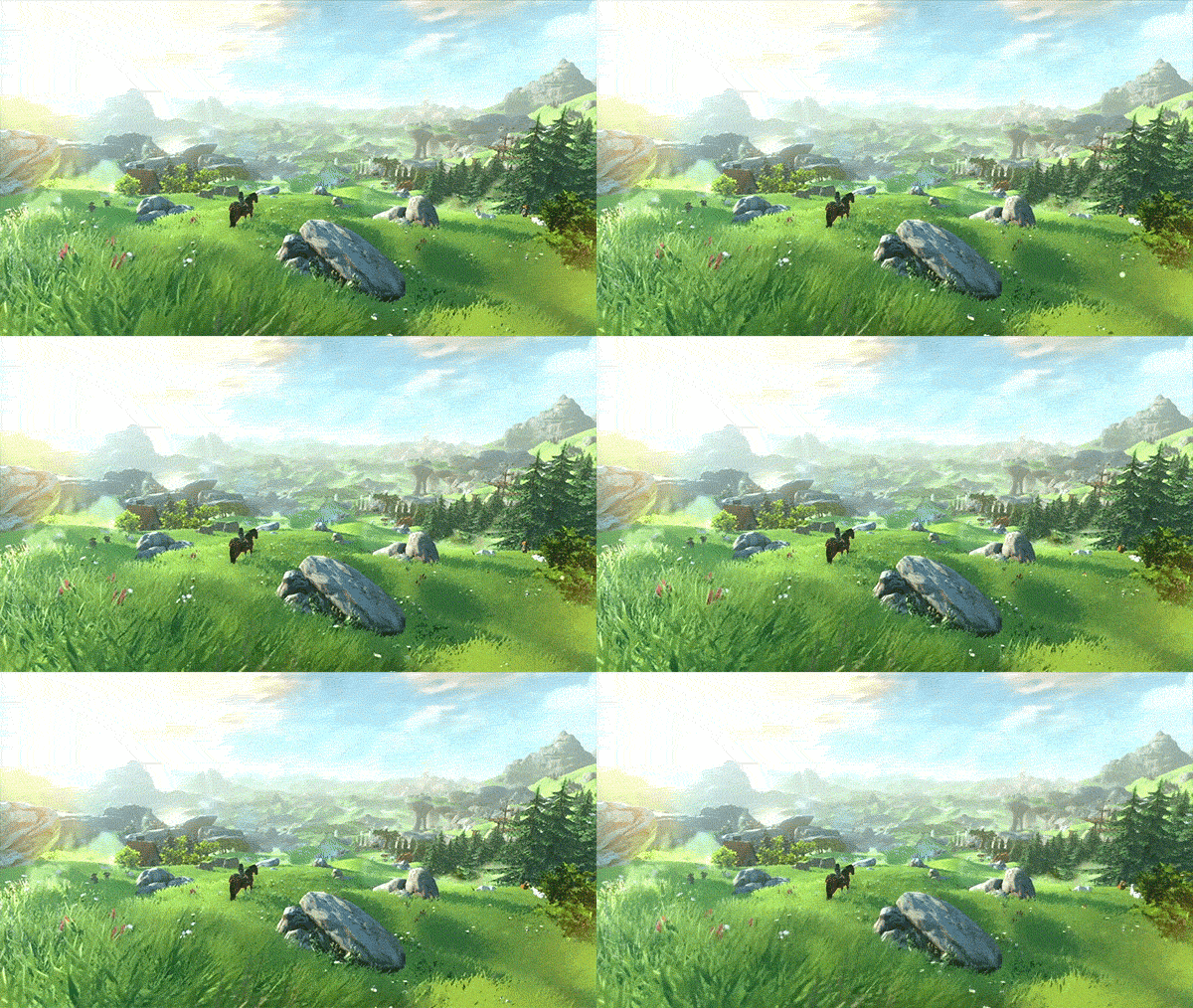
Internet morons been cracking me up since the gtav ps4 reveal.

When Shown Zelda U:
hyrule-grass.gif
Whatever, thats nothing any ps360 open world game could do.


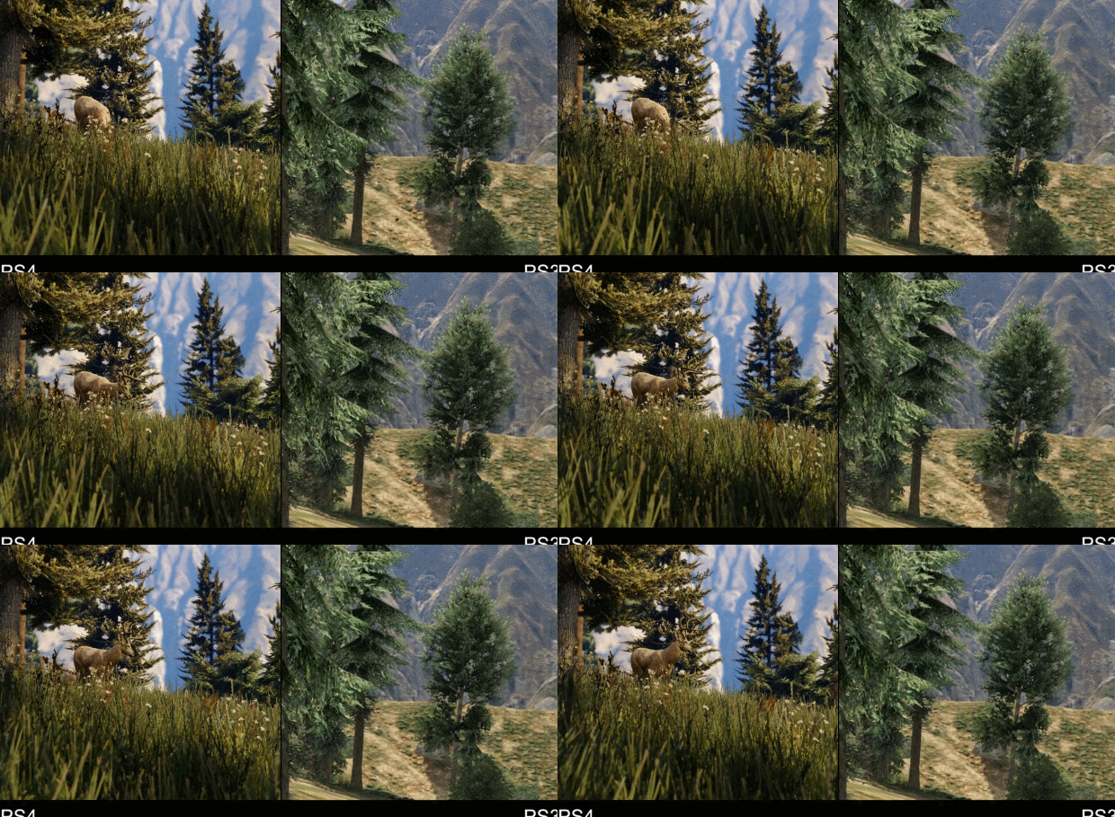
Same Exact people seeing gtav ps4:
gta5rnpy9.gif

OMFG LOOK AT THE GRASS!!! THAT BLOWS PS360 OUT OF THE WATER NEXT GEN POWER ZOMG!!!!


I see many still claiming how Bayonetta 2 isn't anything that couldn't be done last gen and that it has low poly counts in the models. These same people still claim God of War graphically is still superior to anything on Wii U.


Keep Smiling, It Makes People Wonder What You Are Up To!
PA Magician | Busiest PA Magician | Magician Reviewed | Certified Magic Professionals

nccbanner_by_sorceror12-d9japra.png-- nintendoreportbox.png -- nintendo_switch_logo_transparent___wordm

#122 MatrixChicken

MatrixChicken

    Knock knock, Scootaloo...

  • Members
  • 869 posts
  • NNID:MatrixChicken
  • Fandom:
    MLP:FiM, Mario, Star Wars... And more...

Posted 17 June 2014 - 12:35 PM

Actually, looking closer at those press screens, there are a few jaggies. Not that that proves they're real, I'm just saying. And with everybody saying how what we saw in the trailer "wasn't technically impressive", I see no reason it could be 1080p to balance that out. I don't agree, though, I find the trailer pretty impressive, both artistically and technically. We'll have to wait and see what it ends up like. And historically, Nintendo games tend to look better at launch than when first revealed.


splatoonmcsig2_zps010eb482.png


Deviantart: MatrixChicken | Youtube: ThunderFilmStudios | Twitter: @JohnAlBerge

Twitch.tv: ThunderFilms | Soundcloud: ScootriX


#123 NintendoReport

NintendoReport

    NintendoChitChat

  • Moderators
  • 5,907 posts
  • NNID:eddyray
  • Fandom:
    Nintendo Directs and Video Presentations

Posted 17 June 2014 - 12:43 PM

Actually, looking closer at those press screens, there are a few jaggies. Not that that proves they're real, I'm just saying. And with everybody saying how what we saw in the trailer "wasn't technically impressive", I see no reason it could be 1080p to balance that out. I don't agree, though, I find the trailer pretty impressive, both artistically and technically. We'll have to wait and see what it ends up like. And historically, Nintendo games tend to look better at launch than when first revealed.

193618c7c1.gif


Keep Smiling, It Makes People Wonder What You Are Up To!
PA Magician | Busiest PA Magician | Magician Reviewed | Certified Magic Professionals

nccbanner_by_sorceror12-d9japra.png-- nintendoreportbox.png -- nintendo_switch_logo_transparent___wordm

#124 MatrixChicken

MatrixChicken

    Knock knock, Scootaloo...

  • Members
  • 869 posts
  • NNID:MatrixChicken
  • Fandom:
    MLP:FiM, Mario, Star Wars... And more...

Posted 17 June 2014 - 12:48 PM


Actually, looking closer at those press screens, there are a few jaggies. Not that that proves they're real, I'm just saying. And with everybody saying how what we saw in the trailer "wasn't technically impressive", I see no reason it could be 1080p to balance that out. I don't agree, though, I find the trailer pretty impressive, both artistically and technically. We'll have to wait and see what it ends up like. And historically, Nintendo games tend to look better at launch than when first revealed.

193618c7c1.gif


Eh? Are you calling me a cucco? :P


splatoonmcsig2_zps010eb482.png


Deviantart: MatrixChicken | Youtube: ThunderFilmStudios | Twitter: @JohnAlBerge

Twitch.tv: ThunderFilms | Soundcloud: ScootriX


#125 Spartanica

Spartanica

    Goomba

  • Members
  • 1 posts

Posted 28 June 2014 - 02:17 AM

I think it looks great considering it's on the WII U. 


#126 NintendoReport

NintendoReport

    NintendoChitChat

  • Moderators
  • 5,907 posts
  • NNID:eddyray
  • Fandom:
    Nintendo Directs and Video Presentations

Posted 28 June 2014 - 05:47 AM

I think it looks great considering it's on the WII U. 


It wouldn't be great anywhere else.


Keep Smiling, It Makes People Wonder What You Are Up To!
PA Magician | Busiest PA Magician | Magician Reviewed | Certified Magic Professionals

nccbanner_by_sorceror12-d9japra.png-- nintendoreportbox.png -- nintendo_switch_logo_transparent___wordm

#127 Lafosse64

Lafosse64

    Paragoomba

  • Members
  • 27 posts
  • NNID:Lafosse64
  • Fandom:
    The Legend of Zelda, Pokémon

Posted 29 June 2014 - 11:09 PM

i was specting something like the visual demo they showed at E3 2011 but... bah... I can't complain, even if it was 8bit it would be ZELDA and would be AMAZING. Besides the graphis are ok... looks like how Skyward Sword should have looked and the open world is just the best idea they had. Hope they make it a bit more RPG-ish this time. Like it was once said... ''Zelda has a lot to learn from Skyrim'' ... and taking some ideas wouldn't be bad at all.


Edited by Lafosse64, 29 June 2014 - 11:10 PM.

''GAMER SINCE 1990''


#128 storabajskorven

storabajskorven

    Boo

  • Members
  • 572 posts
  • NNID:Stranders

Posted 30 June 2014 - 03:07 AM

i was specting something like the visual demo they showed at E3 2011 but... bah... I can't complain, even if it was 8bit it would be ZELDA and would be AMAZING. Besides the graphis are ok... looks like how Skyward Sword should have looked and the open world is just the best idea they had. Hope they make it a bit more RPG-ish this time. Like it was once said... ''Zelda has a lot to learn from Skyrim'' ... and taking some ideas wouldn't be bad at all.


I also liked the 2011 demo when it was first shown, but have a look at it again now and compare it to what they just showed at E3 2014. The new trailer looks so much better. I think your memory deceives you because in 2011 you were comparing it with TP and SS. (Also, I think they would be far better off learning from the NES Zelda rather than Skyrim.)


#129 SamuraiDeity

SamuraiDeity

    Spiked Goomba

  • Members
  • 19 posts

Posted 04 July 2014 - 09:10 PM

Heres your problem. You are trying to argue your opinion, on a subject comprised of facts.

Is the tech demos pathetic low poly tiny room more technically impressive than the actual games seamless gigantic open world? Where you can go anywhere you see? Every square inch of which is completely covered in dense grass, with each blade individually lit and shaded in real time?

How about the pathetically rigged tech demo link with ceramic doll face? How about the fact the actual game characters face has more animation points in her face than the entire tech demos link? Hell, the damn ARROW has more animation points than tech demo link.

How about all the shepards and goats in the fields reacting in real time to the monster? Oh wait, there WAS no other characters in the tech demo.

How about the fact the in game monster has more polygons and animation points in one arm than the entire ghoma model from the tech demo?

How about how it PERFECTLY reacts dynamically to uneven surfaces where tech demo goma has to be put on entirely flat ground?

How about the high speed cross country chase, while tech demo ghoma simply rotates in the same place?

You can have your opinion. Thats all it is. But it cant stand up to the facts.

The actual game obliterates the tech demo on every level except irritating adolescent 'gritty realism is teh matures!'


This is some really good stuff, I was wondering if anyone could do a more detailed technical comparison. I've seen people saying the tech demo had higher resolution textures. I think they're saying that because they like the "realistic" darker look better but it's hard to say. Another thing people have said is that the tech demo had amazing reflections, but I don't think there's any good comparison point from the trailer to compare the two in that respect.


#130 pexpress

pexpress

    Shy Guy

  • Members
  • 35 posts

Posted 05 July 2014 - 03:32 AM

I like the new design of zelda, its not a cartoon like Wind waker nor a realistic like TP but a nex design and very original


_________________________________________________________________________________________________________________________________________________________________________

accessoires galaxy s5 samsung galaxy s5


Edited by pexpress, 06 July 2014 - 07:10 AM.


#131 NintendoReport

NintendoReport

    NintendoChitChat

  • Moderators
  • 5,907 posts
  • NNID:eddyray
  • Fandom:
    Nintendo Directs and Video Presentations

Posted 05 July 2014 - 04:59 AM

This is some really good stuff, I was wondering if anyone could do a more detailed technical comparison. I've seen people saying the tech demo had higher resolution textures. I think they're saying that because they like the "realistic" darker look better but it's hard to say. Another thing people have said is that the tech demo had amazing reflections, but I don't think there's any good comparison point from the trailer to compare the two in that respect.


You can't be taken seriously if you compare textures from the tech demo which is an "enclosed" environment to the reveal at e3 which is a huge world.
Keep Smiling, It Makes People Wonder What You Are Up To!
PA Magician | Busiest PA Magician | Magician Reviewed | Certified Magic Professionals

nccbanner_by_sorceror12-d9japra.png-- nintendoreportbox.png -- nintendo_switch_logo_transparent___wordm

#132 SamuraiDeity

SamuraiDeity

    Spiked Goomba

  • Members
  • 19 posts

Posted 05 July 2014 - 06:50 AM

Yea I was thinking that myself. I don't even think the textures were that high of quality in the tech demo myself but I could be wrong.

#133 Wolfy

Wolfy

    Thwomp

  • Members
  • 310 posts
  • Fandom:
    snep baks n sweg

Posted 05 July 2014 - 09:42 AM

looks like typical anime rainbow with an even rainbowtier art style to compensate for the rainbowty hardware.


#134 Gruff

Gruff

    Jigglypuff

  • Members
  • 1,179 posts
  • Fandom:
    Zelda, Animal Crossing, SSB, Nintendo

Posted 05 July 2014 - 10:13 AM

looks like typical anime rainbow with an even rainbowtier art style to compensate for the rainbowty hardware.

Go eat a big pile of rainbow.


Villager.jpgBleh eh eh.


#135 Sylentmana

Sylentmana

    Goomba

  • Members
  • 5 posts

Posted 14 July 2014 - 06:03 AM

I think it looks amazing! I like the cel shading and I actually prefer the lighter visuals to the more serious/dark Zelda games.  I also like the changes as well.  I hope they plan on taking the game and trying new things while still staying true to the Zelda feel.  I especially like the open world aspect and hope they are trying to get back to an emphasis on exploration like they first game.


1 user(s) are reading this topic

0 members, 1 guests, 0 anonymous users

Anti-Spam Bots!