

We too.... makes a little more Grammatical sense in English as well.
Green Koopa Troopa
Posted 05 January 2015 - 10:58 PM
Lakitu

Green Koopa Troopa
Posted 05 January 2015 - 11:33 PM
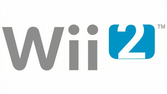
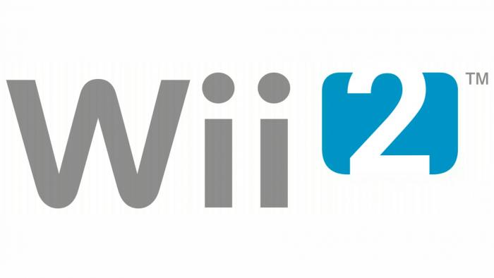
Like this?I feel like it the top is breaching the border the bottom should be too, for balance.
Lakitu
Posted 05 January 2015 - 11:42 PM
Like this?
2015-01-06 20.22.05.jpg
I had done something like this originally, but I felt that the fine blue line helped define the numeral.
But as I look at this new image, you are right, it really does look better.
Two is a pretty easy number to distinguish you'd have to take a lot away from it for people not to recognize it or confuse it.
This looks better but I still feel like the spacing is uneven. like the two should be farther down. It looks like more was cropped of the top than the bottom.
WAR IS PEACE
FREEDOM IS SLAVERY
IGNORANCE IS STRENGTH
LISTEN AND BELIEVE
wall crusher

Posted 06 January 2015 - 12:00 AM
If you just take the U and make it a roman Numeral II I thinik it works even better as a logo. Or just use a more streamline font for the 2 as it looks kinda bland
Cheetah
Posted 06 January 2015 - 02:52 AM
I wonder if things would be any different if Nintendo had actually used this name and logo
Lakitu
Posted 06 January 2015 - 02:58 AM
I wonder if things would be any different if Nintendo had actually used this name and logo
maybe. not as much as some people think though. I think avertising is more of a problem than name/logo.
WAR IS PEACE
FREEDOM IS SLAVERY
IGNORANCE IS STRENGTH
LISTEN AND BELIEVE
Green Koopa Troopa
Posted 06 January 2015 - 03:17 AM
This looks better but I still feel like the spacing is uneven. like the two should be farther down. It looks like more was cropped of the top than the bottom.
Yeah, good point. I used Sketch Book Mobile to create this piece, and it's entire font suite is Sans, Serif, normal, bold and italic. So not a lot of options.If you just take the U and make it a roman Numeral II I thinik it works even better as a logo. Or just use a more streamline font for the 2 as it looks kinda bland
The Unicorn

Posted 06 January 2015 - 07:50 AM
maybe. not as much as some people think though. I think avertising is more of a problem than name/logo.
A generic middle-class white family is playing on their Wii, when suddenly, they hear a knock on the door.
"Wii 2, would like to play."
And then shamisen.
Edited by Tom, 06 January 2015 - 07:51 AM.
"I'M NOT BEING PESSIMISTIC, I'M BEING REALISTIC." - EVERY PESSIMIST EVER.
Cheep-Cheep
Posted 06 January 2015 - 01:00 PM
i remember when everyone that this was gonna be what the wii u was gonna be called
Skrillax numbr 1 faen

Posted 06 January 2015 - 01:33 PM
A generic middle-class white family is playing on their Wii, when suddenly, they hear a knock on the door.
"Wii 2, would like to play."
And then shamisen.
How does the shamisen come into the picture? xD
Btw this is a shamisen for starters:


The Unicorn
Posted 06 January 2015 - 01:37 PM
How does the shamisen come into the picture? xD
Btw this is a shamisen for starters:
"I'M NOT BEING PESSIMISTIC, I'M BEING REALISTIC." - EVERY PESSIMIST EVER.
TYBG

Posted 06 January 2015 - 08:05 PM
i remember when everyone that this was gonna be what the wii u was gonna be called
this was wii 2 forums
Edited by Soul, 06 January 2015 - 08:05 PM.


0 members, 1 guests, 0 anonymous users

