Wow ! those music menus are crazy good, especially the last one.I used the second Wii U menu concept I did as a base and made a "simple menu" system for it... I think.
Maybe a bit PS3ish on the start menu, but when you move your Wiimote cursor over the text, it goes gray, press it and it illuminates and out pop the different submenu items. They'd hover in the air and the background text blurs out. If you'd press a submenu text and hold the button, you could theoratically move the text around and the other submenu items would move in "spherical motion" with it. Think about a simplified Minority Report...
So lets just roll with it... Minority Report goes into custom folder system with movable folders and then into media player
1. Here we have the "simplified Minority Report". Imagine you're using the Wiimote here and you hold A over "Internet Settings" and move your arm around. The rest of the settings submenus roll around in a spherical motion, you push the Wiimote towards the screen and "Internet Settings" goes deeper into the screen while for example "Audio settings" comes closer. If you'd move "Privacy settings" up into the left top corner, "Controller settings" would move down into the right hand corner. Just a fun little thing to mess around with.
2. Now we're going to play some music. (I added the "Pictures" menu at this stage, just to point that out.)
Here we have a folder view, you can see a button up top that could switch it into list view or even icon view, I dunno... You could arrange your folders any way you'd want. Lets listen to some metal...
Here we have some artists. Some folders have been customized, others have not. I want to listen to Mastodon now.
They've released five albums, here I arranged the albums in line and in order. Every album has its cover added to the folder. Lets go to listen to... The Hunter.
So here we have a little media player with track listing and a little info about the album. I paused it, so I wouldn't scare ya with the loud music, since I've got the volume turned all the way up
Anyways, just a fun little thing to imagine. Enjoy (or maybe you won't)

#81

Posted 16 May 2012 - 06:31 PM
#82

Posted 16 May 2012 - 06:37 PM
#83

Posted 16 May 2012 - 06:46 PM
#84

Posted 16 May 2012 - 06:52 PM
I used the second Wii U menu concept I did as a base and made a "simple menu" system for it... I think.
Maybe a bit PS3ish on the start menu, but when you move your Wiimote cursor over the text, it goes gray, press it and it illuminates and out pop the different submenu items. They'd hover in the air and the background text blurs out. If you'd press a submenu text and hold the button, you could theoratically move the text around and the other submenu items would move in "spherical motion" with it. Think about a simplified Minority Report...
So lets just roll with it... Minority Report goes into custom folder system with movable folders and then into media player
1. Here we have the "simplified Minority Report". Imagine you're using the Wiimote here and you hold A over "Internet Settings" and move your arm around. The rest of the settings submenus roll around in a spherical motion, you push the Wiimote towards the screen and "Internet Settings" goes deeper into the screen while for example "Audio settings" comes closer. If you'd move "Privacy settings" up into the left top corner, "Controller settings" would move down into the right hand corner. Just a fun little thing to mess around with.
2. Now we're going to play some music. (I added the "Pictures" menu at this stage, just to point that out.)
Here we have a folder view, you can see a button up top that could switch it into list view or even icon view, I dunno... You could arrange your folders any way you'd want. Lets listen to some metal...
Here we have some artists. Some folders have been customized, others have not. I want to listen to Mastodon now.
They've released five albums, here I arranged the albums in line and in order. Every album has its cover added to the folder. Lets go to listen to... The Hunter.
So here we have a little media player with track listing and a little info about the album. I paused it, so I wouldn't scare ya with the loud music, since I've got the volume turned all the way up
Anyways, just a fun little thing to imagine. Enjoy (or maybe you won't)
I need 20,000 boxes of Kleenex... my nose refuses to stop bleeding. Epic job on these concepts. All I need now are the Wii U, gigs of storage on the SD card and at least 1TB external drive!!!!!!!

"Let's dance, boys!"
- Bayonetta
#85

Posted 17 May 2012 - 01:37 AM
I updated the last one a little bit. Added a little reflection on the media player and "My score" in the info bar.
#86

Posted 17 May 2012 - 10:13 AM
#87

Posted 17 May 2012 - 01:21 PM
i've been waiting for that for 4 years.I would like if you could play them during games.

PM me if you want to add me on 3ds
#88

Posted 19 May 2012 - 03:46 PM
#89

Posted 19 May 2012 - 05:04 PM
yes,the 3ds menu is simple to the point, yet stylish.I think something similar to the Wii and 3DS menus would be fine as long as I can make it green. Otherwise, some new, great, wonderful, amazing, previously unheard of, supertastically awesome menu will do just fine.
#90

Posted 20 May 2012 - 04:23 AM
- CaptainFalco311, neverwinteru and Soul like this
#91

Posted 20 May 2012 - 07:40 AM
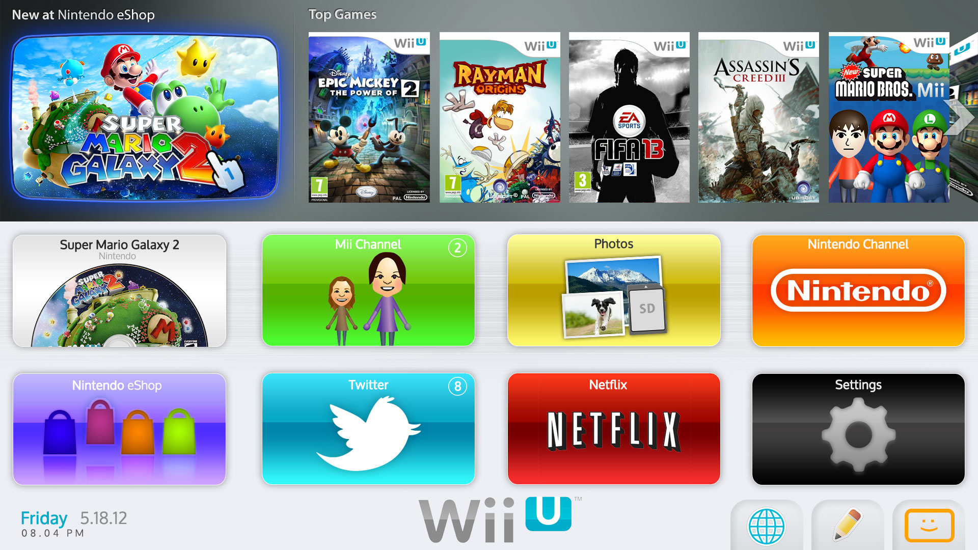
This is what I made. Will make a newer version soon, but this is what I've created so far in Photoshop. Hope you like it!
This. I think that ArnarFB's design looked great, but it just didn't look Nintendo enough. I could see his design being the PS4's menu, but not the Wii U's menu. I think that your design is the perfect blend of Nintendo-ness and modern-ness. If I could change anything in your design at all, I'd...
- Remove the disc menu icon in the bottom segment and replace it with a Nintendo Network menu icon
- Replace the "New at Nintendo eShop" space with a space for playing disc games. You could even have the disc swing in like the Wii
- Replace "Top Games" with "My Games"; leave it a space for downloaded stuff. I liked the Wii Shop Channel's design where it would show on the channel icon what's new in the eShop
- Show your Nintendo Network info somewhere, including your Mii, new messages, and achievements
- Add arrows to the bottom section so you can scroll through the app icons
#93

Posted 23 May 2012 - 09:04 AM
Yep that looks like the controller menu.
I'm still sticking with the idea that the controller menu will be very minimal.
#94

Posted 23 May 2012 - 09:20 AM

Co-Leader of the A.D.P.F
Lose yourself in battle, and rejoice
After War there is Death ~ Goddess Palutena, victory is ours
Yeah, you've done a great job so far, letting the Metal Heads destroy the palace.
#95

Posted 23 May 2012 - 09:59 AM
What else is now intriguing me, like just this minute as soon as I typed the whole social gaming thing, Rayman Legends said social gaming, I know this is a stretch but good the Wii U has a direct tie into your social networks, so like for example Windows Live Accounts and Youtube Accounts can connect to your Facebook. It is a stretch but plausable stretch.
I do expect the menu to be more social, like in that mock up with the games, instead of showing games it should instantly show who's online.
#96

Posted 23 May 2012 - 10:04 AM
That would be pretty cool, we could possible make gameplay videos and put them on social sites for friends to see.I have a feeling the OS is going to be more social. Going back to Iwata's GDC 2011 keynote, he said something along the lines of social gaming has always been around but its just in a different form. He said something like blending the line between normal games and social games.
What else is now intriguing me, like just this minute as soon as I typed the whole social gaming thing, Rayman Legends said social gaming, I know this is a stretch but good the Wii U has a direct tie into your social networks, so like for example Windows Live Accounts and Youtube Accounts can connect to your Facebook. It is a stretch but plausable stretch.
I do expect the menu to be more social, like in that mock up with the games, instead of showing games it should instantly show who's online.

Co-Leader of the A.D.P.F
Lose yourself in battle, and rejoice
After War there is Death ~ Goddess Palutena, victory is ours
Yeah, you've done a great job so far, letting the Metal Heads destroy the palace.
#97

Posted 23 May 2012 - 04:36 PM
That is kinda minimalI'm still sticking with the idea that the controller menu will be very minimal.
#98

Posted 25 May 2012 - 12:22 AM
Hay we are going to have to bump this...
From IGN Don't credit or like this.
Lol
Ifn copied Apples Safari browser which has a commit visited site layout. Looks just like that...

- CaptainFalco311 likes this
#99

Posted 28 May 2012 - 03:52 PM
Thank you
Jetfire UD.
#100

Posted 29 May 2012 - 09:23 AM
1 user(s) are reading this topic
0 members, 1 guests, 0 anonymous users


