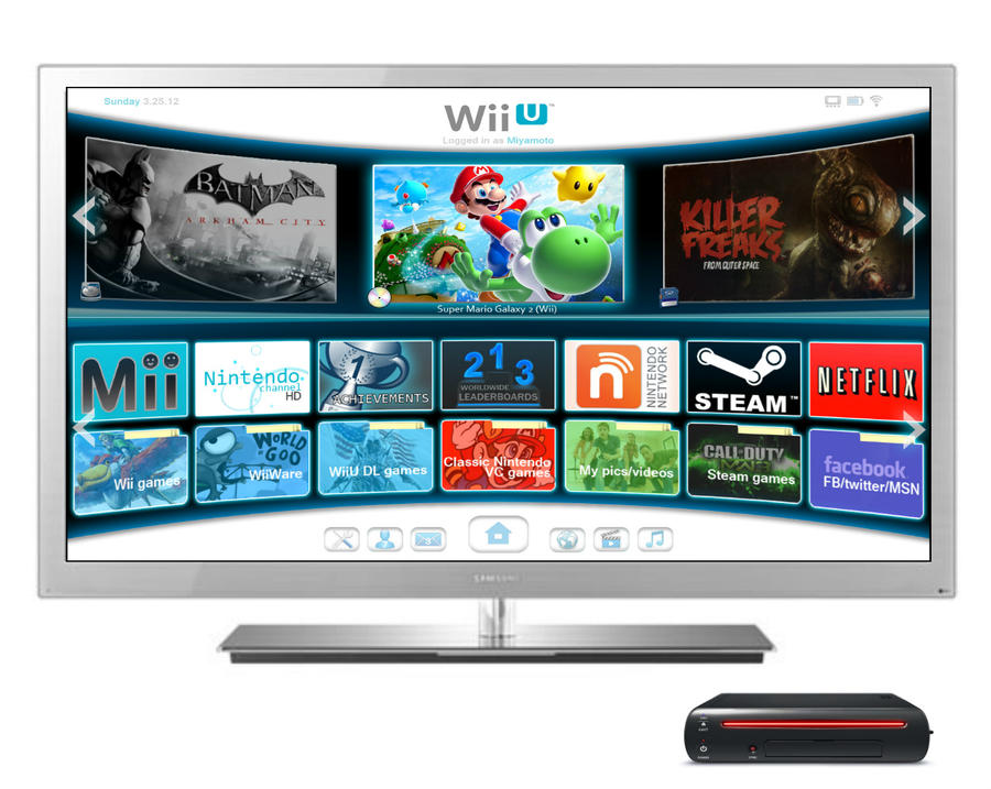
Thanks. This Wii U menu was supposed to look like a modern version of the old Wii menu. More sleek, more "today" and more of everything, I suppose. Simple yet complete, I guess.
When I posted this on IGN boards, I was asked why there were three big icons with games in them. The thought was one was from the disc tray, one from an external HDD and one from SD card. So I made a slight change, notice the icons that portray where the game is being loaded from:
Then, people wanted folders. Folders! Put your stuff into FOLDERS! Folderzzzzzzzzzah! Foldermania, it's global.
But these folders are rather flat and boring, so how about a user-set, custom photo for each folder?
Just slight changes. Nothing big.
First post here, been a long time reader just never registered. Had to say hi when I saw my little Wii U menu ended up here.
I dont want to see steam icon or origin in my wii u menu, also I wish nintendo will remove the mii page.. I want to have my mii in my desktop (main menu) in front of me.. interact with me.. Your creation have potential of reducing the full of selection box's icons.. More like create sub categories (online services, nintendo network could combine the wii U DL games, WIIWARE, classic, wii games, etc... and earn some space for the mii....
Edited by Orion, 12 May 2012 - 11:40 PM.


