Jump to content


Photo

Wii U OS Redesign Concept


  • Please log in to reply
73 replies to this topic

#21 Socalmuscle

Socalmuscle

    Hammer Bro.

  • Members
  • 1,677 posts

Posted 07 October 2013 - 12:43 PM

*pinches his top part of the nose*


Do you think sincerely think that Nintendo wanted to "copy" Apple? I don't think they did. What they thought was probably "Hey! the 3DS UI is pretty good, so, we could use it on the U. But... there are too much options and so we need some shortcut. Let's put the most useful down there." And, it just happened to look like a dock from OSX and other Apple products. As you know, Nintendo avoid paying royalties like the pest. So much that they won't even pay for DVD playback (which needs DVD Forum licence), Or even CD-Rom!! For Blu-ray, I understand... you wouldn't pay rolyalties to one of your direct competitors, hmm? To top it off, they are copyright an*l-ist.


Personally, the flat "modern" look is just a fad. Oh wait. Apple used that flat look in iOS7. Then, something bad became good all of a sudden. And people hate Windows 8 for the Modern/Metro UI... go figure.


Anyway, what Nintendo really needs to focus on is to let people actually personallize their console. Add a wallpaper, change the color of the icons, folders, etc. Just a few ideas out of my head. Ninty has always the first to takes risks. So why not nnovate in the UI instead of following a fad trend? Why not innovate on something new?


Personally, I like the UI the way it is. Needs improvement, yes, but I still love its look.


every "look" is a fad.


Look at the old iPhone UI.


It was the business when it came out.


Today, it's "old."


the point is to keep things fresh and relevent - in a word, modern.


the wii u ui is old. outdated. not modern.


does it work? yes. so does DOS.


but it could really use a major update.


Not saying it needs to clone apple, MS, etc.

But it needs to modernize.


#22 grahamf

grahamf

    The Happiness Fairy

  • Members
  • 2,532 posts

Posted 07 October 2013 - 01:15 PM

*
POPULAR

It's a video game console, not a fashion show.


$̵̵͙͎̹̝̙̼̻̱͖̲̖̜̩̫̩̼̥͓̳̒̀ͨ̌̅ͮ̇̓ͮ̈͌̓̔̐͆ͩ̋͆ͣ́&̾̋͗̏̌̓̍ͥ̉ͧͣͪ̃̓̇̑҉͎̬͞^̸̠̬̙̹̰̬̗̲͈͈̼̯̞̻͎ͭ̐ͦ̋́̆̔̏̽͢$̻̜͕̜̠͔̮͐ͬ̍ͨͩͤͫ͐ͧ̔̆͘͝͞^̄̋̄͗̐ͯͮͨͣ͐͂͑̽ͩ͒̈̚͏̷͏̗͈̣̪͙̳̰͉͉̯̲̘̮̣̘͟ͅ&̐ͪͬ̑̂̀̓͛̈́͌҉҉̶̕͝*̗̩͚͍͇͔̻̬̼̖͖͈͍̝̻̪͙̳̯̌̅̆̌ͥ̊͗͆́̍ͨ̎̊̌͟͡$̶̛̛̙̝̥̳̥̣̥̞̝̱̺͍̭̹̞͔̠̰͇ͪ͋͛̍̊̋͒̓̿ͩͪ̓̓͘^̈ͥͩͭ͆͌ͣ̀̿͌ͫ̈́̍ͨ̇̾̚͏̢̗̼̻̲̱͇͙̝͉͝ͅ$̢̨̪̝̗̰͖̠̜̳̭̀ͥͭͨ̋ͪ̍̈ͮͣ̌^ͦ̏ͬ̋͑̿́ͮ̿ͨ̋̌ͪ̓̋̇͆͟҉̗͍$̛̪̞̤͉̬͙̦̋ͣͬ̒͗̀̍͗̾̽̓̉͌̔͂̇͒̚̕͜^̧͎̖̟̮͚̞̜̮̘͕̹͚̏ͩ͐ͯ͑̍̍̀͒͘*̿ͨ̽̈́͐ͭ̌̈͋̚͟͝҉͕̙*̨̢̭̭̤̺̦̩̫̲͇͕̼̝̯̇ͨ͗̓̃͂ͩ͆͂̅̀̀́̚̚͟%̨͚̙̮̣̭͖͕͙ͣ̽ͮͤ́ͫ̊̊̐̄̌ͣ͌̉̔͊̽̾ͨ^̢̹̭͍̬̖͇̝̝̬̱͈͔̹͉̫̿͛̄̿͊͆ͦ̃ͮͩ͌ͭ̔ͫ̆͞ͅͅ%̵̼̖̻̘ͪͤ̈̃̓̐̑ͩͭ̄̑͊ͫ̆̌̄͡*̴̮̪͕̗̩͇͇ͪ̑̊̈́́̀͞^̼̝̥̦͇̺̘̤̦͕̦̞͑̑ͯ̂ͯ̕͞%ͮͫ̿ͫ̊̈̔̍҉҉̴̸̡*̛̭̖͇͚̝̤̬̰̅̎ͥͯ̓͑̾ͬͨͮ́̕͝^̧̽͋̈ͤͮ̈́́̍ͧ̊҉͇̙̣̯̀́%̴̡̛̘͚͈̗̖̮̫̏̆ͦ̽̔̈̽͒͛̈


#23 Socalmuscle

Socalmuscle

    Hammer Bro.

  • Members
  • 1,677 posts

Posted 08 October 2013 - 10:13 AM

It's a video game console, not a fashion show.


That kind of thinking is what stopped the Gamecube from being taken seriously, despite its killer hardware at the time.


It was perceived as "kiddie," "lunch box for elementary school," etc.


Nowadays, not only the hardware design, bu the sofware UI lead perception as well.


Wii U UI looks (and SOUNDS) very childish.


Sure, you don't want to alienate kids. therefore, it wouldn't be wise to go the route of Metro UI for example.


But you also want to present everything in the best light possible for modern crossover appeal.


If this was 2006 even, the UI would be considered modern.


But now, it looks ancient.


The layout is not bad, though eShop and the Wii U Menu could do well with a modified, updated sidebar.


And all the random shapes are more than annoying, breaking visual continuity, like there aren't part of any theme at all, just a random thought.


It seems that the graphic design/UI/UX team is either resistant to or incapable of change in terms of keeping up with the times.


At some point, I imagine the UI will be updated. But it won't be until the OS itself gets the bloat down quite a bit more.


If this UI were on any other console, it would be ridiculed heavily.


The fact that it is deemed "somewhat normal" or "the Nintendo way" on a Nintendo console only means that people expect less from Nintendo (in terms of UI/UX, not games). that should not be the case.


Edited by Socalmuscle, 08 October 2013 - 10:14 AM.


#24 xile6

xile6

    Alchemist

  • Members
  • 1,532 posts
  • NNID:xile06x

Posted 08 October 2013 - 11:10 AM

The windows 8/ xbox 360/ps4 look is ok but i hate the damn popups telling you you got a message from your friend it kinda kills your game.


I had this happen on ps3 when i had a ton of people get online and off line.


But yea if nintendo updated some of there stuff i think things would be better for them.


Idk why they keep the same setup from the ds.

But we will see if they change it or not, My guesses are not.


youtube ch. http://www.youtube.com/user/xile2010/
xile06 "N" ID
Cod bo2, AC3, Zombiu, NSMB, Pikmin 3, Wind Waker HD, Smash Bro wiiu,
Preorders : ..
Plan to buy : -

#25 KeptMyWiiUAndLeftTheForums

KeptMyWiiUAndLeftTheForums

    Lakitu

  • Members
  • 2,337 posts
  • NNID:xWydrAx
  • Fandom:
    Smash Bros all day.

Posted 08 October 2013 - 05:16 PM

The windows 8/ xbox 360/ps4 look is ok but i hate the damn popups telling you you got a message from your friend it kinda kills your game.


I had this happen on ps3 when i had a ton of people get online and off line.


But yea if nintendo updated some of there stuff i think things would be better for them.


Idk why they keep the same setup from the ds.

But we will see if they change it or not, My guesses are not.

If this causes a problem for some people like xile is saying then then it could be made optional.


WAR IS PEACE

FREEDOM IS SLAVERY

IGNORANCE IS STRENGTH

LISTEN AND BELIEVE


#26 Socalmuscle

Socalmuscle

    Hammer Bro.

  • Members
  • 1,677 posts

Posted 09 October 2013 - 09:23 PM

If this causes a problem for some people like xile is saying then then it could be made optional.

Good point.

Or it could appear at the very top of the screen in a skinny bar that rotates or fades in then out.

the 360 will literally obscure your game.

Edited by Socalmuscle, 09 October 2013 - 09:24 PM.


#27 grahamf

grahamf

    The Happiness Fairy

  • Members
  • 2,532 posts

Posted 09 October 2013 - 11:19 PM

What about something like a news show marquee text? That takes up little space and can tie into the channels theme.


$̵̵͙͎̹̝̙̼̻̱͖̲̖̜̩̫̩̼̥͓̳̒̀ͨ̌̅ͮ̇̓ͮ̈͌̓̔̐͆ͩ̋͆ͣ́&̾̋͗̏̌̓̍ͥ̉ͧͣͪ̃̓̇̑҉͎̬͞^̸̠̬̙̹̰̬̗̲͈͈̼̯̞̻͎ͭ̐ͦ̋́̆̔̏̽͢$̻̜͕̜̠͔̮͐ͬ̍ͨͩͤͫ͐ͧ̔̆͘͝͞^̄̋̄͗̐ͯͮͨͣ͐͂͑̽ͩ͒̈̚͏̷͏̗͈̣̪͙̳̰͉͉̯̲̘̮̣̘͟ͅ&̐ͪͬ̑̂̀̓͛̈́͌҉҉̶̕͝*̗̩͚͍͇͔̻̬̼̖͖͈͍̝̻̪͙̳̯̌̅̆̌ͥ̊͗͆́̍ͨ̎̊̌͟͡$̶̛̛̙̝̥̳̥̣̥̞̝̱̺͍̭̹̞͔̠̰͇ͪ͋͛̍̊̋͒̓̿ͩͪ̓̓͘^̈ͥͩͭ͆͌ͣ̀̿͌ͫ̈́̍ͨ̇̾̚͏̢̗̼̻̲̱͇͙̝͉͝ͅ$̢̨̪̝̗̰͖̠̜̳̭̀ͥͭͨ̋ͪ̍̈ͮͣ̌^ͦ̏ͬ̋͑̿́ͮ̿ͨ̋̌ͪ̓̋̇͆͟҉̗͍$̛̪̞̤͉̬͙̦̋ͣͬ̒͗̀̍͗̾̽̓̉͌̔͂̇͒̚̕͜^̧͎̖̟̮͚̞̜̮̘͕̹͚̏ͩ͐ͯ͑̍̍̀͒͘*̿ͨ̽̈́͐ͭ̌̈͋̚͟͝҉͕̙*̨̢̭̭̤̺̦̩̫̲͇͕̼̝̯̇ͨ͗̓̃͂ͩ͆͂̅̀̀́̚̚͟%̨͚̙̮̣̭͖͕͙ͣ̽ͮͤ́ͫ̊̊̐̄̌ͣ͌̉̔͊̽̾ͨ^̢̹̭͍̬̖͇̝̝̬̱͈͔̹͉̫̿͛̄̿͊͆ͦ̃ͮͩ͌ͭ̔ͫ̆͞ͅͅ%̵̼̖̻̘ͪͤ̈̃̓̐̑ͩͭ̄̑͊ͫ̆̌̄͡*̴̮̪͕̗̩͇͇ͪ̑̊̈́́̀͞^̼̝̥̦͇̺̘̤̦͕̦̞͑̑ͯ̂ͯ̕͞%ͮͫ̿ͫ̊̈̔̍҉҉̴̸̡*̛̭̖͇͚̝̤̬̰̅̎ͥͯ̓͑̾ͬͨͮ́̕͝^̧̽͋̈ͤͮ̈́́̍ͧ̊҉͇̙̣̯̀́%̴̡̛̘͚͈̗̖̮̫̏̆ͦ̽̔̈̽͒͛̈


#28 Socalmuscle

Socalmuscle

    Hammer Bro.

  • Members
  • 1,677 posts

Posted 09 October 2013 - 11:46 PM

What about something like a news show marquee text? That takes up little space and can tie into the channels theme.


That's actually not a bad idea at all.

I think the marquee was played out.

But it's been rested and may be ready for a comback if implemented with a modern touch.

#29 grahamf

grahamf

    The Happiness Fairy

  • Members
  • 2,532 posts

Posted 10 October 2013 - 09:21 AM

That's actually not a bad idea at all.

I think the marquee was played out.

But it's been rested and may be ready for a comback if implemented with a modern touch.

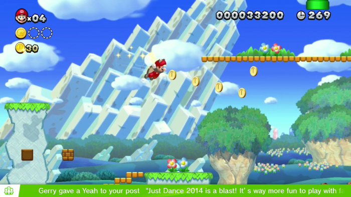
here's a rough mockup. It would need to be tweaked to look better and the text needs to be better formatted, but this is what i was thinking of.

wqpxtw.jpg


$̵̵͙͎̹̝̙̼̻̱͖̲̖̜̩̫̩̼̥͓̳̒̀ͨ̌̅ͮ̇̓ͮ̈͌̓̔̐͆ͩ̋͆ͣ́&̾̋͗̏̌̓̍ͥ̉ͧͣͪ̃̓̇̑҉͎̬͞^̸̠̬̙̹̰̬̗̲͈͈̼̯̞̻͎ͭ̐ͦ̋́̆̔̏̽͢$̻̜͕̜̠͔̮͐ͬ̍ͨͩͤͫ͐ͧ̔̆͘͝͞^̄̋̄͗̐ͯͮͨͣ͐͂͑̽ͩ͒̈̚͏̷͏̗͈̣̪͙̳̰͉͉̯̲̘̮̣̘͟ͅ&̐ͪͬ̑̂̀̓͛̈́͌҉҉̶̕͝*̗̩͚͍͇͔̻̬̼̖͖͈͍̝̻̪͙̳̯̌̅̆̌ͥ̊͗͆́̍ͨ̎̊̌͟͡$̶̛̛̙̝̥̳̥̣̥̞̝̱̺͍̭̹̞͔̠̰͇ͪ͋͛̍̊̋͒̓̿ͩͪ̓̓͘^̈ͥͩͭ͆͌ͣ̀̿͌ͫ̈́̍ͨ̇̾̚͏̢̗̼̻̲̱͇͙̝͉͝ͅ$̢̨̪̝̗̰͖̠̜̳̭̀ͥͭͨ̋ͪ̍̈ͮͣ̌^ͦ̏ͬ̋͑̿́ͮ̿ͨ̋̌ͪ̓̋̇͆͟҉̗͍$̛̪̞̤͉̬͙̦̋ͣͬ̒͗̀̍͗̾̽̓̉͌̔͂̇͒̚̕͜^̧͎̖̟̮͚̞̜̮̘͕̹͚̏ͩ͐ͯ͑̍̍̀͒͘*̿ͨ̽̈́͐ͭ̌̈͋̚͟͝҉͕̙*̨̢̭̭̤̺̦̩̫̲͇͕̼̝̯̇ͨ͗̓̃͂ͩ͆͂̅̀̀́̚̚͟%̨͚̙̮̣̭͖͕͙ͣ̽ͮͤ́ͫ̊̊̐̄̌ͣ͌̉̔͊̽̾ͨ^̢̹̭͍̬̖͇̝̝̬̱͈͔̹͉̫̿͛̄̿͊͆ͦ̃ͮͩ͌ͭ̔ͫ̆͞ͅͅ%̵̼̖̻̘ͪͤ̈̃̓̐̑ͩͭ̄̑͊ͫ̆̌̄͡*̴̮̪͕̗̩͇͇ͪ̑̊̈́́̀͞^̼̝̥̦͇̺̘̤̦͕̦̞͑̑ͯ̂ͯ̕͞%ͮͫ̿ͫ̊̈̔̍҉҉̴̸̡*̛̭̖͇͚̝̤̬̰̅̎ͥͯ̓͑̾ͬͨͮ́̕͝^̧̽͋̈ͤͮ̈́́̍ͧ̊҉͇̙̣̯̀́%̴̡̛̘͚͈̗̖̮̫̏̆ͦ̽̔̈̽͒͛̈


#30 Socalmuscle

Socalmuscle

    Hammer Bro.

  • Members
  • 1,677 posts

Posted 10 October 2013 - 02:33 PM

here's a rough mockup. It would need to be tweaked to look better and the text needs to be better formatted, but this is what i was thinking of.

wqpxtw.jpg


Great idea. Either there or at the top.


Now style it in a minimal Wii U style like ESPN, CNN, etc. do for their bottom of the screen tickers - and you are on to something.


Android and iPhone have a notification that pops up at the top as well. Not quite a marquee, but similar.


Your idea is a good one and it's unobtrusive.


Edited by Socalmuscle, 10 October 2013 - 02:33 PM.


#31 Kiki Neko-Chan

Kiki Neko-Chan

    Bullet Bill

  • Members
  • 399 posts
  • Fandom:
    Wii/U, The Sims

Posted 12 October 2013 - 04:34 PM

*
POPULAR

Something like this?

Attached Thumbnails

  • marionotifs.png

Add Mii on miiverse:

thewiiuguy


^ dayum what a creative name


#32 grahamf

grahamf

    The Happiness Fairy

  • Members
  • 2,532 posts

Posted 12 October 2013 - 05:23 PM

Muffin yeah! That's perfect!

$̵̵͙͎̹̝̙̼̻̱͖̲̖̜̩̫̩̼̥͓̳̒̀ͨ̌̅ͮ̇̓ͮ̈͌̓̔̐͆ͩ̋͆ͣ́&̾̋͗̏̌̓̍ͥ̉ͧͣͪ̃̓̇̑҉͎̬͞^̸̠̬̙̹̰̬̗̲͈͈̼̯̞̻͎ͭ̐ͦ̋́̆̔̏̽͢$̻̜͕̜̠͔̮͐ͬ̍ͨͩͤͫ͐ͧ̔̆͘͝͞^̄̋̄͗̐ͯͮͨͣ͐͂͑̽ͩ͒̈̚͏̷͏̗͈̣̪͙̳̰͉͉̯̲̘̮̣̘͟ͅ&̐ͪͬ̑̂̀̓͛̈́͌҉҉̶̕͝*̗̩͚͍͇͔̻̬̼̖͖͈͍̝̻̪͙̳̯̌̅̆̌ͥ̊͗͆́̍ͨ̎̊̌͟͡$̶̛̛̙̝̥̳̥̣̥̞̝̱̺͍̭̹̞͔̠̰͇ͪ͋͛̍̊̋͒̓̿ͩͪ̓̓͘^̈ͥͩͭ͆͌ͣ̀̿͌ͫ̈́̍ͨ̇̾̚͏̢̗̼̻̲̱͇͙̝͉͝ͅ$̢̨̪̝̗̰͖̠̜̳̭̀ͥͭͨ̋ͪ̍̈ͮͣ̌^ͦ̏ͬ̋͑̿́ͮ̿ͨ̋̌ͪ̓̋̇͆͟҉̗͍$̛̪̞̤͉̬͙̦̋ͣͬ̒͗̀̍͗̾̽̓̉͌̔͂̇͒̚̕͜^̧͎̖̟̮͚̞̜̮̘͕̹͚̏ͩ͐ͯ͑̍̍̀͒͘*̿ͨ̽̈́͐ͭ̌̈͋̚͟͝҉͕̙*̨̢̭̭̤̺̦̩̫̲͇͕̼̝̯̇ͨ͗̓̃͂ͩ͆͂̅̀̀́̚̚͟%̨͚̙̮̣̭͖͕͙ͣ̽ͮͤ́ͫ̊̊̐̄̌ͣ͌̉̔͊̽̾ͨ^̢̹̭͍̬̖͇̝̝̬̱͈͔̹͉̫̿͛̄̿͊͆ͦ̃ͮͩ͌ͭ̔ͫ̆͞ͅͅ%̵̼̖̻̘ͪͤ̈̃̓̐̑ͩͭ̄̑͊ͫ̆̌̄͡*̴̮̪͕̗̩͇͇ͪ̑̊̈́́̀͞^̼̝̥̦͇̺̘̤̦͕̦̞͑̑ͯ̂ͯ̕͞%ͮͫ̿ͫ̊̈̔̍҉҉̴̸̡*̛̭̖͇͚̝̤̬̰̅̎ͥͯ̓͑̾ͬͨͮ́̕͝^̧̽͋̈ͤͮ̈́́̍ͧ̊҉͇̙̣̯̀́%̴̡̛̘͚͈̗̖̮̫̏̆ͦ̽̔̈̽͒͛̈


#33 KeptMyWiiUAndLeftTheForums

KeptMyWiiUAndLeftTheForums

    Lakitu

  • Members
  • 2,337 posts
  • NNID:xWydrAx
  • Fandom:
    Smash Bros all day.

Posted 15 October 2013 - 09:57 AM

Something like this?

Dis I lyke. Dis has dat ninty feel. You na me?


Edited by xWydrAx, 16 October 2013 - 04:36 AM.

WAR IS PEACE

FREEDOM IS SLAVERY

IGNORANCE IS STRENGTH

LISTEN AND BELIEVE


#34 Mewbot

Mewbot

    I'm batman

  • Members
  • 2,027 posts
  • NNID:R00bot
  • Fandom:
    Legend of Zelda and Super Smash Bros.

Posted 15 October 2013 - 09:59 PM

It just needs personalisation in my opinion. Allow you to use a photo taken from the internet or something be used as a background.


Y U READ THIS?...WHY IS THERE TEXT HERE? LOL WTF
       bi5tzqg.gif
 

                                 Wii U ID : R00bot


#35 KeptMyWiiUAndLeftTheForums

KeptMyWiiUAndLeftTheForums

    Lakitu

  • Members
  • 2,337 posts
  • NNID:xWydrAx
  • Fandom:
    Smash Bros all day.

Posted 16 October 2013 - 04:37 AM

It just needs personalisation in my opinion. Allow you to use a photo taken from the internet or something be used as a background.

I have serious doubts nintendo will do that, as porn backgrounds are a given if this is allowed.


WAR IS PEACE

FREEDOM IS SLAVERY

IGNORANCE IS STRENGTH

LISTEN AND BELIEVE


#36 Dankey Kang

Dankey Kang

    Cheep-Cheep

  • Members
  • 126 posts
  • Fandom:
    Coding and Gaming!

Posted 16 October 2013 - 01:56 PM

Nice design :D


AlwaysNintendoLogo-e1402524089702.png


Check out Always Nintendo! It's your daily dose of Wii U and Nintendo 3DS news!


#37 Arkhandar

Arkhandar

    Dry Bones

  • Members
  • 479 posts
  • Fandom:
    Zelda, Metroid, Mario, Kirby, DK

Posted 22 October 2013 - 12:28 PM

Dis I lyke. Dis has dat ninty feel. You na me?


It's still "flat"-design orientated, so you've got to admit that not all aspects of the "flat" movement are bad.


If you try to fail and succeed, which have you done?

Posted Image

#38 KeptMyWiiUAndLeftTheForums

KeptMyWiiUAndLeftTheForums

    Lakitu

  • Members
  • 2,337 posts
  • NNID:xWydrAx
  • Fandom:
    Smash Bros all day.

Posted 22 October 2013 - 12:41 PM

It's still "flat"-design orientated, so you've got to admit that not all aspects of the "flat" movement are bad.

Lol I never said all the aspects are XD I quite like the flat look when used certain ways, but at the same time, I'm old enough to remember times when not everything was flat, and I liked it then, so why would I suddenly pretend like it sucks now?


WAR IS PEACE

FREEDOM IS SLAVERY

IGNORANCE IS STRENGTH

LISTEN AND BELIEVE


#39 Arkhandar

Arkhandar

    Dry Bones

  • Members
  • 479 posts
  • Fandom:
    Zelda, Metroid, Mario, Kirby, DK

Posted 22 October 2013 - 02:47 PM

*
POPULAR

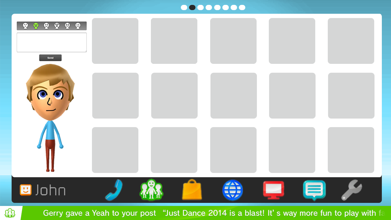
How about this guys?


Wii+U+Menu+-+by+Arkhandar.png


Edited by Arkhandar, 23 October 2013 - 01:11 PM.

If you try to fail and succeed, which have you done?

Posted Image

#40 grahamf

grahamf

    The Happiness Fairy

  • Members
  • 2,532 posts

Posted 22 October 2013 - 03:05 PM

That looks pretty nice. But take out the phone and put in a overflow button that contains the settings, electronic manual, statistics, etc. And instead of putting in a whole Miiverse panel just put in a button (below the mii) that brings up the post to miiverse screen.


have the white background only frame the apps, to make the separation between the apps and the Mii more clear. and center the top dots in that new frame.


After that it should be really awesome.


What's the phone for, anyways?


Edited by grahamf, 22 October 2013 - 03:07 PM.

$̵̵͙͎̹̝̙̼̻̱͖̲̖̜̩̫̩̼̥͓̳̒̀ͨ̌̅ͮ̇̓ͮ̈͌̓̔̐͆ͩ̋͆ͣ́&̾̋͗̏̌̓̍ͥ̉ͧͣͪ̃̓̇̑҉͎̬͞^̸̠̬̙̹̰̬̗̲͈͈̼̯̞̻͎ͭ̐ͦ̋́̆̔̏̽͢$̻̜͕̜̠͔̮͐ͬ̍ͨͩͤͫ͐ͧ̔̆͘͝͞^̄̋̄͗̐ͯͮͨͣ͐͂͑̽ͩ͒̈̚͏̷͏̗͈̣̪͙̳̰͉͉̯̲̘̮̣̘͟ͅ&̐ͪͬ̑̂̀̓͛̈́͌҉҉̶̕͝*̗̩͚͍͇͔̻̬̼̖͖͈͍̝̻̪͙̳̯̌̅̆̌ͥ̊͗͆́̍ͨ̎̊̌͟͡$̶̛̛̙̝̥̳̥̣̥̞̝̱̺͍̭̹̞͔̠̰͇ͪ͋͛̍̊̋͒̓̿ͩͪ̓̓͘^̈ͥͩͭ͆͌ͣ̀̿͌ͫ̈́̍ͨ̇̾̚͏̢̗̼̻̲̱͇͙̝͉͝ͅ$̢̨̪̝̗̰͖̠̜̳̭̀ͥͭͨ̋ͪ̍̈ͮͣ̌^ͦ̏ͬ̋͑̿́ͮ̿ͨ̋̌ͪ̓̋̇͆͟҉̗͍$̛̪̞̤͉̬͙̦̋ͣͬ̒͗̀̍͗̾̽̓̉͌̔͂̇͒̚̕͜^̧͎̖̟̮͚̞̜̮̘͕̹͚̏ͩ͐ͯ͑̍̍̀͒͘*̿ͨ̽̈́͐ͭ̌̈͋̚͟͝҉͕̙*̨̢̭̭̤̺̦̩̫̲͇͕̼̝̯̇ͨ͗̓̃͂ͩ͆͂̅̀̀́̚̚͟%̨͚̙̮̣̭͖͕͙ͣ̽ͮͤ́ͫ̊̊̐̄̌ͣ͌̉̔͊̽̾ͨ^̢̹̭͍̬̖͇̝̝̬̱͈͔̹͉̫̿͛̄̿͊͆ͦ̃ͮͩ͌ͭ̔ͫ̆͞ͅͅ%̵̼̖̻̘ͪͤ̈̃̓̐̑ͩͭ̄̑͊ͫ̆̌̄͡*̴̮̪͕̗̩͇͇ͪ̑̊̈́́̀͞^̼̝̥̦͇̺̘̤̦͕̦̞͑̑ͯ̂ͯ̕͞%ͮͫ̿ͫ̊̈̔̍҉҉̴̸̡*̛̭̖͇͚̝̤̬̰̅̎ͥͯ̓͑̾ͬͨͮ́̕͝^̧̽͋̈ͤͮ̈́́̍ͧ̊҉͇̙̣̯̀́%̴̡̛̘͚͈̗̖̮̫̏̆ͦ̽̔̈̽͒͛̈


0 user(s) are reading this topic

0 members, 0 guests, 0 anonymous users

Anti-Spam Bots!