I'm sure i'm not the only one, but I think the Wii U's OS design is really outdated compared to the Xbox 360/one or the PS3/4. So I decided I might as well make a concept of what I think nintendo should remove add and change. Also take note my photoshop skills aren't too swell.
If you love the Wii U's OS, you better get out of here while you can.
SIMPLE CONCEPT (hybrid of the Xbox 360, iOS 7 and Windows 8):
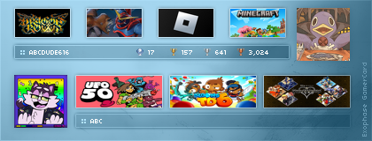
Home Menu Screen:
Your disc game is now a large icon on the home screen. All your Virtual Console games can be located inside the virtual console folder now (will be detailed in the next few pictures). The eShop is now a icon on the screen which can show you new games without the need to go into the store. The Wii Menu is now open in the background, and useable with the tap of the screen and opened in an instant. Friends list is now an app on the bottom bar. The background is also dynamic and changeable (iOS 7 background foolishly used here).

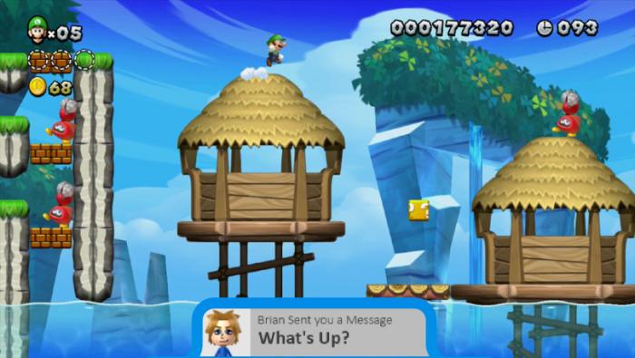
In game notifications:
Want to know if a friend is online? Miiverse comment? Message? Friend Request? Someone just trying to annoy you during your game session? In game notifications tell you that all without having to go into the suspend menu.

Still working on concepts for a party system and better profile.
Very nice!
While it does bear a resemblance to Metro UI, it is light years ahead of the shambles that make up the Wii U UI.
I am working on something as well and I hope someone somewhere at Nintendo gets the hint.
Even little kids want something that looks nice, neat, and "cool"
The truth is that all design is going more minimalist and "flat."
the key is to retain some elements that sparkle with character, but don't let it dominate the UI.
I have also found cheap, amateur graphical mistakes in the Nintendo Ui that I can't believe someone was paid to do.
I'm sure i'm not the only one, but I think the Wii U's OS design is really outdated compared to the Xbox 360/one or the PS3/4. So I decided I might as well make a concept of what I think nintendo should remove add and change. Also take note my photoshop skills aren't too swell.
If you love the Wii U's OS, you better get out of here while you can.
SIMPLE CONCEPT (hybrid of the Xbox 360, iOS 7 and Windows 8):
Home Menu Screen:
Your disc game is now a large icon on the home screen. All your Virtual Console games can be located inside the virtual console folder now (will be detailed in the next few pictures). The eShop is now a icon on the screen which can show you new games without the need to go into the store. The Wii Menu is now open in the background, and useable with the tap of the screen and opened in an instant. Friends list is now an app on the bottom bar. The background is also dynamic and changeable (iOS 7 background foolishly used here).
In game notifications:
Want to know if a friend is online? Miiverse comment? Message? Friend Request? Someone just trying to annoy you during your game session? In game notifications tell you that all without having to go into the suspend menu.
Still working on concepts for a party system and better profile.
Very nice!
While it does bear a resemblance to Metro UI, it is light years ahead of the shambles that make up the Wii U UI.
I am working on something as well and I hope someone somewhere at Nintendo gets the hint.
Even little kids want something that looks nice, neat, and "cool"
The truth is that all design is going more minimalist and "flat."
the key is to retain some elements that sparkle with character, but don't let it dominate the UI.
I have also found cheap, amateur graphical mistakes in the Nintendo Ui that I can't believe someone was paid to do.