Jump to content


Photo

nStream


  • Please log in to reply
9 replies to this topic

#1 peachy

peachy

    Spiked Goomba

  • Members
  • 13 posts
  • Fandom:
    Wii, Wii2, 3DS

Posted 26 April 2011 - 04:36 PM

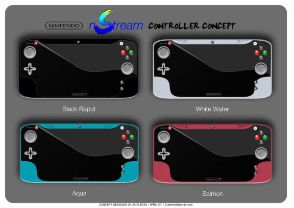
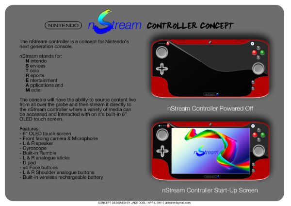
Here is my latest Nintendo creation called the nStream Controller. It is based on many of the rumors surrounding the successor to the Wii and is formally inspired by the visor of Samus.
Any feedback would be appreciated as I'll continue to develop the design over time.

Jade.
Posted Image
Posted Image

Edited by peachy, 27 April 2011 - 08:23 PM.


#2 peachy

peachy

    Spiked Goomba

  • Members
  • 13 posts
  • Fandom:
    Wii, Wii2, 3DS

Posted 27 April 2011 - 08:03 PM

I just completed the interface design to my nStream Controller Concept for Nintendo's next gen console.

HERE is a 62second mock-up video showing how the interface could operate and below are a few images of the interface.

Posted Image
Posted Image
Posted Image
Posted Image
Posted Image

Edited by peachy, 29 April 2011 - 05:05 PM.


#3 Ephesus

Ephesus

    Blooper

  • Members
  • 191 posts
  • Fandom:
    Star Trek, Fringe, NCIS, yoshis, fantasy

Posted 30 April 2011 - 04:58 AM

The design looks... *puts on shades* ...peachy. *intro scream*

Well, I believe console designing isn't something most of us are familiar with (especially myself), so I'm afraid constructive feedback will be fairly rare. I'll still try to provide you with some, with the mindset of a customer who wants to buy one of those.

The menu text is stylized and all, but it's hardly legible. Try spacing the characters a little more, and maybe experiment with less deformed fonts.
I like how the scrolling strip of text has a perspective.

Can't think of anything else right now, so... yeah.

These are my dragon persona Darren's parents. Or Darrents, if you will.

Posted Image


#4 peachy

peachy

    Spiked Goomba

  • Members
  • 13 posts
  • Fandom:
    Wii, Wii2, 3DS

Posted 17 May 2011 - 05:28 PM

The design looks... *puts on shades* ...peachy. *intro scream*

Well, I believe console designing isn't something most of us are familiar with (especially myself), so I'm afraid constructive feedback will be fairly rare. I'll still try to provide you with some, with the mindset of a customer who wants to buy one of those.

The menu text is stylized and all, but it's hardly legible. Try spacing the characters a little more, and maybe experiment with less deformed fonts.
I like how the scrolling strip of text has a perspective.

Can't think of anything else right now, so... yeah.


Thanks for the feedback Ephesus, I'll take that in to consideration for my development, cheers!
In the mean time I have this...

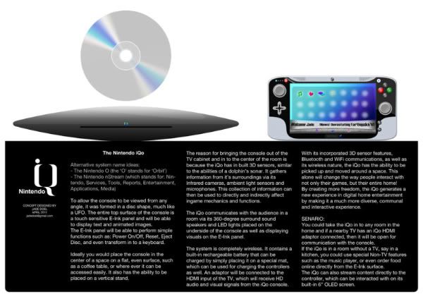
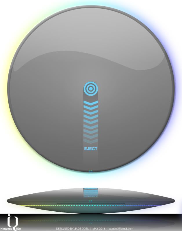
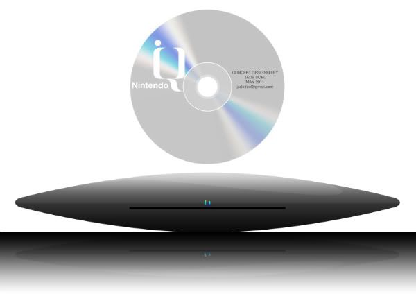
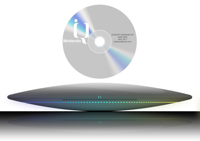
My idea for the console called the Nintendo iQo.

Video of Controller interface:
Video Here

Original larger images of console and controller here:
Console
Controller

Posted Image

Posted Image

Posted Image

Edited by peachy, 17 May 2011 - 05:55 PM.


#5 Feld0

Feld0

    Pokey

  • Members
  • 1,002 posts

Posted 17 May 2011 - 10:31 PM

Your concept for the iQuo is really cool, Jade, but I'd love to see what that e-ink screen looks like from the top. The ability to carry the console itself around the house is very interesting and unique, but I don't think it's very safe to move it around with a spinning disc and hard drive inside. Also, I have strong doubts about the possible battery life of the thing, if it's really going to be as freakishly powerful as the rumours say.

Still, props for the excellent concept. I got your email, and added it to the big mockups page on the blog.

P.S.: Next time, can you please only post your images once, and the link to them from the other relevant threads? Thanks. :P It makes it easier to see everyone's feedback on them when it's all on the same thread.

#6 peachy

peachy

    Spiked Goomba

  • Members
  • 13 posts
  • Fandom:
    Wii, Wii2, 3DS

Posted 18 May 2011 - 06:56 AM

Your concept for the iQuo is really cool, Jade, but I'd love to see what that e-ink screen looks like from the top. The ability to carry the console itself around the house is very interesting and unique, but I don't think it's very safe to move it around with a spinning disc and hard drive inside. Also, I have strong doubts about the possible battery life of the thing, if it's really going to be as freakishly powerful as the rumours say.

Still, props for the excellent concept. I got your email, and added it to the big mockups page on the blog.

P.S.: Next time, can you please only post your images once, and the link to them from the other relevant threads? Thanks. :P It makes it easier to see everyone's feedback on them when it's all on the same thread.


Hi Peter. Thanks for the feedback! Sorry about the multiple posts, I will take this in to consideration for next time.

I'm planning on doing a few images or perhaps a video of the e-ink screen.
I also had concerns for the safety of the console due to it's portability, but if you made it correctly and used the right components like an anti-shock disc drive and a hard drive with out moving parts, which are all possible - I think it'll be robust enough.
If my idea for a system cooling unit was incorporated, then the majority of the battery power will be consumed by the surround sound speakers and LED lights on the underside of the console. E-Ink uses microscopic amounts of energy and same with a hard drive with no moving parts.

I personally believe that the actual purpose of a conventional "video game console" needs to change. The gaming console hasn't really evolved since conception:
- You put it in a cupboard
- Plug it in to the back of a TV
- Load a game into it
- Power it on... And that's it!

These are the only times a person directly interact with it. I view this as a opportunity to change the gaming console as we know it today.
There sits all this incredible technology, doing nothing more than what is expected of it. By removing the console from the cabinet, placing it in the center of a space, and making it completely wireless and portable (let alone including an e-ink touch panel), I visualize a home gaming console finally exceeding its expectations and potential in an unconventional manner.


Posted Image

Posted Image

Posted Image

NEW VIDEOS:


Edited by peachy, 18 May 2011 - 08:48 PM.


#7 Blarg

Blarg

    Spiked Goomba

  • Members
  • 15 posts

Posted 24 May 2011 - 08:53 AM

The first controller seems a bit too much like a handheld system to me.
Posted Image

#8 Ruthie

Ruthie

    Blooper

  • Writers
  • 170 posts
  • Fandom:
    Mario, Final Fantasy, Uncharted, Ratchet

Posted 29 May 2011 - 01:17 PM

I like the colour schemes on the grey and black controllers, they look pretty slick. It does look like the screen is pretty much dominating the whole controller though.
Assistant Writer of Wii U Go and Vita/3DS enthusiast.

#9 AMAC

AMAC

    Pegasus

  • Members
  • 1,055 posts
  • Fandom:
    Yoshi, Ponies, Mario, Professor Layton

Posted 07 June 2011 - 09:29 AM

Hey, these mock ups are actually not to far from the actual controller. Here's a picture of the real thing:
Posted Image

#10 Camcam281

Camcam281

    Bob-omb

  • Members
  • 276 posts
  • Fandom:
    Kid icarus, Mario kart, and OoT :)

Posted 14 June 2011 - 01:53 PM

Yeah, that is really close! Keep up the good work! Awesome seeing people open up their eyes to see what should happen :D
Posted Image


2 user(s) are reading this topic

0 members, 2 guests, 0 anonymous users

Anti-Spam Bots!