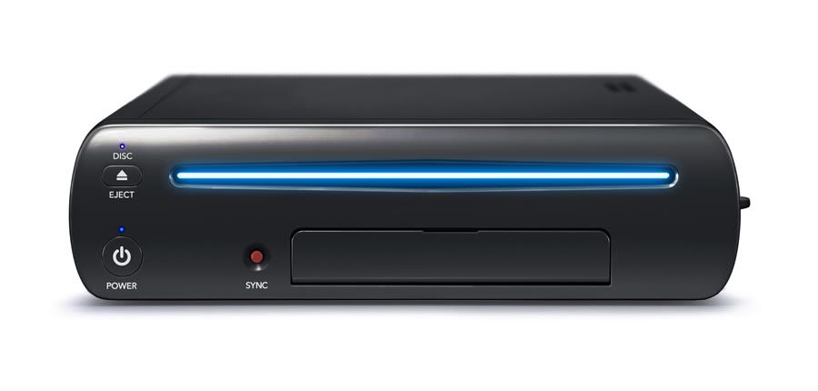
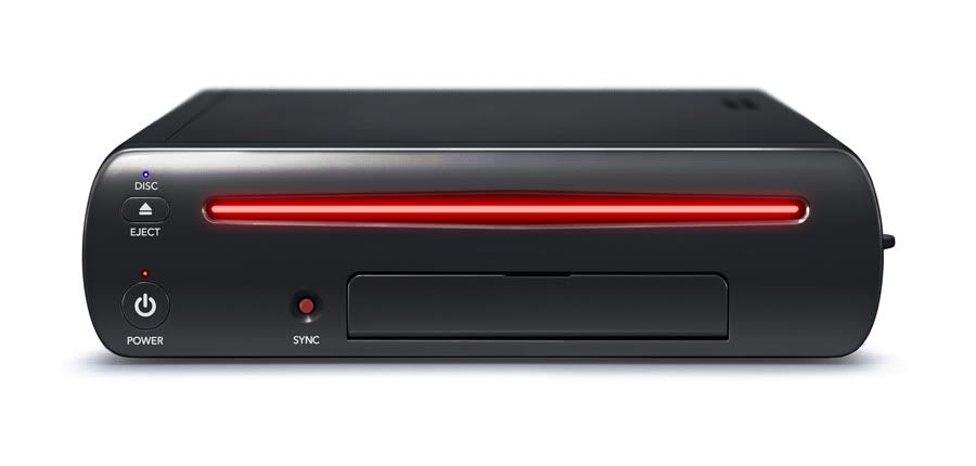
Wii U Console Redesign
#1

Posted 24 April 2012 - 08:04 PM
It just looks too much like the Wii, sure it sits horizontal when the Wii sat vertical (how the Wii sat was actually optional, but it was advertised and recommended to sit vertical.) The design for the actual Wii U console just looks too bland.
I am not really sure what Nintendo would change if they actually did this. (Maybe different colors would do the trick.) But I am sure they could find a way to make it look more interesting.
Thoughts?
#2

Posted 24 April 2012 - 08:05 PM
The console looks sexy though.I think that the console itself for the Wii U should be redesigned.
It just looks too much like the Wii, sure it sits horizontal when the Wii sat vertical (how the Wii sat was actually optional, but it was advertised and recommended to sit vertical.) The design for the actual Wii U console just looks too bland.
I am not really sure what Nintendo would change if they actually did this. (Maybe different colors would do the trick.) But I am sure they could find a way to make it look more interesting.
Thoughts?
- Keviin likes this
#3

Posted 24 April 2012 - 08:07 PM
The console looks sexy though.
Yeah it kinda does look sexy. But I think matte black would be even sexier. PLUS it would match my entertainment system and current consoles.

#4

Posted 24 April 2012 - 08:07 PM
#5

Posted 24 April 2012 - 08:08 PM
I think that the console itself for the Wii U should be redesigned.
It just looks too much like the Wii, sure it sits horizontal when the Wii sat vertical (how the Wii sat was actually optional, but it was advertised and recommended to sit vertical.) The design for the actual Wii U console just looks too bland.
I am not really sure what Nintendo would change if they actually did this. (Maybe different colors would do the trick.) But I am sure they could find a way to make it look more interesting.
Thoughts?
I deff agree. I think nintendo could really make it look really cool. I think they should at least change the color because your right, it looks a lot like the wii and then add something to it. Create a different shape or design with it. Make it look smoooth and shinnny
#6

Posted 24 April 2012 - 08:08 PM
Yeah it kinda does look sexy. But I think matte black would be even sexier. PLUS it would match my entertainment system and current consoles.
White just stands out on my entertainment system.
#7

Posted 24 April 2012 - 08:09 PM
I know what you mean, bro.But I disagree. (Duh)
#8

Posted 24 April 2012 - 08:10 PM
I deff agree. I think nintendo could really make it look really cool. I think they should at least change the color because your right, it looks a lot like the wii and then add something to it. Create a different shape or design with it. Make it look smoooth and shinnny
Exactly!
I know what you mean, bro.
Alright.
#9

Posted 24 April 2012 - 08:13 PM


Coming to your living room in 2012.
Edited by Sportsgamer, 24 April 2012 - 08:14 PM.
- Keviin, Dragon and patrickryan39 like this
#12

Posted 24 April 2012 - 08:16 PM
#14

Posted 24 April 2012 - 08:17 PM
It looks too uninspired though. I wish it was a little more creative.
Exactly my point.
#15

Posted 24 April 2012 - 08:18 PM
#16

Posted 24 April 2012 - 08:19 PM
It should be shorter but the front looks very nice look how cool these look.
Coming to your living room in 2012.
YESSSSSSSSSSSSSSSSSS!!!!!! I WILL TAKE THE ONE WITH NEON BLUE!!!!!
- Soastockton likes this

#17

Posted 24 April 2012 - 08:26 PM
I would say just release the console in both black or white, i don't why we should wait 2 years for a different colour.
Its obviously a marketing technique but i think everybody would prefer more choice at launch.

This is where it ends
#18

Posted 24 April 2012 - 08:28 PM
It should be shorter but the front looks very nice look how cool these look.
Coming to your living room in 2012.
Check out my artworks thread here on the forums
Follow me on 
#19

Posted 24 April 2012 - 08:52 PM
#20

Posted 24 April 2012 - 09:44 PM

0 user(s) are reading this topic
0 members, 0 guests, 0 anonymous users


