Jump to content


Photo

Fast Racing Neo Screens and Discussion


  • Please log in to reply
168 replies to this topic

#1 Raiden

Raiden

    wall crusher

  • Members
  • 4,738 posts

Posted 03 August 2014 - 09:43 AM

http://nintendoevery...ots-next-month/


What's another month? Even tho Shin'en never fails I have this feeling some might play the screens  because of the hype and anticipation didn't live up to what they had in mind. Still it's SHin'en so nou doubt be great looking.


#2 3Dude

3Dude

    Whomp

  • Section Mods
  • 5,482 posts

Posted 03 August 2014 - 01:03 PM

oh shiznet.

banner1_zpsb47e46d2.png


#3 NintendoReport

NintendoReport

    NintendoChitChat

  • Moderators
  • 5,907 posts
  • NNID:eddyray
  • Fandom:
    Nintendo Directs and Video Presentations

Posted 03 August 2014 - 01:29 PM

Wii U power


Keep Smiling, It Makes People Wonder What You Are Up To!
PA Magician | Busiest PA Magician | Magician Reviewed | Certified Magic Professionals

nccbanner_by_sorceror12-d9japra.png-- nintendoreportbox.png -- nintendo_switch_logo_transparent___wordm

#4 Mewbot

Mewbot

    I'm batman

  • Members
  • 2,027 posts
  • NNID:R00bot
  • Fandom:
    Legend of Zelda and Super Smash Bros.

Posted 04 August 2014 - 04:54 AM

12/10 will salivate.


Y U READ THIS?...WHY IS THERE TEXT HERE? LOL WTF
       bi5tzqg.gif
 

                                 Wii U ID : R00bot


#5 GAMER1984

GAMER1984

    Lakitu

  • Members
  • 2,036 posts
  • NNID:gamer1984
  • Fandom:
    Nintendo

Posted 04 August 2014 - 07:41 AM

About damn time. But seriously man they better cone with it. After all the talk about what WiiU can do and the long wait my Jaw needs to hit the floor

#6 Raiden

Raiden

    wall crusher

  • Members
  • 4,738 posts

Posted 04 August 2014 - 10:57 AM

About damn time. But seriously man they better cone with it. After all the talk about what WiiU can do and the long wait my Jaw needs to hit the floor

They did this with Wii and less than 40MB used.

nbaF5Em.jpg


#7 GAMER1984

GAMER1984

    Lakitu

  • Members
  • 2,036 posts
  • NNID:gamer1984
  • Fandom:
    Nintendo

Posted 04 August 2014 - 12:46 PM

They did this with Wii and less than 40MB used.
nbaF5Em.jpg

I know that's cool but they should have wait and not said anything rather than say early 2014 and here we are getting our first peak in September

#8 Raiden

Raiden

    wall crusher

  • Members
  • 4,738 posts

Posted 04 August 2014 - 12:55 PM

I know that's cool but they should have wait and not said anything rather than say early 2014 and here we are getting our first peak in September

I agree they let us know way to early. Perhaps they felt would not take this long. Whatever the case only a month away and I am confident they will look very nice. Mind you anything Wii U can do a PC can do miles better but pretty sure like Art of Balance U it will be very nice looking. I mean Nano Assault Neo was done ina very short amount of time and looked nice and barely even used 1 core of the CPU and the game looked and played well.


Edited by Ryudo, 04 August 2014 - 12:56 PM.


#9 GAMER1984

GAMER1984

    Lakitu

  • Members
  • 2,036 posts
  • NNID:gamer1984
  • Fandom:
    Nintendo

Posted 04 August 2014 - 01:19 PM

I agree they let us know way to early. Perhaps they felt would not take this long. Whatever the case only a month away and I am confident they will look very nice. Mind you anything Wii U can do a PC can do miles better but pretty sure like Art of Balance U it will be very nice looking. I mean Nano Assault Neo was done ina very short amount of time and looked nice and barely even used 1 core of the CPU and the game looked and played well.


Everyone will be watching

#10 3Dude

3Dude

    Whomp

  • Section Mods
  • 5,482 posts

Posted 04 August 2014 - 02:31 PM

Im guessing we are going to see some very very dense backgrounds. Lots of trees, buildings etc.

banner1_zpsb47e46d2.png


#11 GAMER1984

GAMER1984

    Lakitu

  • Members
  • 2,036 posts
  • NNID:gamer1984
  • Fandom:
    Nintendo

Posted 04 August 2014 - 08:57 PM

Im guessing we are going to see some very very dense backgrounds. Lots of trees, buildings etc.


Well my body is ready... been ready since January 1st 2014 to be honest.


#12 Ghost

Ghost

    BASEDGOD

  • Members
  • 376 posts

Posted 05 August 2014 - 01:44 AM

http://nintendoevery...ots-next-month/


What's another month? Even tho Shin'en never fails I have this feeling some might play the screens  because of the hype and anticipation didn't live up to what they had in mind. Still it's SHin'en so nou doubt be great looking.


They are the only people I think who could take on Pokemon or Zelda and still maintain at a decent level maybe even better.  


#13 Socalmuscle

Socalmuscle

    Hammer Bro.

  • Members
  • 1,677 posts

Posted 05 August 2014 - 11:07 PM

Dang. Almost forgot about this game.

Hope it looks good.

WW know on a technical level, it will be impressive under the hood.

But it is possible to do everything right and "miss" the boat based in public perception of what art style looks nice.

You look at Project Cars for example and it looks unbelievable.

But the art style is realistic. So it's a certain target.

Fast racing is going for a sci if futuristic look with high res sharp textures.

There is going to be a priority on speed, so it goes without saying there wil need to be some trade offs.

However, this is a team that is known for maximizing what is available.

So once again highly interested. Though the shifting timetables always seem to affect enthusiasm.

#14 megafenix

megafenix

    Blooper

  • Members
  • 169 posts

Posted 17 September 2014 - 07:09 PM

Dang. Almost forgot about this game.

Hope it looks good.

WW know on a technical level, it will be impressive under the hood.

But it is possible to do everything right and "miss" the boat based in public perception of what art style looks nice.

You look at Project Cars for example and it looks unbelievable.

But the art style is realistic. So it's a certain target.

Fast racing is going for a sci if futuristic look with high res sharp textures.

There is going to be a priority on speed, so it goes without saying there wil need to be some trade offs.

However, this is a team that is known for maximizing what is available.

So once again highly interested. Though the shifting timetables always seem to affect enthusiasm.

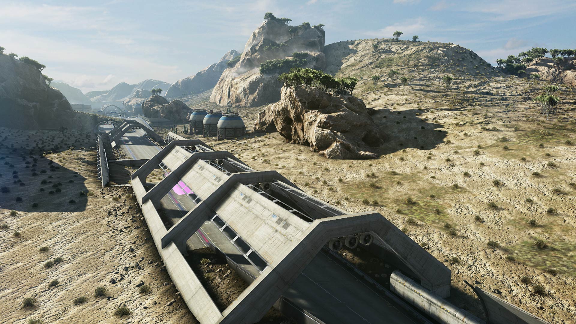
oh it does, here

FastRacingNeo1.jpg


it loos pretty good to me, the terrain and the rocks have pretty good lod and judging by the geometry and the shadows seems they used tessellation with dispalcements here


#15 3Dude

3Dude

    Whomp

  • Section Mods
  • 5,482 posts

Posted 17 September 2014 - 08:35 PM

oh it does, here

FastRacingNeo1.jpg


it loos pretty good to me, the terrain and the rocks have pretty good lod and judging by the geometry and the shadows seems they used tessellation with dispalcements here


No tesselation w/displacement maps. Thats just good lighting, shadow maps, ssao, and excellent ibl tricks


banner1_zpsb47e46d2.png


#16 Mewbot

Mewbot

    I'm batman

  • Members
  • 2,027 posts
  • NNID:R00bot
  • Fandom:
    Legend of Zelda and Super Smash Bros.

Posted 18 September 2014 - 06:22 PM

No tesselation w/displacement maps. Thats just good lighting, shadow maps, ssao, and excellent ibl tricks


it loos pretty good to me, the terrain and the rocks have pretty good lod and judging by the geometry and the shadows seems they used tessellation with dispalcements here

Oh_Boy_here_we_go_again_413978.jpg

You two, always getting in fights.


Y U READ THIS?...WHY IS THERE TEXT HERE? LOL WTF
       bi5tzqg.gif
 

                                 Wii U ID : R00bot


#17 Socalmuscle

Socalmuscle

    Hammer Bro.

  • Members
  • 1,677 posts

Posted 19 September 2014 - 12:26 AM

Yeah, can't really tell if there is tessellation present or not unless you see it moving.

The environment shadows look great. So do the models (except the large racetrack enclosure... Not overly thrilled with that. Low poly and some old tricks used to flesh out geometry with texture maps pretending to be geometry. But a team that small putting out a game this fast that looks this amazing... Nor prob. Just being hyper critical. The reason it stands out so much is directly due to just how outstanding everything else looks. ) and textures.

But the shadow where the large track enclosure meets the "land" area is really old school. Would be nice to dial down the "photoshop drop shadow effect" there.

Now I'm excited to see the vehicle models.

So glad they chose a realistic art direction.

#18 3Dude

3Dude

    Whomp

  • Section Mods
  • 5,482 posts

Posted 19 September 2014 - 07:09 AM

Yeah, can't really tell if there is tessellation present or not unless you see it moving.

The environment shadows look great. So do the models (except the large racetrack enclosure... Not overly thrilled with that. Low poly and some old tricks used to flesh out geometry with texture maps pretending to be geometry. But a team that small putting out a game this fast that looks this amazing... Nor prob. Just being hyper critical. The reason it stands out so much is directly due to just how outstanding everything else looks. ) and textures.

But the shadow where the large track enclosure meets the "land" area is really old school. Would be nice to dial down the "photoshop drop shadow effect" there.

Now I'm excited to see the vehicle models.

So glad they chose a realistic art direction.


Not sure what you are seeing with the racetrack overhead, it is simple, but by design, its supposed to be a trapezoid, and Im not sure what you are seeing with the textures trying to emulate geometry, as it appears to be completely smooth slabs of concrete beams in the shape of a trapezoid. If it was trying to shave polies, it would do it on the perfectly round er... air conditioning units on the underside. Why is the track air conditioned? In the open desert? Does anyone know what else those units could be? Anyways, another reason I dont think this is a low poly shortcut is because in several instances down the track it switches from the trapezoid to a perfectly smooth half dome.

A good example of what I think you were talking about can be made note of with the trees in the background, especially the trees on the nearest rock, as they are close enough to see that they are, in fact, completely flat like billboards, but given the illusion of being full trees by very well done lighting and shading.

As for the photoshop drop shadow, if its what I think you are talling about, the strip on the left side of the track, thats actually not a shadow at all. From where the light source is (sun) overhead and on the left side, and seeing how the shadows of everything is casted from left to right, and rather long indicating time of day/angle) we can tell that the sun is rising (assuming the track is heading south, as it doesnt look like a setting scene) we can tell that there in fact, should be no cast shadow at all there, as that is the side and direction the sun is on and coming from.

So, what is it? Well, its an approximation on global illumination called ambient occlusion. As opposed to a shadow, which is cast by an object blocking light leaving a shadow in its shape, what we have here is the simulation of bouncing light not making it into that corner.

The majority of the light hits the ground, bounces off and up, and hits the concrete and reflects away, leaving a portion of the ground now without as much light.

*update* Megaphenix asked shin en about tesselation and got a response, good job phenix!

@ megafenix64 2d
@ShinenGames wow, the geometry looks
so real and shadows seem to respect the
bumpy areas of the silhouette,must likely
tessellation work
View details ·
Shin'en Multimedia
@ ShinenGames
1d
@megafenix64 @ShinenGames We used
a lot of 3D scanning. Great results but
hard to work with >1GB files for a single
mesh...


So it is indeed ibl, thanks for the confirmation phenix. Fantastic ibl results, the ibl looks really great.

banner1_zpsb47e46d2.png


#19 Socalmuscle

Socalmuscle

    Hammer Bro.

  • Members
  • 1,677 posts

Posted 19 September 2014 - 09:21 AM

Not sure what you are seeing with the racetrack overhead, it is simple, but by design, its supposed to be a trapezoid, and Im not sure what you are seeing with the textures trying to emulate geometry, as it appears to be completely smooth slabs of concrete beams in the shape of a trapezoid. If it was trying to shave polies, it would do it on the perfectly round er... air conditioning units on the underside. Why is the track air conditioned? In the open desert? Does anyone know what else those units could be? Anyways, another reason I dont think this is a low poly shortcut is because in several instances down the track it switches from the trapezoid to a perfectly smooth half dome.A good example of what I think you were talking about can be made note of with the trees in the background, especially the trees on the nearest rock, as they are close enough to see that they are, in fact, completely flat like billboards, but given the illusion of being full trees by very well done lighting and shading.As for the photoshop drop shadow, if its what I think you are talling about, the strip on the left side of the track, thats actually not a shadow at all. From where the light source is (sun) overhead and on the left side, and seeing how the shadows of everything is casted from left to right, and rather long indicating time of day/angle) we can tell that the sun is rising (assuming the track is heading south, as it doesnt look like a setting scene) we can tell that there in fact, should be no cast shadow at all there, as that is the side and direction the sun is on and coming from.So, what is it? Well, its an approximation on global illumination called ambient occlusion. As opposed to a shadow, which is cast by an object blocking light leaving a shadow in its shape, what we have here is the simulation of bouncing light not making it into that corner.The majority of the light hits the ground, bounces off and up, and hits the concrete and reflects away, leaving a portion of the ground now without as much light.*update* Megaphenix asked shin en about tesselation and got a response, good job phenix!
@ megafenix64 2d
@ShinenGames wow, the geometry looks
so real and shadows seem to respect the
bumpy areas of the silhouette,must likely
tessellation work
View details ·
Shin'en Multimedia
@ ShinenGames
1d
@megafenix64 @ShinenGames We used
a lot of 3D scanning. Great results but
hard to work with >1GB files for a single
mesh...
So it is indeed ibl, thanks for the confirmation phenix. Fantastic ibl results, the ibl looks really great.


I appreciate the amazing graphics on display in that one screen. Very much so in fact.

But I'm also objectively critiquing as well. I can do the same with any game on any console.

Obviously the budget and time constraints here are so much more sever than say Bungie and Activision and the massive staff that worked on destiny (which won't be moving near as fast. Lol) And I have found some rare compromises there too.

But the graphical fidelity here is the winner. The racetrack is supposed to be trapezoid and I'm sure polygon budget came into play with that design decision. There are a lot of polygons already in the environment. Factor in the race vehicles and the. The sheer speed at which you'll be racing, and it's very much an achievement. And the polygons trying to be geometry aren't where you're looking.

They are specifically the piping and/ or support structures laid on invisible polygons as texture maps on the upper end of the structure.

But the shadow the meets the ground from the structure... I'm still hoping they rethink that. It is a shadow effect. Looks like an extra texture layer. And it beyond respecting the lighting, there are many issues with it. May just be wanting to actually ship the game now. But there is still time. Everything else is so perfect that's something like that is almost jarring.

Edited by Socalmuscle, 19 September 2014 - 09:23 AM.


#20 3Dude

3Dude

    Whomp

  • Section Mods
  • 5,482 posts

Posted 19 September 2014 - 11:24 AM

I appreciate the amazing graphics on display in that one screen. Very much so in fact.

But I'm also objectively critiquing as well. I can do the same with any game on any console.

Obviously the budget and time constraints here are so much more sever than say Bungie and Activision and the massive staff that worked on destiny (which won't be moving near as fast. Lol) And I have found some rare compromises there too.

But the graphical fidelity here is the winner. The racetrack is supposed to be trapezoid and I'm sure polygon budget came into play with that design decision. There are a lot of polygons already in the environment. Factor in the race vehicles and the. The sheer speed at which you'll be racing, and it's very much an achievement. And the polygons trying to be geometry aren't where you're looking.

They are specifically the piping and/ or support structures laid on invisible polygons as texture maps on the upper end of the structure.

But the shadow the meets the ground from the structure... I'm still hoping they rethink that. It is a shadow effect. Looks like an extra texture layer. And it beyond respecting the lighting, there are many issues with it. May just be wanting to actually ship the game now. But there is still time. Everything else is so perfect that's something like that is almost jarring.


Oh, I see what you are talking about now. I dont really put to much care into scrutinizing low-mid lod assets, beyond do they transition to the close lod smoothly. Its kind of like concentrating on mid-far mipmaps. Although I dont think they are trying to be textured to look round. They look like they are supposed to be flat, thin rectangular prisms. With the hdr image based lighting they are using, if they wanted them to look round with the texture, the texture would look round as hell, as far as the texture is concerned anyways. Its shaded as if it were a flat peice of metal, and while I agree using that technique with something thats supposed to be round, like pipes is an eye sore, using it on something thats already supposed to be flat... doesnt look that out of place. At least the mid lod, looking at the picture on my monitor now, the far lod used on the last 2 sections actually DOES look pretty out of place. So yeah, totally. Still Im more concerned with how the transition to the close lod 3d model will be jarring or not, as you will never see the game from this angle as you will be on the track.

If you are looking to run a critical eye on something, dont forget to also look at the nearest group of trees, they arent supposed to be flat like billboards.

As for the shading on the left hand side, nope not a shadow, thats 100% Screen Space Ambient Occlusion, and a damn fine job at it too. Probably the best example of showing what ssao does for corners in terrain that ive seen in a long time.

If only I could get an ssao off version it would easily replace this for obvious/easiest visualization of ssao.
IugX91V.png

As its still a complex scene in frneo, but the ssao is really obvious and well done. And well, any active global illumination technique is the exact opposite of 'old school shading', even an approximation like ssao, and especially when its this well done.

banner1_zpsb47e46d2.png


4 user(s) are reading this topic

0 members, 4 guests, 0 anonymous users

Anti-Spam Bots!