New Xeno Title!
#1

Posted 23 January 2013 - 09:19 PM
All I could think of is that Monster Hunter Tri Ultimate might have to be pushed aside..... I WANT THIS GAME
#2

Posted 23 January 2013 - 11:49 PM
#3

Posted 23 January 2013 - 11:56 PM
#4

Posted 24 January 2013 - 05:00 AM
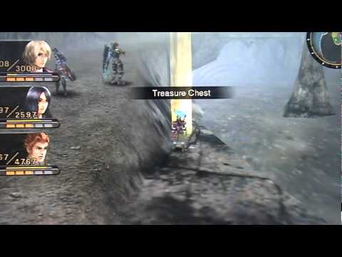
Character Models are are awesome! But I hope the game is more colorful in the future
Ive seen this sentiment echoed a lot, and everytime i see it i cant help but think how short sighted it is.
Weve seen one environment. And on top of that, there are still freaking neon colors all over the place. There are many environments in xenoblade i could pick that would be just as 'in need of color'.
I never got into the Xeno games in the past, but when i saw this video on nintendo direct, i instantly wanted to jump in and play it. Looks great!
There is only one xeno game this is like, and thats the most recent, Xenoblade. Xenogears and xenosaga, while made by some of the same people, have nothing in common gameplay wise with xenoblade and X.
If you like the looks of this, find a way to pick up Xenoblade to pass the time.
- ChrisTerror likes this

#5

Posted 24 January 2013 - 06:30 AM
Some people always have a cellphone on them. I'm so awesome I always have a 3DS.
Check out my blog! Portal's Portal
#6

Posted 24 January 2013 - 07:34 AM

#7

Posted 24 January 2013 - 08:03 AM
Ill probably get this if I end up liking Monster Hunter.
What? why? That doesnt make any sense. Monster hunter couldnt be any more different from xenoblade/x.

#8

Posted 24 January 2013 - 08:17 AM
What? why? That doesnt make any sense. Monster hunter couldnt be any more different from xenoblade/x.
Ive never played either.

#9

Posted 24 January 2013 - 10:14 AM
Ive never played either.
Well you definately cant use one as a measuring stick for the other.
You can use xenoblade however to gauge if youd be interested in x, as x appears to be a bigger better wverything xenoblade on super steroids.

#10

Posted 24 January 2013 - 10:47 AM
Obviously it's an exclusive and built specifically for Wii U, but from looking at the textures, scale, enemies etc it really looks HUGE. Remember the "low Wii U bandwidth" comments and watch the vid again, there is no way thoses textures and details with such a high draw distance could be done om "low bandwidth".
ZombiU demo from E3 looked slightly better than final build because they went OTT on film grain, Wonderful 101 has impressive shaders etc not possible on PS3 or 360.
So the only way we can judge Wii U's real power is from exclusives built from the ground up.
#11

Posted 24 January 2013 - 11:40 AM
Ive seen this sentiment echoed a lot, and everytime i see it i cant help but think how short sighted it is.
Weve seen one environment. And on top of that, there are still freaking neon colors all over the place. There are many environments in xenoblade i could pick that would be just as 'in need of color'.
There aren't neon colors though. I took a quick look again and everything is slightly desaturated, even during broad daylight and during the sunset scenes. It has a wide range of colors, yes, but none of those are "neon".

#12

Posted 24 January 2013 - 11:51 AM
Thoughts:
The textures and shadow effects looked really good
The sword used wasn't the Monado (so its probably not a sequel)
the game looked like it had at least a 4 member party size
The dude at the end looked like Shulk from XBC (but knowing Monolithsoft it could just as well be a similar-looking character)
#13

Posted 24 January 2013 - 12:13 PM

^Made by me.^
#14

Posted 24 January 2013 - 12:21 PM
There aren't neon colors though. I took a quick look again and everything is slightly desaturated, even during broad daylight and during the sunset scenes. It has a wide range of colors, yes, but none of those are "neon".
I don't think it's desaturated enough to make the game look bad, but it's definitely a bit duller than say, real life visuals regardless of whether or not there's literally rainbows all over the game. I think it'd look a little nicer if the sunnier spots were a bit more saturated compared to the less well lit areas but it's an artistic direction and honestly I didn't even notice it the first time I watched it
Look again at the neon transforming mechs, and the neon bioluminescence enemies begin to give off as it gets dark.
What you are talking about isnt desaturation. Its volumetric air space. it simulates the effect of particulate matter in the air. And this is one of tbe best examples ive ever seen. It actually has variations of density in multiple locations at sirprising differences in distance, many farther out than devs would ever bother with.... In fact it may be animated or part of a cycle, an advanced part of X's version of xenoblades very varied weather/environment system. As for the color scheme said effect makes. Reminds me a lot of Nevada honestly.
Regaurdless, your assumption was still very short sighted. Just look at xeno lades Satorl marsh.

Ew! theres no colors! The whole gamez colorless and desaturated!

Yeah! that game gets it! thoughs colors are way better!
Same game, same place, just different time.
Edited by 3Dude, 24 January 2013 - 12:46 PM.
- routerbad likes this

#15

Posted 24 January 2013 - 12:33 PM
#16

Posted 24 January 2013 - 12:39 PM
Lolwat. I thought we were having a decent discussion until I saw your edit. How is me suggesting people think it lacks color because it appears slightly desaturated being short sighted? Regardless of special air effects, the end result is less saturation variance, and a lack of true neon colors. Colors such as the glowing and bio-luminescence are only bright by comparison, but not "neon". I think you may be trying to defend the game too hard, especially as I said "it still looks good and it's an artistic direction". :/ I was just trying to give an artistic input but if you're closed off to other's opinions then that's fine.Look again at the neon transforming mechs, and the neon bioluminescence enemies begin to give off as it gets dark.
What you are talking about isnt desaturation. Its volumetric air space. it simulates the effect of particulate matter in the air. And this is one of tbe best examples ive ever seen. It actually has variations of density in multiple locations at sirprising differences in distance, many farther out than devs would ever bother with.... In fact it may be animated or part of a cycle, an advanced part of X's version of xenoblades very varied weather/environment system. As for the color scheme said effect makes. Reminds me a lot of Nevada honestly.
Regaurdless, your assumption was still very short sighted. Just look at xeno lades Satorl marsh.
Edited by Ixchel, 24 January 2013 - 12:40 PM.

#17

Posted 24 January 2013 - 12:55 PM
Lolwat. I thought we were having a decent discussion until I saw your edit. How is me suggesting people think it lacks color because it appears slightly desaturated being short sighted? Regardless of special air effects, the end result is less saturation variance, and a lack of true neon colors. Colors such as the glowing and bio-luminescence are only bright by comparison, but not "neon". I think you may be trying to defend the game too hard, especially as I said "it still looks good and it's an artistic direction". :/ I was just trying to give an artistic input but if you're closed off to other's opinions then that's fine.
You made a sweeping decision of the entire games direction based off seconds worth of glimpses of 1 area, in the same time/weather cycle.
shortsighted - lacking foresight or
scope; "a short view of the problem";
My pictures of satorl marsh during different states shows exactly why were you being short sighted.
Im guessing you probably never played xenoblade, where an area goes from drab and unremarkable to alien and fantastical literally, like the changing of the weather... Cause if you had, you wouldnt have jumped to the assumptions you did so callously.

#18

Posted 24 January 2013 - 01:02 PM
I think you're not reading into my intent correctly. I don't even know what assumption you think I made. All I said was that the video has a slight desaturated look and that may be why some people thinks it needs more color. People's opinions are being formed on that video, the other areas/cycles are irrelevant to the point I was making. :/You made a sweeping decision of the entire games direction based off seconds worth of glimpses of 1 area, in the same time/weather cycle.
shortsighted - lacking foresight or
scope; "a short view of the problem";
My pictures of satorl marsh during different states shows exactly why were you being short sighted.
Im guessing you probably never played xenoblade, where an area goes from drab and unremarkable to alien and fantastical literally, like the changing of the weather... Cause if you had, you wouldnt have jumped to the assumptions you did so callously.
Your mocking is rather unprofessional, especially as I never stated a negative view of this game.

#19

Posted 24 January 2013 - 01:43 PM
I think you're not reading into my intent correctly. I don't even know what assumption you think I made. All I said was that the video has a slight desaturated look and that may be why some people thinks it needs more color. People's opinions are being formed on that video, the other areas/cycles are irrelevant to the point I was making. :/
Your mocking is rather unprofessional, especially as I never stated a negative view of this game.
You were the one who responded to my post, you should have paid attention to the context of the situation you were entering.
There is no mocking, short sighted is an adjective properly used for your failure to think about how the way the area looks in the breif snippet you used to judge it 'being in need of color' could change so much so as to be completely unreconizable, as was the case often in its predecessor, the impact of these colorful and exciting areas were directly dependent on the high contrast juxtaposition of their less colorful forms, as my demonstration pictures of the satorl marsh clearly illustrate.
You are going to say, 'but i didnt know that', To which i reply, thats what it means to be short sighted on a matter. Its not mocking, its vocabulary.
Edited by 3Dude, 24 January 2013 - 01:46 PM.

#20

Posted 24 January 2013 - 02:03 PM
I did pay attention to the context.You were the one who responded to my post, you should have paid attention to the context of the situation you were entering.
There is no mocking, short sighted is an adjective properly used for your failure to think about how the way the area looks in the breif snippet you used to judge it 'being in need of color' could change so much to be completely unreconizable, as was the case often in its predecessor, the impact of these colorful and exciting areas were directly dependent on the high contrast juxtaposition of their less colorful forms, as my demonstration pictures of the satorl marsh clearly illustrate.
You are going to say, 'but i didnt know that', To which i reply, thats what it means to be short sighted on a matter. Its not mocking, its vocabulary.
You complained: "I don't see how people thinks the game needs more color, the video has enough color for me."
I answered: "The video is a little desaturated in addition to not having much variance in saturation, which may be why some people feel it needs more color"
I provided insight to other people's opinions, nothing more. My answer was appropriate.
Now you're bringing other context into this. I'm sorry but no matter how much the game later looks like Nintendo Land or not (honestly the screenshot you showed to be "colorful" was basically duochromatic and also has variance issues) is completely irrelevant and useless information that I may as well not know. I never said it needed color, if you read back. The closest I said was that it would look nicer if the sunlight provided more saturation variance than it currently does. Which is a lot different than making every color fullblown neon which you seem to think I want.
I can see it's not worth my time continuing this with you. Jeeze, sorry I tried to help.

1 user(s) are reading this topic
0 members, 1 guests, 0 anonymous users


