Jump to content


Photo

New Xeno Title!


  • Please log in to reply
46 replies to this topic

#41 3Dude

3Dude

    Whomp

  • Section Mods
  • 5,482 posts

Posted 26 January 2013 - 06:06 AM

On Neogaf everybody thinks the same as I do with the colors.


No, only everybody who hasnt played xenoblade and thus doesnt know any better.

Its called contrast and juxtaposition. If all your areas are bright and colorful, it dilutes the impact with a constant barrage of sameness. This area appears to be arid plains/desert, the color scheme and light scattering is appropriate (and incredibly well done), and, knowing xenoblade, can easily transform at the drop of a hat. Or change of the time, or weather, or (literally) earth shattering event.

An overly simplistic and shortsighted notion.

Edited by 3Dude, 26 January 2013 - 06:09 AM.

banner1_zpsb47e46d2.png


#42 Chaz

Chaz

    Red Koopa Troopa

  • Members
  • 50 posts
  • Fandom:
    Pikmin, Animal Crossing

Posted 26 January 2013 - 08:08 AM

No, only everybody who hasnt played xenoblade and thus doesnt know any better.

Its called contrast and juxtaposition. If all your areas are bright and colorful, it dilutes the impact with a constant barrage of sameness. This area appears to be arid plains/desert, the color scheme and light scattering is appropriate (and incredibly well done), and, knowing xenoblade, can easily transform at the drop of a hat. Or change of the time, or weather, or (literally) earth shattering event.

An overly simplistic and shortsighted notion.


Choice of color palette aside, the overall look does look a little off. Light scattering looks appropriate on the far away objects and gives the game a nice sense of scale with the big monsters, but close to the camera it wouldn't account for the lack on contrast on the main characters. There are no blacks anywhere in this trailer outside of the cards which looks incorrect.

#43 3Dude

3Dude

    Whomp

  • Section Mods
  • 5,482 posts

Posted 26 January 2013 - 08:30 AM

Choice of color palette aside, the overall look does look a little off. Light scattering looks appropriate on the far away objects and gives the game a nice sense of scale with the big monsters, but close to the camera it wouldn't account for the lack on contrast on the main characters. There are no blacks anywhere in this trailer outside of the cards which looks incorrect.


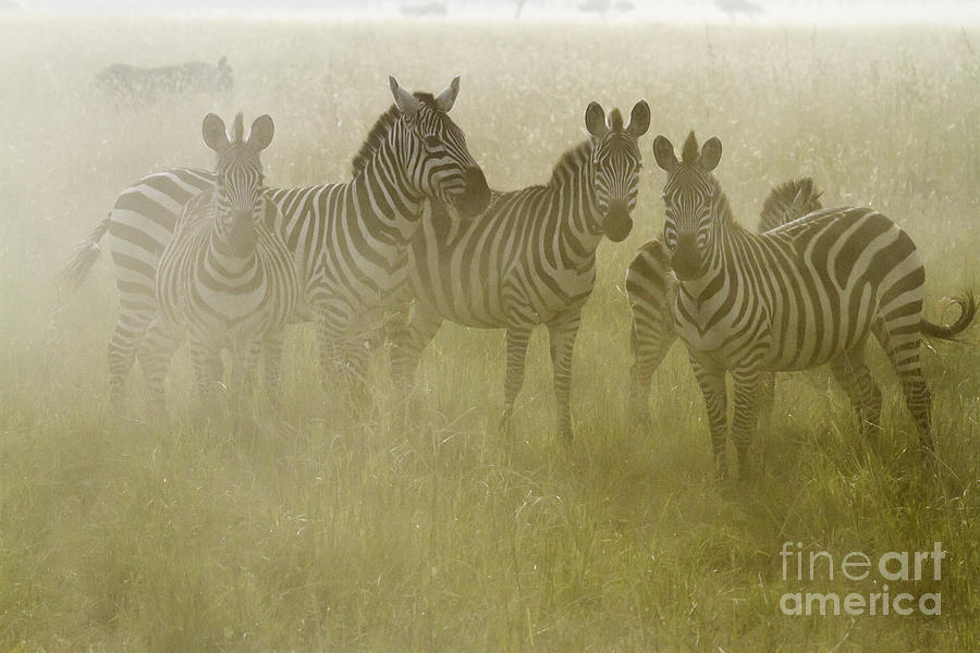
Welcome to modern lighting solutions, and a system powerful enough for mass soft shadowing. Have any of you ever been in an arid area like this? At times their is so much dust in the air it diffuses sunlight.

Although my Mojave is a lot more red than this, this looks more like the plains of africa, nevertheless, the dust in the air gives the same effect.

Posted Image

Its Dusty, as it should be judging by the dry arid environment. They are doing an immaculant job, and people might want to save their comments for environments that are not SUPPOSED to look like this.

Edited by 3Dude, 26 January 2013 - 08:31 AM.

banner1_zpsb47e46d2.png


#44 syks-1

syks-1

    Dry Bones

  • Members
  • 479 posts

Posted 26 January 2013 - 08:46 AM

ITS NOT FINISHED!!!!! lol :)

#45 3Dude

3Dude

    Whomp

  • Section Mods
  • 5,482 posts

Posted 26 January 2013 - 09:08 AM

ITS NOT FINISHED!!!!! lol :)


I dont expect the final product of this area to look much different from this. I see a few cache/z test misses being brandished as 'horrible popin' by desperate fanboys on gaf (protip gaf, popin doesnt happen IN FRONT OF already rendered foilage) That will be fixed, probably things like particle effects and combat effects will be spruced up, But none of thats directly related to the main environment shown. maybe the water will get a few more layers... Again though, this isnt specific to the environment shown. It looks pretty finished, and it looks pretty damn good, really damn good, for monolithsofts first generation wii u game.

I would however, expect other areas not shown yet to look VERY different.

Edited by 3Dude, 26 January 2013 - 09:20 AM.

banner1_zpsb47e46d2.png


#46 Jin

Jin

    Goomba

  • Members
  • 5 posts

Posted 28 January 2013 - 09:20 AM

I cant wait to see more of this game! dat mech section!

#47 Gimbal

Gimbal

    Abscond

  • Members
  • 475 posts
  • NNID:Savoir
  • Fandom:
    School Rumble

Posted 31 January 2013 - 03:58 PM

All this game needs to do to make the press happy is have good side quests. Really, that's about it...

Edited by Symbol, 31 January 2013 - 03:59 PM.

"So if Zero Suit Samus is fanbait for guys, where is the fanbait for girls? Why isn’t Captain Falcon wearing a thong or sporting a chest twice the size of his last model? Why doesn’t Mario have an absurd crotch buldge holding in his 10 inch slice of manhood? Why doesn’t Yoshi look like a Fist of the North Starcharacter.
 
That, my friends, is why the design is sexist."~Angelo M. D'Argenio-4/17/2014
 
"Yes, because owning only 1 game in this series makes you qualified to have an opinion on it"~PyroKinesis-5/7/2014


"He is a game dev, critic, games media writer, and candidate for a phd by the way. So, LMFAO."~3Dude 9/4/2014


1 user(s) are reading this topic

0 members, 1 guests, 0 anonymous users

Anti-Spam Bots!