Jump to content


Nintyfan

Member Since 22 Aug 2013
Offline Last Active Nov 14 2013 08:56 PM

#254338 Wii U OS Redesign Concept

Posted by Kiki Neko-Chan on 02 November 2013 - 08:14 PM

I love that style and would be happy to have that on my Wii U. But the colors are pretty toned down, which is fine but seems to remind me of the PS3? But at this point it's just me nitpicking. I haven't been contributing at all though.


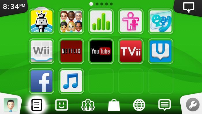
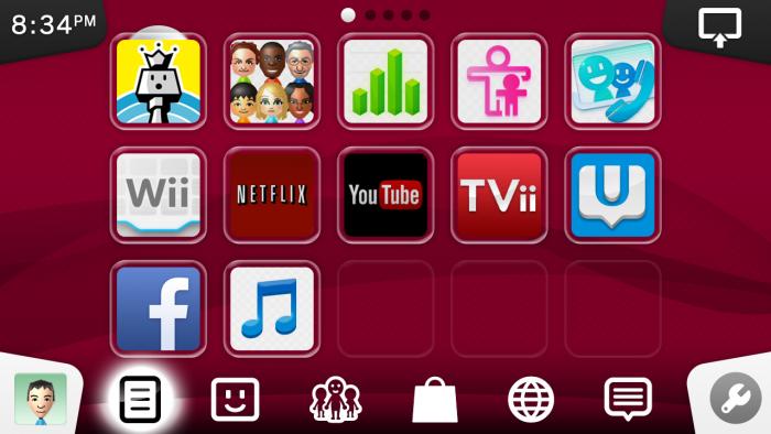
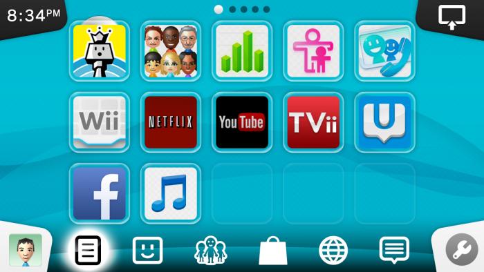
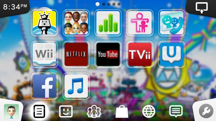
The background colour is fully customizable and can even be have an image of the game that is inserted in the console. But yeah, i see how it's looking like XMB... is that good or bad? :)


1v1.jpg

1v2.jpg

1v3.jpg

1v.jpg


#254333 Wii U OS Redesign Concept

Posted by Kiki Neko-Chan on 02 November 2013 - 06:48 PM

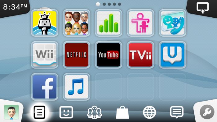
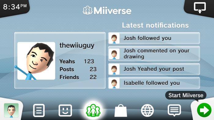
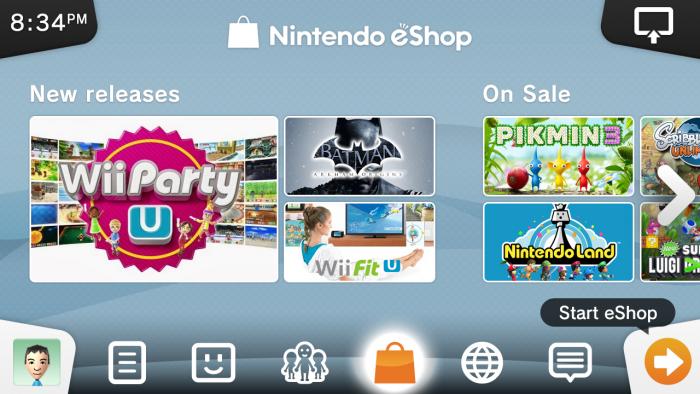
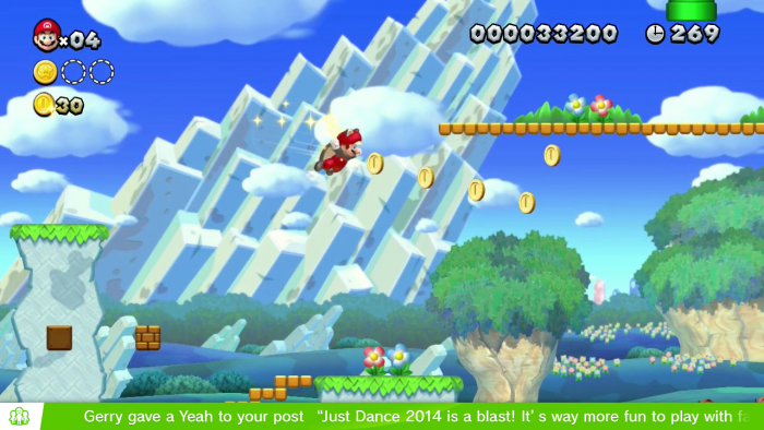
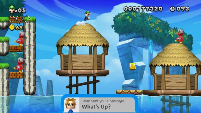
Here's version 2 of my previous concept! 


I toned down the colours and redid the entire layout. 


There isn't a definite art style on my concept.. It uses a combination of the glass style from the Wii U OS and flat design.

The background is inspired by the floating waves background in Mii Maker which is animated as well.


Soo.. yeah.


Update: One more thing.. It looks absolutely beautiful on the GamePad! Check it out for yourself!

Attached Thumbnails

  • 1.jpg
  • 2.jpg
  • 3.jpg


#252649 Wii U OS Redesign Concept

Posted by Arkhandar on 22 October 2013 - 02:47 PM

How about this guys?


Wii+U+Menu+-+by+Arkhandar.png


#251134 Wii U OS Redesign Concept

Posted by Kiki Neko-Chan on 12 October 2013 - 04:34 PM

Something like this?

Attached Thumbnails

  • marionotifs.png


#248689 Wii U OS Redesign Concept

Posted by grahamf on 30 September 2013 - 01:59 AM

Yeah the metro thing is too recognizable as Microsoft. But the HUD would be useful.


It'd be nice if it brought emphasis to the home button. Kind of like a central ticker tape thing. And the home screen could be more useful, with a list of all of the latest notifications without requiring you to jump into the Notifications app or Miiverse.


This is all I can come up with though.

HUD.jpg


I don't think there's really anything wrong with the app screen. I've been playing with the home menu a little bit to try to fit n something like Blackberry's hub, but there's not as much room unless to take the old Xbox 360's blade interface.


#248675 Wii U OS Redesign Concept

Posted by Abcdude on 29 September 2013 - 11:20 PM

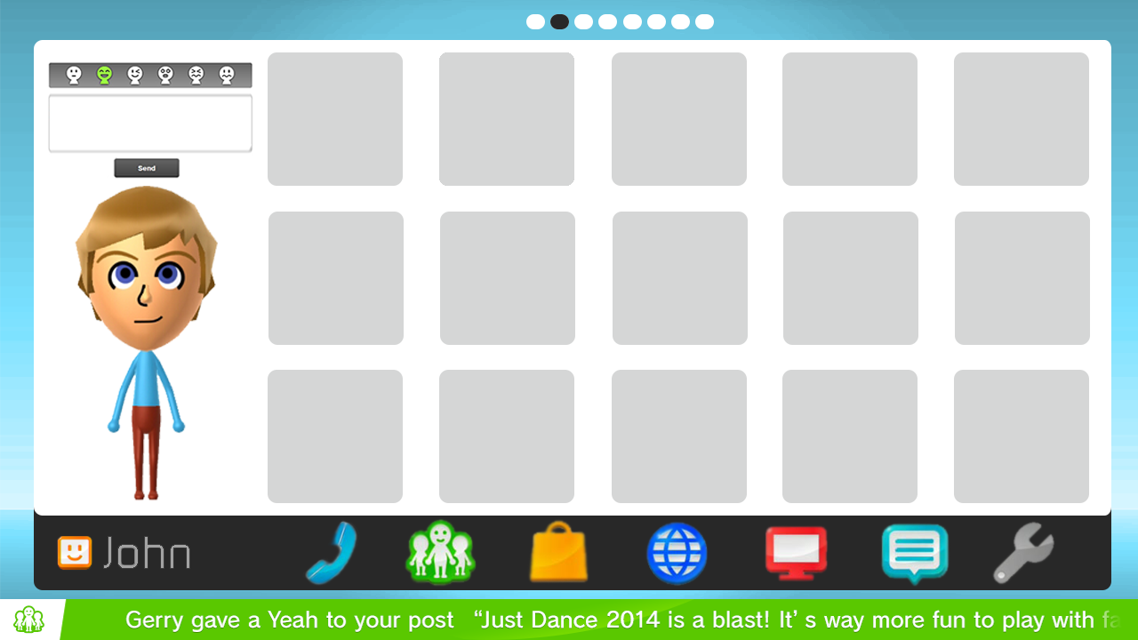
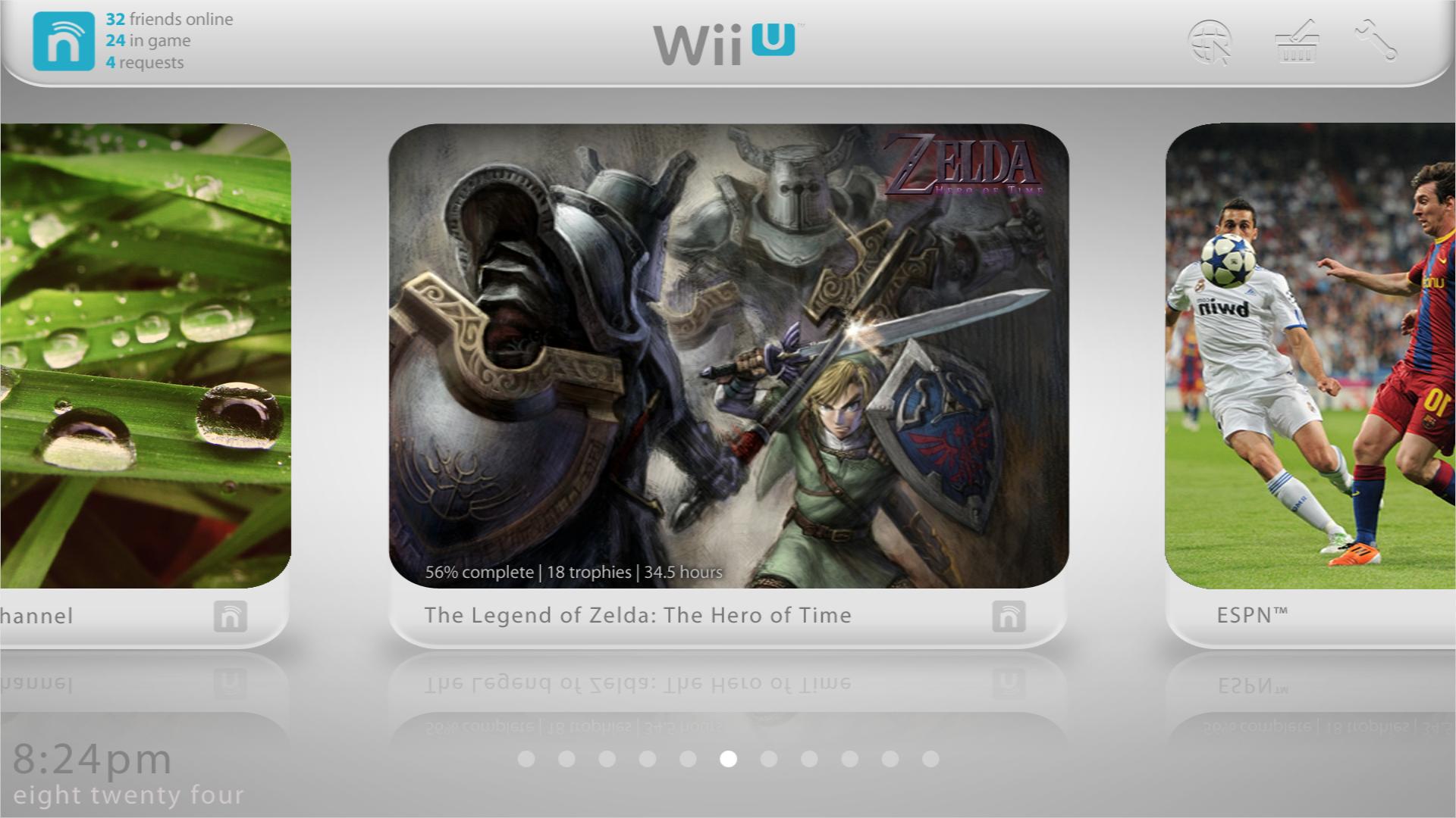
I'm sure i'm not the only one, but I think the Wii U's OS design is really outdated compared to the Xbox 360/one or the PS3/4. So I decided I might as well make a concept of what I think nintendo should remove add and change. Also take note my photoshop skills aren't too swell.


If you love the Wii U's OS, you better get out of here while you can.


SIMPLE CONCEPT (hybrid of the Xbox 360, iOS 7 and Windows 8):


Home Menu Screen: 


Your disc game is now a large icon on the home screen. All your Virtual Console games can be located inside the virtual console folder now (will be detailed in the next few pictures). The eShop is now a icon on the screen which can show you new games without the need to go into the store. The Wii Menu is now open in the background, and useable with the tap of the screen and opened in an instant. Friends list is now an app on the bottom bar. The background is also dynamic and changeable (iOS 7 background foolishly used here).


ASeZuds.png


In game notifications: 


Want to know if a friend is online? Miiverse comment? Message? Friend Request? Someone just trying to annoy you during your game session? In game notifications tell you that all without having to go into the suspend menu.


lZczOmF.png


Still working on concepts for a party system and better profile.


#242529 wii u ambassador program

Posted by AndyG on 29 August 2013 - 03:46 AM

I feel people are really making way too big a deal of all of this. Sure some free games would be nice but that won't really help make customers happy. I own and love my console to death, It saddens me that people just have to complain and say that Nintendo is robbing them of there money, Nintendo are trying pretty darn hard to get everything sorted out and i feel satisfied with what they have to offer, so instead of complaining about what Nintendo hasn't done YET...lets look at what good has come to the WiiU, and it's fair to say that the WiiU has a lot of love to give.


#242460 Nintendo announces 2DS?

Posted by grahamf on 28 August 2013 - 08:51 PM

2lbzwxc.jpg


#241575 Wii U Summer/Fall Update

Posted by Arkhandar on 25 August 2013 - 06:03 PM

tpzji.jpg


Something in the lines of this is what we probably need. 


Disclaimer: I am not the author of this image.


#241429 Wind Waker HD Wii U Deluxe bundle leaked!

Posted by Hank Hill on 25 August 2013 - 11:12 AM

Advice: complaining about Nintendo on a Nintendo fansite doesn't make you sound smart or biting, it mostly just makes you come off as annoying.


Advice: Just because somebody isn't singing the praises of Nintendo doesn't mean they're complaining. Everything Desert Punk said is true and shows actual concern.


...moreover, I can't even figure out HOW you got complaining out of what he said.


#240679 Wind Waker HD Bundle and Pokemon bundles rumored

Posted by DéliopT on 21 August 2013 - 02:44 AM

Could it be something like this:


wind_waker___bundle_by_wasabidesignband-


#241138 Hey Wii U community!

Posted by Gruff on 22 August 2013 - 07:29 PM

Welcome to the forums! (I'm also known as GameCube just so ya know)

Here's a nice welcoming video for you:


#241131 Hey Wii U community!

Posted by dante👌 on 22 August 2013 - 06:40 PM

WELCOME TO THEWIIU FORUMS BUDDY! I'M Z71!!!!!! I LIKE SHOUTING.. BE QUIET BLAKE YOU'RE TALKING TO LOUD!


#241121 Hey Wii U community!

Posted by Blake on 22 August 2013 - 06:04 PM

Welcome!


Anti-Spam Bots!