

Damn... i just wasted 10 seconds of my life looking for something interesting in the status updates.
Anyway, the icons next to the topics look great and the WiiU game case style top works well,

Side Project - Wii U Forums New Design
Started by Lord Pickleton, Aug 10 2012 11:00 PM
Side Project Design Interface Wii U Forums No Ponies Here
36 replies to this topic
#22

Expansion Pak
-

- Members
-

- 821 posts
Enlightened Fanboy
- NNID:Koopamann14
-
- Fandom:
- Pokemon the Series: XY and PS4
Posted 11 August 2012 - 04:11 PM
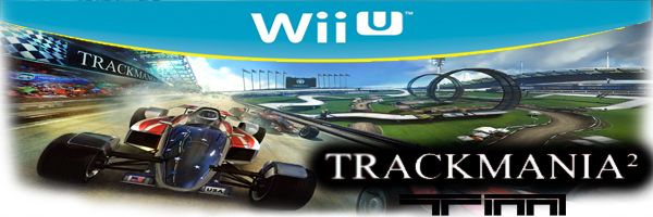
I nominate to be Luigi at the topIt looks way better. My only problem is the banner you should make it something more general to appeal to most people on this forum, like super smash bros characters.
A picture like this shows that we are a Nintendo Community. And we stay together in these forums. It also appeals to Nintendo fans more than the other picture.

I shower you with coconut cream pies.
#23
SolxBurst
-

- Writers
-

- 630 posts
Okami Amaterasu
- NNID:SolxBurst
-
- Fandom:
- Okami, Fire Emblem, Legend of Zelda
Posted 11 August 2012 - 07:16 PM
Maybe with the "Wii U News" section, instead of having the same papers icon the feedback section does, you have a little broadcast tower icon, just another little thing that might be cool.

"...A well written villain is a hero in his/her own world..."
#24
Lord Pickleton
-

- Members
-

- 1,188 posts
Pokey
-
- Fandom:
- Monster Hunter, Criterion, Codemasters
Posted 12 August 2012 - 03:31 PM
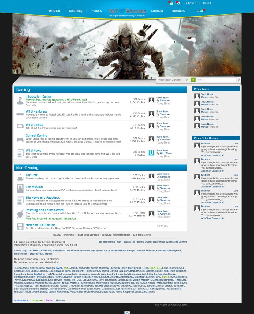
I started messing around with the "Featured Wii U Game" section and came up with this. i'm still trying to see how the bottom part will work with this new change. Do you welcome this change or do you like the old one better? Sorry it's Photobucket quality I'm not ready to update it on DeviantArt yet.
- Kiki Neko-Chan and Robotic Sunshine Commander like this

#25
Mensrea
-
- Members
-

- 70 posts
Red Koopa Troopa
-
- Fandom:
- Metroid,Zelda ,Pikmin ,Resistance
Posted 12 August 2012 - 03:56 PM
I really like it.
A noble spirit embiggens the smallest man
#26
Robotic Sunshine Commander
-
- Members
-
- 1,350 posts
Pokey
Posted 12 August 2012 - 05:03 PM
thats an awesome concept even better than the last one. i hope it gets changed to that 
i love the status updates lol XDDD
i love the status updates lol XDDD
Edited by hardcoreUfan, 12 August 2012 - 05:04 PM.

#27
Soul
-

- Members
-

- 3,660 posts
TYBG
-
- Fandom:
- I ENJOY HIP HOP BEATS
Posted 12 August 2012 - 05:58 PM
Yep this is way better than the actual website.
#28
Hinkik
-

- Members
-
- 667 posts
Skrillax numbr 1 faen
-
- Fandom:
- Skrallux
Posted 13 August 2012 - 01:36 AM
Woaah can't believe I've missed this.
This is amazing! Awesome work!
This is amazing! Awesome work!

#29
Kiki Neko-Chan
-

- Members
-

- 399 posts
Bullet Bill
-
- Fandom:
- Wii/U, The Sims
Posted 14 August 2012 - 09:27 AM
Hello Cerberuz and all,
I remade your mockup (hope you don't mind) according to what I'd like for it to look like. Cerberuz, I really like your design. It's clean, simple and sharp. But there were some elements in it that I didn't like, so I made my own version using your basic concept. While making this, I kept the Wii U's interface in mind. http://www.gameranx....un/miiverse.jpg The checkered background and rounded edges of the boxes have been implemented into my design.
I know some of you may not like it, but I'd also like to have some opinions on mine.
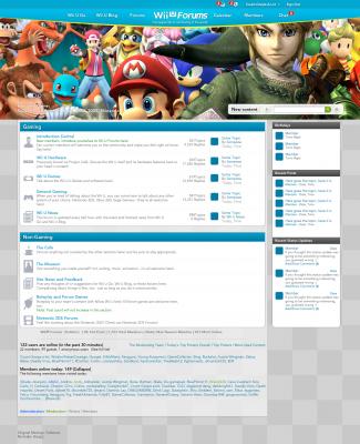
The changes:
- Made the logo white instead of grey. Grey on blue is kind of unreadable.
- Added small drop shadows on the text in the banner.
- Changed the font from Continuum to Avenir. (It looks better in small print, and it's the font that Nintendo uses on their websites/ads.)
- Made the blue a little more greenish (like the color that they use on the official Wii U Box art.)
- Added a gradient to the banner to make it look 3D.
- Made the "featured game" bigger and added "Featured Game [Game Name, Date, Company]" text
- Changed the background from black to a light checkered background.
- Made some elements match the banner.
So, that's pretty much it.
Thank you for reading this, and don't forget to state an opinion
I remade your mockup (hope you don't mind) according to what I'd like for it to look like. Cerberuz, I really like your design. It's clean, simple and sharp. But there were some elements in it that I didn't like, so I made my own version using your basic concept. While making this, I kept the Wii U's interface in mind. http://www.gameranx....un/miiverse.jpg The checkered background and rounded edges of the boxes have been implemented into my design.
I know some of you may not like it, but I'd also like to have some opinions on mine.
The changes:
- Made the logo white instead of grey. Grey on blue is kind of unreadable.
- Added small drop shadows on the text in the banner.
- Changed the font from Continuum to Avenir. (It looks better in small print, and it's the font that Nintendo uses on their websites/ads.)
- Made the blue a little more greenish (like the color that they use on the official Wii U Box art.)
- Added a gradient to the banner to make it look 3D.
- Made the "featured game" bigger and added "Featured Game [Game Name, Date, Company]" text
- Changed the background from black to a light checkered background.
- Made some elements match the banner.
So, that's pretty much it.
Thank you for reading this, and don't forget to state an opinion
Add Mii on miiverse:
thewiiuguy
^ dayum what a creative name
#30
Soul
-
- Members
-
- 3,660 posts
TYBG
-
- Fandom:
- I ENJOY HIP HOP BEATS
Posted 14 August 2012 - 11:13 AM
Love the improvements.Hello Cerberuz and all,
I remade your mockup (hope you don't mind) according to what I'd like for it to look like. Cerberuz, I really like your design. It's clean, simple and sharp. But there were some elements in it that I didn't like, so I made my own version using your basic concept. While making this, I kept the Wii U's interface in mind. http://www.gameranx....un/miiverse.jpg The checkered background and rounded edges of the boxes have been implemented into my design.
I know some of you may not like it, but I'd also like to have some opinions on mine.
The changes:
- Made the logo white instead of grey. Grey on blue is kind of unreadable.
- Added small drop shadows on the text in the banner.
- Changed the font from Continuum to Avenir. (It looks better in small print, and it's the font that Nintendo uses on their websites/ads.)
- Made the blue a little more greenish (like the color that they use on the official Wii U Box art.)
- Added a gradient to the banner to make it look 3D.
- Made the "featured game" bigger and added "Featured Game [Game Name, Date, Company]" text
- Changed the background from black to a light checkered background.
- Made some elements match the banner.
So, that's pretty much it.
Thank you for reading this, and don't forget to state an opinion
#31
Press
-

- Members
-

- 325 posts
Thwomp
-
- Fandom:
- Zelda, Smash, FF, KH, Sonic
Posted 14 August 2012 - 01:13 PM
I really think that would attract more people to use these forums with this style.
I'm all for it!
I'm all for it!
#32
SolxBurst
-
- Writers
-
- 630 posts
Okami Amaterasu
- NNID:SolxBurst
-
- Fandom:
- Okami, Fire Emblem, Legend of Zelda
Posted 14 August 2012 - 03:31 PM
The things I liked were the change in font color for the title, and the notification change. Other than that I didn't noticed much that caught my eye as an improvement. The background change as a tile alternating color I think seems weird and less solid for the design IMO, and the featured game title was a nice touch but I didn't like how zoomed in it was, I liked in cerberuz's that it didn't take the whole screen and that it gave a 3D effect and also had a curved bottom.Hello Cerberuz and all,
I remade your mockup (hope you don't mind) according to what I'd like for it to look like. Cerberuz, I really like your design. It's clean, simple and sharp. But there were some elements in it that I didn't like, so I made my own version using your basic concept. While making this, I kept the Wii U's interface in mind. http://www.gameranx....un/miiverse.jpg The checkered background and rounded edges of the boxes have been implemented into my design.
I know some of you may not like it, but I'd also like to have some opinions on mine.
The changes:
- Made the logo white instead of grey. Grey on blue is kind of unreadable.
- Added small drop shadows on the text in the banner.
- Changed the font from Continuum to Avenir. (It looks better in small print, and it's the font that Nintendo uses on their websites/ads.)
- Made the blue a little more greenish (like the color that they use on the official Wii U Box art.)
- Added a gradient to the banner to make it look 3D.
- Made the "featured game" bigger and added "Featured Game [Game Name, Date, Company]" text
- Changed the background from black to a light checkered background.
- Made some elements match the banner.
So, that's pretty much it.
Thank you for reading this, and don't forget to state an opinion
Nice job though!
"...A well written villain is a hero in his/her own world..."
#33
WisdomPowerCourage
-

- Members
-
- 615 posts
ZEWOP BOOPITY BOP!
-
- Fandom:
- Cats Pajamas.
Posted 14 August 2012 - 06:02 PM
I like how both of them have my username on the online users.
#34
gregoryorizal
-

- Members
-

- 211 posts
Spiny
Posted 17 August 2012 - 08:04 AM
I love the icons next to the topics

#35
Hinkik
-
- Members
-
- 667 posts
Skrillax numbr 1 faen
-
- Fandom:
- Skrallux
Posted 22 August 2012 - 07:43 AM
Too bad though, I don't think we can apply this without making the forum software completely from scratch.
#36
Lord Pickleton
-
- Members
-
- 1,188 posts
Pokey
-
- Fandom:
- Monster Hunter, Criterion, Codemasters
Posted 22 August 2012 - 07:46 AM
For now I will just update the Original Post with the some small changes including the new Design for the "Featured Wii U Game" and putting the Games logo on the opposite side of the search bar like I have been doing with my signatures for some time.
I also changed the game to Pikmin 3 since some of you wanted to see it.
Right now I'm thinking if I should make a thread with more of the signatures I made.
The thread with my signatures is right Here
I also changed the game to Pikmin 3 since some of you wanted to see it.
Right now I'm thinking if I should make a thread with more of the signatures I made.
The thread with my signatures is right Here
Edited by Cerberuz, 11 November 2012 - 06:50 AM.
#37
dagwood dang
-
- Members
-
- 343 posts
Thwomp
-
- Fandom:
- Starfox, Elder Scrolls, LoZ
Posted 22 August 2012 - 08:01 AM
Dude. Cerb. This is awesome man. Very nice work.


Also tagged with one or more of these keywords: Side Project, Design, Interface, Wii U Forums, No Ponies Here
Non-Gaming →
Site News and Feedback →
Here, we shall thunk.Started by Auzzie Wingman, 10 Nov 2013 |
|

|
||
Non-Gaming →
The Museum →
What do you guys think of my Pokemon design - Ash,Venusaur, Charizard, BlastoiseStarted by scribbleworx, 16 Sep 2013 |
|

|
||
Gaming →
General Gaming →
First Look: The New PS4 Interface PreviewStarted by dante👌, 19 Jun 2013 |
|

|
||
Non-Gaming →
Roleplay and Forum Games →
Auzzie's Ultimate Scramble!Started by Auzzie Wingman, 25 Feb 2013 |
|

|
||
Non-Gaming →
Site News and Feedback →
Reasons why this forum is implodingStarted by Auzzie Wingman, 24 Feb 2013 |
|
|
1 user(s) are reading this topic
0 members, 1 guests, 0 anonymous users

